Scientific Visualization in Seismology
160 likes | 290 Vues
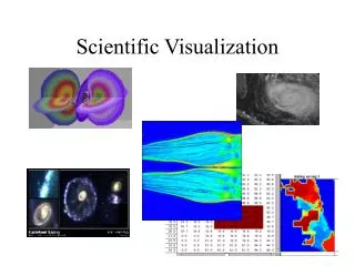
In this presentation at the SCEC-CME All Hands Meeting, visualization expert Amit Chourasia explores innovative methods for revealing insights in seismology. Highlighting technologies like Terashake2.1 and SCEC's Visualization Portal, the discussion covers the importance of visualization in understanding complex data. It focuses on how deep, qualitative, and unexpected insights can drive scientific discovery. With examples from teacher training and media usage, Chourasia emphasizes collaboration and the development of tools to enhance visual interpretation of seismic data.

Scientific Visualization in Seismology
E N D
Presentation Transcript
Scientific Visualization in Seismology Amit Chourasia Visualization Scientist Visualization Services Presented at : SCEC-CME All Hands Meeting Jun 2006
Current Work • “Earthworks effort” -Viz on demand through web • On the fly viz
Past Work • SCEC data used for IEEE Vis 2006 contest • Cover for GRL • Movies being used in Teacher Training • Movies part of National Geographic’s Documentary • Movies shown at TV/Internet News • Movies shown at key meetings/conferences...
Insight? Purpose of Visualization is insight • But, what exactly is insight? • How can it be measured? Ref: North. C., Towards measuring Visualization Insight, CGA, May/June 2006 Some important characteristics of Insight are • Complex • Deep • Qualitative • Unexpected • Relevant
Lets take a look at Insight • Complex - involving all or large amounts of data in a synergistic way, not simple data values. (Whittier Narrows effect) • Deep – it builds up over time, accumulating and building up on itself to create depth. It often generates further questions. (Movie stack for different simulations, comparison movies) • Qualitative – is not exact, can be uncertain and subjective, and can have multiple levels of resolution. (Input wave super shear) • Unexpected – is often unpredictable, serendipitous and creative. (Sun bursts patterns, reflection in ocean) • Relevant – is deeply embedded in the data domain, connecting the data to existing domain knowledge and giving relevant meaning. It goes beyond dry analysis, to relevant domain impact. (Coupling surface information like fault lines, freeways, topography, etc)
Our Focus • Enable science through visualization
Collaboration • What is missing ? • What are features of interest ? • How can features be extracted ? • Tell us your visual interpretations and conceptions of simulations.
Software Tools • Vista (SDSC/NPACI) • Mesh Viewer (SDSC/NPACI) • DeskVox • Autodesk’s Maya & Image Studio • Adobe’s suite (After Effects, Photoshop, Illustrator) • Other tools that’ll work
Simulations • What happens ? • Where ( Place + Time) ? • How it happens ? Visualization Monitering-On the Fly • Why? Diagnosis after completion Science
Future Directions Visualization Caution: What is left out? What is distilled? Ensure detail and significant features are not lost. Monitering • Integrated • Web based? Automated Diagnosis / Analysis • Feature Driven • Multivariate • Replicable • Quick
People Visualization Services • Steve Cutchin • Alex Decastro • Amit Chourasia • Patrick Yau (Former Intern)
Hope you are still awake! ?- Drop a line: amit sdsc.edu http://visservices.sdsc.edu/