Download

1 / 5
50 likes | 162 Vues
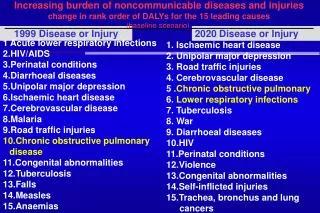
The DisMod 3 model from the Institute for Health Metrics and Evaluation generates crucial estimates of disease prevalence, incidence, and mortality across various demographics. With over 20,000 estimates for each disease cause, evaluating the plausibility of these models is essential. Our visualization solution includes summary figures such as age patterns of disease by region and scatterplots comparing age-standardized rates from 1990 to 2010. We created a class to standardize model results at both country and regional levels, enhancing clarity and accessibility for researchers.

E N D
visualizing disease and injury rates Ian Bolliger Institute for Health Metrics and Evaluation
Background • DisMod 3 model produces country-age-sex-year-specific prevalence, incidence, excess mortality • Over 20,000 estimates per disease cause • Models can be very sensitive to parameter choice • Need a way to evaluate plausibility of each disease model along several criteria • Solution: Visualizations
Challenges • Model results stored in several formats (i.e. CSV, JSON) • Model is still evolving • Result formats will continue to change • Need to adapt to researchers desiring new visualizations
Implementation • Two types of summary figures deemed most valuable • Age pattern of disease by region • Scatterplot of age-standardized rate in 1990 and 2010 by country • Class developed to standardize format of model results at country and region level • MeanEstimates • Methods within this class written to produce plots