Design: Type
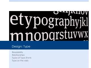
Design: Type. Readability Relationships Types of Type (Fonts Type on the web. Readability. Type has multiple purposes but the most important is readability. The ability for a reader to easily read and understand the text. Contributors/Distractors

Design: Type
E N D
Presentation Transcript
Design: Type Readability Relationships Types of Type (Fonts Type on the web
Readability Type has multiple purposes but the most important is readability. The ability for a reader to easily read and understand the text. Contributors/Distractors Size, color, texture, light, font, weight, relationship etc.
Concordant Uses one type family with little change in style, size or weight. This can be used to communicate a sedated or formal situation but can also be dull.
Conflicting • When you combine type faces that are similar but not the same. This makes the page less interesting because it is not concordant. Times New Roman & Palatino
Contrasting When you combine separate typefaces that are distinct and different from each other. The best designs have contrast and this includes font.
Type Categories Remember them in groups of two: Old/Modern, Serif/Sans, Script/Decorative
Type Contrasts Size, Weight, Structure, Form, Direction and Color
My Rules Never use more than three fonts and two is probably enough Never use more than one serif font Never use more than one san serif font Never use more than one decorative font and only in limited doses Typically, I choose one Serif, one san and call it a style!
Fun • Dafont.com • What the Font