Download
1 / 15
150 likes | 177 Vues
Learn how to calculate standard deviation and create histograms for data sets in math class. Practice examples provided to enhance understanding.

E N D
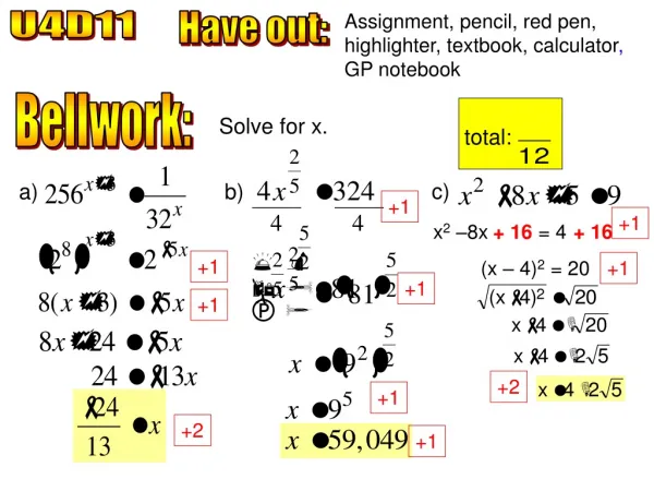
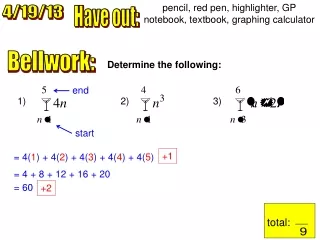
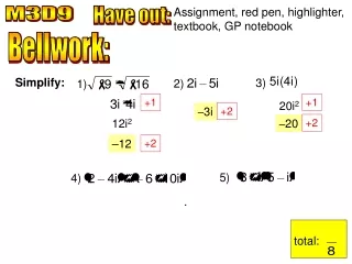
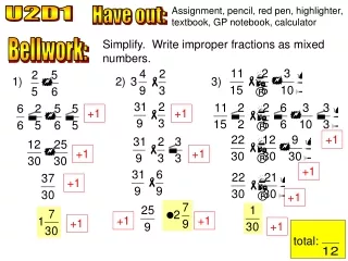
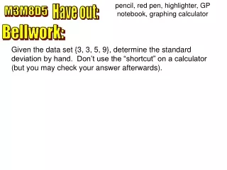
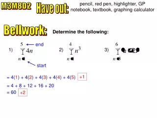
pencil, red pen, highlighter, GP notebook, textbook, graphing calculator M3M8D2 Have out: Bellwork: Determine the following: end 1) 2) 3) start +1 = 4(1) + 4(2) + 4(3) + 4(4) + 4(5) = 4 + 8 + 12 + 16 + 20 = 60 +2
Bellwork: Determine the following: 2) 3) +1 +1 = (1)3 + (2)3 + (3)3 + (4)3 = (3 + 2) + (4 + 2) + (5 + 2) + (6 + 2) = 1 + 8 + 27 + 64 = 5 + 6 + 7 + 8 = 100 = 26 +2 +2
Introduction to Standard Deviation Range measures the spread of a set of data from low to high. For example, yesterday we discussed the range of heights of an 8th grade class from 60 to 71 inches. The spread is from 60 to 71. There are two other measures of spread. Today, we will focus on the first measure: ____________ ____________. deviation standard Standard Deviation measures the spread of the data from the mean. The larger the standard deviation, the more spread out the data is from the mean. Example #1: Suppose you are given the following data set: 4, 6, 9, 6, 5. Sketch a histogram of the data.
Introduction to Histograms Example #1: The heights (in inches) of 20 8th graders are as follows: 63, 65, 69, 61, 62, 63, 65, 67, 69, 64, 65, 66, 66, 67, 64, 69, 68, 62, 60, 71 Rewrite the list in ascending order (or use sort on calculator). 60, 61, 62, 62, 63, 63, 64, 64, 65, 65, 65, 66, 66, 67, 67, 68, 69, 69, 69, 71 ) L1 OPS 2: SortA( 2nd LIST 1: Edit STAT Enter data in L1. 1: Edit STAT ENTER
60, 61, 62, 62, 63, 63, 64, 64, 65, 65, 65, 66, 66, 67, 67, 68, 69, 69, 69, 71 range The ______ of the data is the difference between the highest and lowest data. 71 11 60 Range = _____ – _____ = _____ Max Min Since all measurements are to the nearest inch, there are _____ + _____ = _____ possible data points. 11 1 12 histogram We are going to make a _________ (bar graph) where we are going to group the data into intervals. To keep each interval the same length, use 4 intervals because 4 is a factor of ____. 12 class size 12 3 Each __________ will be ____ = ___ 4 frequency table Make a ______________ to organize the data.
Frequency Height (inches) 60, 61, 62, 62, 63, 63, 64, 64, 65, 65, 65, 66, 66, 67, 67, 68, 69, 69, 69, 71 Make each interval 3#s wide 62 Make a tally of the heights within each interval 63 65 66 68 69 65.3 Mean = ______ Use your calculator to compute the following: 65 Median = ______ Use the frequency table to make a histogram on graph paper. Make sure that the bars touch!
Frequency 8 6 4 2 Height (inches) 0 60 – 62 66 – 68 63 – 65 69 – 71 0 62 63 65 66 68 69 Make sure to include a “break.”
Let’s make the same histogram on a graphing calculator. First, however, clear all functions of the menu. Y = 2nd STAT PLOT 1: Plot 1 ENTER ON TYPE Choose histogram Make sure all other plots are turned off. ENTER Arrow over, highlight, and hit
Once you select histogram, make sure the screen shows: Freq: 1 X list: L1 9: ZoomStat ENTER ZOOM Select Arrow down 6 This makes ____ intervals, but we just want 4 intervals. Therefore, we need to change the window.
WINDOW Select 1 60 72 3 –1 8 Xmin = ___ Xmax = ___ Xscl = ___ Ymin = ___ Ymax = ___ Yscl = ___ Class size Most at any interval + 1 MAX + 1 MIN Select Select GRAPH TRACE Notice the intervals and frequency
Example #2: A police officer clocked the following speeds (in mph) in a Wal-Mart parking lot. Record the data into L1 and sort ascending (see your notes from day 1). Be sure to clear the previous data from L1. To avoid data entry mistakes, make sure that the mean of the above data is about 39.8125. ) L1 2nd QUIT MATH 3: mean( 2nd LIST
Leaves Stem stem and leaf A ______ - ____ - _____ Plot is a way to organize and analyze statistical data. To make one, complete the following steps: 1. Draw a vertical line 2. On the left side of the line, list all the numbers that are in the 10s place from the set of data. 3. List each number in the ones place on the right side of the line in ascending order. 1 0 5 5 9 2 1 4 6 8 9 4 5 5 6 3 2 2 8 9 5 6 7 1 2 5 4 0 1 2 5 6 9 5 1 2 6 4 By the way, if you turn the stem–and–leaf plot 90 degrees, it looks like a histogram.
Leaves Stem 1 0 5 5 9 2 1 4 6 8 9 4 5 5 6 3 2 2 Frequency 8 9 5 6 7 1 2 5 4 0 1 2 5 6 9 5 1 2 speed (mph) 6 4 Since there are 32 data points, the median is equal to the average between the ____ and ____ points when data is in ascending order. 17th 16th 40 Median = + 41 2 = 40.5 On graph paper, make a histogram for the car speed data with 5 intervals of equal length.
Leaves Stem 1 0 5 5 9 2 1 4 6 8 9 4 5 5 6 3 2 2 8 9 5 6 7 1 2 5 4 0 1 2 5 6 9 5 1 2 6 4 But first, let’s answer the following: 64 10 54 Range = ____ – ____ = ____ Min Max 54 55 Class size = 11 = ____ = ____ 5 Make a frequency table to organize the data. 20 31 21 42 32 53 43 54
20 31 21 Frequency 42 32 16 53 43 54 14 12 10 8 6 4 2 speed (mph) 0 21 – 31 10 – 20 0 54 – 64 43 – 53 32 – 42