Download

1 / 8
80 likes | 102 Vues
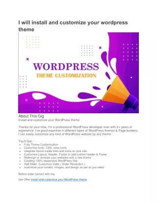
Sometimes, customizing an already responsive design to fit your needs can be more difficult than converting a static theme into a responsive design. It also makes sense to convert PSD to WordPress theme.<br><br>Read More: https://bit.ly/2E58l3L

E N D
Email us: sales@hirewpgeeks.com • Call us:+1.949.591.8153 • Make Any WordPress Theme Responsive With so many mobile devices with different screen sizes and different browsers, having a responsive website is very important. If you want to change a static theme into a responsive design, this article will help you. Sometimes, customizing an already responsive design to fit your needs can be more difficult than converting a static theme into a responsive design. It also makes sense to convert PSD to WordPress theme.
Email us:sales@hirewpgeeks.com • Call us:+1.949.591.8153 Convert Your WordPress Theme to a Responsive Design • For responsive design, your site grid should be fluid with relative measures and not fixed ones. • Images should be flexible and design changes should be easily implementable to adjust to different devices. • CSS media queries should be used to define breakpoints for design changes.
Email us: sales@hirewpgeeks.com • Call us:+1.949.591.8153 Tools Needed • The first thing we need to do is to check the HTML and CSS structure. • For this, you may need tools, such as Firebug, Chrome, and Firefox Developer tools. • You will also have to edit some PHP and HTML files, for which text editor like Notepad++ will do the trick.
Email us: sales@hirewpgeeks.com • Call us:+1.949.591.8153 Define a Default Zoom • The first step is to define a default zoom so that the browsers provide. • The pages based on the device width and not fall back to the larger default size. • This is done by editing the header.php file in the theme folder and the first step is to add a code to the header.
Email us: sales@hirewpgeeks.com • Call us:+1.949.591.8153 Fluid Element Widths and Heights • After a zoom default is set, the next step is to find containers for the main sections of the site. • You can use Firebug for this as it can display the HTML structure of your website inside the browser. • A WordPress theme typically has the elements, such as a body, wrapper, header, menu, main content, sidebar, and footer.
Email us: sales@hirewpgeeks.com • Call us:+1.949.591.8153 A Mobile Menu • Now, the next step is to create a mobile menu, which usually is collapsible. • There are a number of ways to do that. • The easiest way to do that is to set the dimensions from fixed to fluid, as we have done with other aspects above.
Contact Us We are always happy to make valuable new contacts. sales@hirewpgeeks.com https://www.hirewpgeeks.com/ 127 Palm Street San Francisco, CA 94111 USA • +1.949.591.8153