7 Tips for More Effective Data Visualization
Use these 7 tips for great data visualization and no other set of chart. Effective data visualization takes skill and storytelling, an eye for detail and an understanding your audience.

7 Tips for More Effective Data Visualization
E N D
Presentation Transcript
7 Tips for Effective Data Visualization
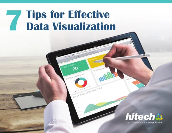
In today’s data-driven world, how data is shown and shared determines its impact and effectiveness. Plotting data into charts and graphs isn’t enough. Effective data visualization takes skill and storytelling, an eye for detail, and an understanding of your audience. Use these 7 tips for great data visualizations and no other set of charts. www.hitechbpo.com | info@hitechbpo.com
1 Determine the story you want your data to tell Understand the data you’re working with and determine what story you want to tell. Ask a few questions - if required. Don’t forget your visual story will drive understanding, discussions and decision-making. WHAT STORY DO YOU WANT TO TELL? Use Outliers to illuminate deviators from others Highlight Trends to indicate changes over a period Showcase Patterns for repeated consistent characters Portray Correlations for establishing relationship between 2 or more variables www.hitechbpo.com | info@hitechbpo.com
2 Choose the right kind of visualization to represent data Choose one or more or a combination of the four fundamental types of data visualizations. Each of it delivers specific insights. FREQUENTLY USED FOR ANSWERS QUESTIONS LIKE EXAMPLES Spot trends Which products / services sell the best? Circular area chart Line chart Bar chart Classifying curtrent versus old Values COMPARISON VISUALIZATIONS How is sales, if compared to previous years? Seeing highest versus older values Classifying the relationship between data points that change over time How big is our market share & what is the total market size? Stacked area chart Stacked bar chart Pie chart COMPOSITION VISUALIZATIONS What percentage of the budget is dedicated to A, B and C? Seeing the relative difference between parts of a whole Classifying commanalities and outliers Total how many customers exist in a demographic range? Bar histogram Line histogram Scatter plot DISTRIBUTION VISUALIZATIONS Seeing the general shape of a range How many customers are late by how many days in making payments? Portraying correlations and clusters What is the correlation between advertising spend and sales? Scatter plot Scatter plot bubble size RELATIONSHIP VISUALIZATIONS Identifying outliers Does expences and revenue have variances across regions? www.hitechbpo.com | info@hitechbpo.com
3 Use colors as powerful tools to enhance the visuals With help of colors, give clear cues about relative values, points of emphasis, and differentiation amongst data sets. Use colors carefully and sparingly, as inappropriate colors used can increase the confusion instead of clearing it up. DO DON’T USE DISTINCT COLORS FOR EACH SEGMENT OF A PIE CHART COLOR SEGMENTS USING DIFFERENT SHADES OF THE SAME COLOR USE DIFFERENT SHADES OF THE SAME COLOR TO DESIGNATE NUMEROUS VISUAL ELEMENTS USE DIFFERENT COLORS WHEN DEALING WITH NUMEROUS GRAPHICAL ELEMENTS USE THE SAME COLOR FOR EACH BAR OF A BAR CHART USE A DIFFERENT COLOR FOR EACH BAR www.hitechbpo.com | info@hitechbpo.com
4 Avoid chartjunk situation For every visual that you create, ask “Which elements are the most important to the story that your data is trying to tell”. To adhere to this thought process: • Limit the number of visualization in a dashboard to 9 or may be less – unless the client requires it otherwise. • Add callouts to emphasize on the information critical to convey the message. • Use lot of trend lines to highlight important correlations between variables. Also ensure that the graphs are more scannable. • Use a wide plethora of size and colors to define unique data variables. • Avoid excess use of decorative fonts, text treatments such as underline, italics, and visual embellishments such as drop shadows. www.hitechbpo.com | info@hitechbpo.com
5 Adhere to design principles Bring clarity and avoid confusions while assessing complex datasets. DO DON’T ORDER SLICES FROM LARGEST TO SMALLEST for easier comparison RANDOMLY ORDER THE SLICES USE TRANSPARENT COLORS so each element remains visible USE SOLID COLOR WITH OVERLAPPING DATA USE 2D LINES USE 3D LINES to clearly convey priority and ranking www.hitechbpo.com | info@hitechbpo.com
6 Showcase data at the right scale, to make visuals correct - not attractive Improper scales can make major insights seem mediocre and minor deviations feel massive. For correct representation of the story, show data as: START Y-AXIS VALUE AT 0 350 DO 300 350 250 300 250 200 200 • Ensure that the scale of axes accurately reflects the size of data 150 150 100 100 50 • Select the axes that best represent the trend in the data 50 0 • Take care that absolute numbers or percentage makes the data clearer 0 400 • Don’t use cropped axis and start the Y axis at 0 TRUNCATE THE SCALE DON’T 350 350 300 PRO TIP: Vertical type can be difficult to read, so use horizontal labels whenever possible. 300 350 300 250 250 250 200 200 200 150 150 100 100 150 50 50 0 100 0 JAN FEB 50 www.hitechbpo.com | info@hitechbpo.com
7 Create visualizations keeping target audience in mind Know the audience for whom you are putting together the data in form of visualizations and what are they interested in. Clearest and best looking visuals can turn turtle, if audience does not find it interesting and engaging. Deliver persuasive story by: • Highlight & order the information, purely based on audience interest and trends. • Visualize data sets in intuitive & conventional manner as per everyone’s understanding. • Conduct dry runs to test the visuals with experienced colleagues to ensure you convey the story they are interested in. www.hitechbpo.com | info@hitechbpo.com
Ahmedabad, Gujarat, INDIA. 50 Riverside Drive, New York, USA Kochi, Kerala, India Santa Clara, CA, USA Tel: +91.79.4000.3251 | www.hitechbpo.com | info@hitechbpo.com Headquarters hitech solutions Hi-Tech House, Nr. Gurukul Tower, Gurukul Ahmedabad 380052, Gujarat, India. Ahmedabad 9th Floor, Commerce House - 4, Beside Reliance Petrol Pump, 100 Feet Road, Prahladnagar. Ahmedabad 380015, Gujarat, India Cochin 43-A, E Block, 3rd Floor, Cochin Special Economic Zone (CSEZ),Kakkanad, Kochi 682 037, Kerala, India USA California 547 Moreland Way, Santa Clara, CA 95054, USA

