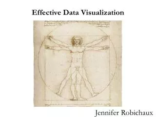
Effective Data Visualization
This resource dives into effective data visualization by analyzing Napoleon's March on Moscow during the War of 1812. It emphasizes the importance of critical examination of visuals in data representation and suggests applying these concepts to enhance figures in theses and team design projects. Additionally, insights from Hermann Brenner's analysis of long-term cancer survival rates are discussed, showcasing how to interpret data contextually. Discover key take-home messages that will sharpen your ability to present complex information clearly and compellingly.

Effective Data Visualization
E N D
Presentation Transcript
Effective Data Visualization Jennifer Robichaux
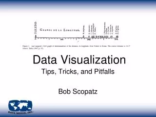
Napoleon’s March on Moscow The War of 1812
http://homepage.ntlworld.com/clivebillson/tube/tube.html#1908smallhttp://homepage.ntlworld.com/clivebillson/tube/tube.html#1908small
Multiple Iterations Hermann Brenner, "Long-term survival rates of cancer patients achieved by the end of the 20th century:a period analysis," The Lancet, 360 (October 12, 2002), 1131-1135.
Take Home Messages • Look at visuals more critically • Apply these concepts to your figures generated in your Theses and Team Design Projects