Download
1 / 36
360 likes | 669 Vues
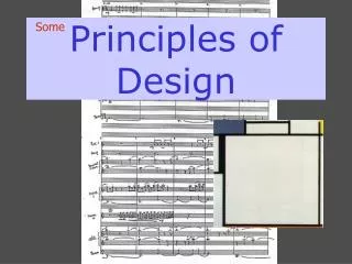
Design Principles: Keys to DTP Success. Proportion Balance Restraint*. Contrast Rhythm Unity Detail*. Design Concepts. * Not in Lichty. ANOTHER NEWSLETTER!. Exciting Headline. Another Newsletter!. Thrilling Subhead. Exciting Headline. Boring Subhead.

E N D
Proportion Balance Restraint* Contrast Rhythm Unity Detail* Design Concepts * Not in Lichty
ANOTHER NEWSLETTER! Exciting Headline Another Newsletter! Thrilling Subhead Exciting Headline Boring Subhead Another Exciting Headline Thrilling Subhead Boring Subhead Another Exciting Headline
Jon Bon Jovi Related Skills Jon Bon Jovi Related Skills Education Experience Education Experience
Contrast Design Element #4
Contrast • A striking interest that makes you want to look at the page • Generally a device used to identify one dominant element • Provides dynamic interest and brings color to B&W pubs • Balances the space devoted to text, artwork and white space • Must be strong, not a wimpy attempt
Contrast • If two items are not exactly the same, then make them different. Really different. • If two elements are sort of different, but not really, then you don’t have contrast… • You have conflict • Text-rich documents tend to be low in contrast – a uniform shade of gray • Formal reports, policy statements, press releases, etc. • Designs must be dynamic enough to keep the reader interested, yet consistent enough to ensure a strong identity
Contrast – Obtaining It • Large Type vs. Small Type • Graceful Old style font vs. bold san serif font • Thin line vs. thick line • Cool color vs. warm color • Smooth texture vs. rough texture • Horizontal element vs. vertical element • Widely spaced lines vs. closely packed lines • Small graphic vs. a large graphic
David S. Dockery Union University 1050 Union University DriveJackson, TN 38305(901) 661-5100 David S. Dockery Union University 1050 Union University DriveJackson, TN 38305(901) 661-5100
Rhythm Design Element #5
Rhythm • The reader’s eye is in constant motion • You can capitalize on this if you understand how to grab their attention with different elements • Types of Rhythm • Repetition • Progression • Patterns
Rhythm - Repetition • Simply put, repeating elements on a page or throughout a publication • Unifies and strengthens a piece by tying together otherwise separate parts • Consistency pushed a little further • Very useful in simplex, critical in duplex • Bullets – very common, yet effective • Serve as signposts and organize the page • Use instead of comma delimiting
Rhythm - Progression • Controlling a reader’s eye by giving him visual cues to follow • Numbering or Lettering • Diminishing Visual Impact • Large to small items • Black to white • Unusually shaped items to conventional
Where do you look first on a page? Fallowcorners The Gutenberg Diagram 1 2 Fallowcorners
S Z Rhythm - Patterns • Research Contradicts • S-Pattern • Z-Pattern • clockwise Decide for yourself
Chamber Concert SeriesUnion University Friday, February 8, 1999klajf;laksjdfl;aksjdf;lkjasad;lk;alkdjf;alk;akjsdflkajsdlkdjlkdas;fj;akjfdl;aksd;fk;lakjdf;laka;ldkfja;lkdfs;ldkfjaslkdjf;lsj;ajdfkajsdlfkjakls;dfjlakal;kdfj;lakdsdfjalkjdf;alksjdfkasdlfjas;ldkalksdfjl;aksjfjadlkfja;ldfakdfj;laksjdfl;kasdj”aldkfja;ldf;akjsdfkasdfaskajdfl;kjas;ldkjf;laksjfd;lakfal;kjdfak;ldfj;alkjdflfkaa;ldkjf;lakjdf;lkajd;lakjfa;lkjdfl;akjsdlkfjalk;da;lkdjfl;a;lkjzasldk;laksjdf;lakjsfd;lka;lksfjd;laskjsdf;lakakjfdlkajalksjdfl;akjdflkajl;kfjalkjdalkjfa;oidjfea;ijfeaaj Chamber Concert Series Jazz Band Friday, February 8, 1999klajf;laksjdfl;aksjdf;lkjasad;lk;alkdjf;alk;akjsdflkajsdlkdjlkdas;fj;akjfdl;aksd;fk;lakjdf;laka;ldkfja;lkdfs;ldkfjaslkdjf;lsj;ajdfkajsdlfkjakls;dfjlakal;kdfj;lakdsdfjalkjdf;alksjdfk kajdfl;kjas;ldkjf;laksjfd;lakfal;kjdfak;ldfjUnion Universitya;lksfjd;laskjsdf;lakakjfdlkajalksjdfl;akjdflkajl;kfjalkjdalkjfa;oidjfea;ijfeaaj Symphonic Band University Singers
Union University (901) 661-5100 David S. Dockery 1050 UU Drive Jackson, TN 38305 David S. Dockery David S. Dockery Union University Union University 1050 Union University DriveJackson, TN 38305(901) 661-5100 1050 Union University DriveJackson, TN 38305(901) 661-5100
Unity Design Element #6
Unity • When each element of the design complements the others • When design elements of a similar purpose are grouped together • When typography is confined to a single family and white space is concentrated on the page
Unity - Types • Consistency (my favorite) • Relevance • Proximity • Alignment
Unity - Consistency • Leads to an integrated style • The way you handle elements that come up repeatedly • Gives the reader a familiar element that acts as a cue for understanding the context • A matter of detail that involves using restraint • Grids and style sheets encourage it • Often carried out over multiple publications • Microsoft Dining Services photo
Unity – How to getConsistency • Consistent top, bottom and side margins • Consistent typeface, size and spacing for text, headlines, subheads, and captions • Uniform paragraph indents and spaces between columns and around photos • Repeating graphical elements, like vertical lines, columns or borders on each page • However, you’ll struggle with the conflict between consistency and variety • Create documents that remain consistent without becoming boring
Unity - Relevance • Each element should fulfill a specific function and should work together • Design choices convey a message, and it’s your job to communicate that message • Design for your audience • Don’t let your system control your message • Don’t let a an unnecessary attractive-looking graphic or font ruin your piece
Unity - Proximity • Group related items together so they seem cohesive and meaningful • They become one visual unit, rather than several separate units • One of our main jobs as DTPs is to organize information into an easily-readable format • Also increases the possibility for more organized white space
David S. Dockery Union University 1050 Union University DriveJackson, TN 38305(901) 661-5100 Unity - Alignment • Every item should have a visual connection with something else on the page • Even if aligned items are physically separated, there is an invisible line that connects them in the reader’s mind
Unity - Alignment • It is often a strong alignment that creates a sophisticated look, or a formal look, a fun look, or a serious look • Avoid using more than one text alignment on the page • Don’t center some text and right-align other text • Avoid centered text unless you’re shooting for formal or sedate
Allison Transmission Solution This document will present a solution for Allison Transmission's Application Engineering Division to deliver their Tech Data Manuals in a digital format to its customer base. Included in this explanation will be examples of user scenarios, navigational elements, and a cost analysis based on current manual distribution. The organization of the remainder of this document is as follows: · Mission and Objectives - a statement of the project's mission and objectives The purpose of this document is to illustrate the requirements and the design of the Allison Transmission Tech Data Manual CD-ROM and related procedures. Please keep in mind as you are reading this document and viewing the associated prototype that this is a work in progress. The contents are a reflection of communications between Bill Fiock, Application Engineer from Allison Transmissions and Digital Razor, a graduate student group from Florida State University's Interactive Development Lab.
Plan of Attack The purpose of this document is to illustrate the requirements and the design of the Allison Transmission Tech Data Manual CD-ROM and related procedures. Please keep in mind as you are reading this document and viewing the associated prototype that this is a work in progress. The contents are a reflection of communications between Bill Fiock, Application Engineer from Allison Transmissions and Digital Razor, a graduate student group from Florida State University's Interactive Development Lab. This document will present a solution for Allison Transmission's Application Engineering Division to deliver their Tech Data Manuals in a digital format to its customer base. Included in this explanation will be examples of user scenarios, navigational elements, and a cost analysis based on current manual distribution. We feel that the best plan of attack for this project is to deliver the digitally-formatted manuals in a browser-based environment on CD-ROM with a possible backup copy available on the WWW. This will allow easy access to the information through an application that is becoming a constant on computer users' desktops: the browser. Browser installation programs from the major vendors (Netscape, Microsoft Internet Explorer) can be included on the CD-ROM; however, we are suggesting that the Netscape Navigator browser be the only one included. Because the project will be browser-based, both versions will be updated in the same manner and will have the same look and feel. We will essentially be building a web site that will be delivered over two different channels - CD-ROM and the WWW. Using Acrobat The purpose of this document is to illustrate the requirements and the design of the Allison Transmission.
Attention to Detail Design Element #7
Attention to Detail The inns and outsof hotelmanagement. • Successful design is based on attention to detail • The smallest offending detail can sabotage the appearance of an otherwise attractive project • Proofread, Proofread, Proofread • especially for misused words that slip past a spell-checker
Detail – Examining Proofs • Analyze reduced-sized copies of your pages – thumbnail proofs • You’ll see where good design has been sacrificed for expediency.
Summing Up Design • Don’t Panic, you don’t have to memorize all of these and try to work them into every project • Keep these items in the back of your mind as you design your publications and they’ll take care of themselves • As long as you’re fulfilling the purpose of the publication, you’re golden
What to study for test • Mainly all Class Notes found on website and in Read folder – 1, 2, 3, & 4 • Historical Items (don’t worry about dates) • Be able to describe what it was like before… • What to identify when you’re communicating in print (three elements and attitudes from Lichty) • Terminology • Media Types • Design Principles
References • Looking Good in Print, Roger C. Parker • The Non-Designer’s Design Book, Robin Williams • Desktop Publishing Design, Kristine Moore • Design Principles for Desktop Publishers, Tom Lichty