Designing Effective Computer-Based Materials for Videoconferences
This guide by Donald Dover, Videoconference Operations Manager, covers essential principles for designing computer-based course materials tailored for videoconference technology. It highlights the importance of adapting text and color choices to ensure effective communication. Key considerations include understanding different screen resolutions, font sizes, and styles, as well as color contrasts for improved readability. The insights aim to enhance your presentations and engage your audience better, providing a more effective learning environment through creative and thoughtful design.

Designing Effective Computer-Based Materials for Videoconferences
E N D
Presentation Transcript
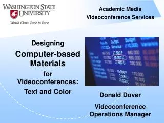
Academic Media Videoconference Services Designing Computer-based Materials for Videoconferences: Text and Color Donald Dover Videoconference Operations Manager
Adapt your computer-based course materials to videoconference technology Objective Academic Media Videocoferenc Services
Why does it matter? Computer monitors and TV screens differ 640 x 480 resolution Interlaced scanning TV 1024 x 768 resolution Progressive scanning PC
Technology upgrade: Two connections People TV TV Content Hi Def PC PC
Fonts Sizes Color Contrast When designing slides, think about:
Sometimes fonts are large (40) Sometimes they get smaller (32) Sometimes they are even smaller (24) Hopefully someone will not go smaller than this (20) But occasionally someone feels the need to go this small (16) Finally you may have a great deal of trouble reading this line (12) Size Matters—
Times New Roman is a good large font (32) But can reduce readability as the size decreases (24) Courier in a large font (32) Courier is more difficult to read (24) Arial is a great large font (32) It works well in a medium font size (24) And still holds up well in a smaller font than recommended (18) Font Styles (& Sizes)
Monotype Corsiva needs a much larger font (32) to appear large enough to be seen (24) Arial Narrow in a large font (32) Easier to read than Brush script (24) Univers is a great large font (32) But as the letters get smaller you lose detail (24) And you lose the ability to see definition between letters (18) Font Styles (& Sizes)
Colors • Background/text colors • Contrast
Colors • Background/text colors • Contrast
Colors • Background/text colors • Contrast
Colors • Background/text colors • Contrast
Colors • Background/text colors • Contrast
Text size Font Colors Summary
Be Creative Creativity should support communication Know the technology’s limitations
Contact your operator your site coordinator Donald Dover Videoconference Operations Manager dover@wsu.edu Questions?