Download
1 / 31
330 likes | 415 Vues
Explore the origins, impact, and legacy of Constructivism - a groundbreaking art and architectural movement that emerged after WWI in Russia, aiming for social change and innovation. Discover key figures like El Lissitzky and Rodchenko.

E N D
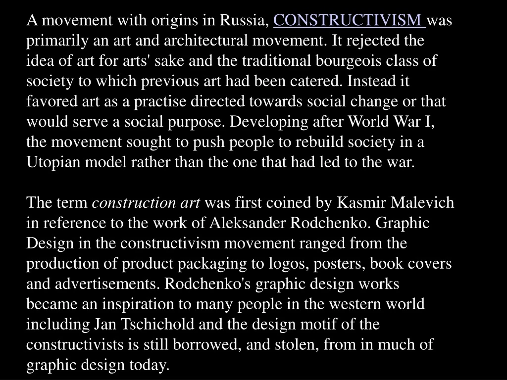
A movement with origins in Russia, CONSTRUCTIVISM was primarily an art and architectural movement. It rejected the idea of art for arts' sake and the traditional bourgeois class of society to which previous art had been catered. Instead it favored art as a practise directed towards social change or that would serve a social purpose. Developing after World War I, the movement sought to push people to rebuild society in a Utopian model rather than the one that had led to the war. The term construction art was first coined by Kasmir Malevich in reference to the work of Aleksander Rodchenko. Graphic Design in the constructivism movement ranged from the production of product packaging to logos, posters, book covers and advertisements. Rodchenko's graphic design works became an inspiration to many people in the western world including Jan Tschichold and the design motif of the constructivists is still borrowed, and stolen, from in much of graphic design today. 15-09
How Vladmire Tatlin's Tower might have looked had it been built
The Constructivists burned brilliantly in the years immediately preceding and following the 1917 Russian Revolution. The only avant-garde design movement in history to be co-opted as an instrument of government policy, it sought to build shining new socialist cities on the devastated landscape of a Russia that had been ravaged by political chaos, economic collapse and the fallout from the First World War. But by the early 1930s it was all over. The movement was effectively outlawed following the rise to power of Joseph Stalin, who decreed a new conservative style, Socialist Realism, in its place. The Russian avant-garde reached its creative and popular height in the period between the Russian Revolution of 1917 and 1932, at which point the ideas of the avant-garde clashed with the newly emerged state-sponsored direction of Socialist Realism.
15-09 El Lissitzky, Beat the Whites with the Red Wedge, 1919. The Bolshevik army emblem, a red wedge, slashes diagonally into a white sphere signifying A. F. Kerensky’s “white” forces. The slogan’s four words are placed to reinforce the dynamic movement.
15-15 The Constructor, El Lissitzky, 1924
15-15 El Lissitzky, cover of For the Voice, by Mayakovsky, 1923. In contrast to the Veshch cover, constructed on a diagonal axis, here a rigid right angle is animated by the counterbalance of the M and circles.
15-16 El Lissitzky, pages from For the Voice, by Mayakovsky, 1923. The poem “Our March” begins, “Beat your drums on the squares of the riots, turned red with the blood of revolution.” The title type has staccato cadences of a drumbeat; the red square signifies the blood-stained town squares.
15-17 El Lissitzky, pages from For the Voice, by Mayakovsky, 1923. The poem “Our March” begins, “Beat your drums on the squares of the riots, turned red with the blood of revolution.” The title type has staccato cadences of a drumbeat; the red square signifies the blood-stained town squares.
El Lissitzky, book cover for The Isms of Art, 1924. Complex typographic information is organized into a cohesive whole by the construction of structural relationships.
15-19 El Lissitzky, title page for The Isms of Art, 1924. The graphic spirit achieved by medium-weight sans-serif type, mathematical division of the space, white areas, and bold rules established a typographic standard for the modern movement.
15-20 El Lissitzky, text format for The Isms of Art, 1924. Rigorous verticals separate German, French, and English texts, and horizontal bars emphasize an important introductory quotation.
15-23 El Lissitzky, exhibition poster, 1929. In this stark, powerful image, the youth of a collective society are cloned into an anonymous double-portrait above the exhibition structure designed by Lissitzky.
15-23 Alexander Rodchenko and Varvara Stepanov’s famous Books! poster employs a stark grammar of simple geometry and flat colour to promote the Soviet campaign for worker education.
15-23 Stairs, 1930—Alexander Rodchenko pushed the boundaries of photography by publishing an innovative series of photos that looked for abstract motifs in the real world, an elliptical style still characteristic of the work of many contemporary photographers
15-23 Boris Aronson, a Russian immigrant, designed for the Yiddish Unser Theater in the Bronx. He took his position as an opportunity to introduce Constructivist designs to audiences in America. —Ansky’s production of Day and Night, 1924.
a vary raw and true example of the kind of typeface that the artists like Von Doesburg felt went with the aesthetic design of posters and paintings.
The Netherlands-based De Stijl i—also known as neoplasticism— embraced an abstract, aesthetic of basic visual elements such as geometric forms and primary colors. Partly a reaction against the decorative excesses of Art Deco, and incorporating some Dada tendencies the reduced quality of De Stijl art was envisioned as a universal visual language appropriate to the modern era. Led by the painters Theo van Doesburg and Piet Mondrian — its central and celebrated figures — De Stijl artists applied their style to a host of media in the fine and applied arts and beyond. The members envisioned nothing less than the ideal fusion of form and function, thereby making De Stijl in effect the ultimate style. To this end, De Stijl artists turned their attention not only to fine art media such as painting and sculpture, but virtually all other art forms as well, including industrial design, typography, even literature and music. De Stijl's influence was perhaps felt most noticeably in the realm of architecture, helping give rise to the International Style of the 1920s and 1930s.
15-43 Théo van Doesburg and Laszlo Moholy-Nagy, book cover, 1925. The essence of de Stijl is conveyed.
The Red and Blue Chair The original chair was constructed of unstained beech wood and was not painted until the early 1920s. Bart van der Leck, saw his original model and suggested that he add bright colors. The effect of this color scheme made the chair seem to almost disappear against the black walls and floor of the Schröder house where it was later placed. The areas of color appeared to float, giving it an almost transparent structure. 15-43
15-43 Gerrit Rietveld, Schroder House, Utrecht, 1924
15-43 Gerrit Rietveld, Schroder House, Utrecht, 1924
15-46 Vilmos Huszár, cover design for De Stijl, 1917. Huszár combined his composition with type and Van Doesburg’s logo to create a concise rectangle in the center of the page.
15-48 Théo van Doesburg, cover for De Stijl, 1922. Type is asymmetrically balanced in the four corners of an implied rectangle. De Stijl is combined with the letters N and B, which indicated Nieuwe Beelden (New Images).
15-57 Bart Anthony Van der Leck, Het Vlas (The Flax), 1941.
15-62 Henryk Berlewi, exhibition poster, 1925. This early application of Mechano-faktura principles to graphic design is for an exhibition held in a Warsaw automobile showroom.
15-63 Henryk Berlewi, Putos Chocolates brochure, page 6, 1925. Copywriter Aleksander Wat closely collaborated with Berlewi to integrate text and form.
15-66 Ladislav Sutnar, cover of Nejmensi dum (Minimum Housing), 1931.
15-70A Laszlo Moholy-Nagy, title page spread for i10, 1927. The printer was deeply disturbed by this design, with its words running vertically, bold sans-serif type placed into serif text for emphasis, bullets separating paragraphs, and bold bars by page numbers.
15-70B Laszlo Moholy-Nagy, title page spread for i10, 1927. The printer was deeply disturbed by this design, with its words running vertically, bold sans-serif type placed into serif text for emphasis, bullets separating paragraphs, and bold bars by page numbers.