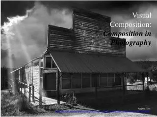
Visual Composition: Composition in Photography
Visual Composition: Composition in Photography. Adapted from http://photoinf.com/General/KODAK/guidelines_for_better_photographic_composition_introduction.html. Have you ever wondered why some photographs catch your attention more than others?.

Visual Composition: Composition in Photography
E N D
Presentation Transcript
Visual Composition:Composition in Photography Adapted from http://photoinf.com/General/KODAK/guidelines_for_better_photographic_composition_introduction.html
Have you ever wondered why some photographs catch your attention more than others?
…why some are left hanging in galleries for months, or even years, to be enjoyed by thousands?
Have you ever wondered why some photographers consistently win the praises of judges and critics?
One of the main reasons why some pictures are more outstanding than others is because of their strong composition.
Good composition is a subject with a history of its own. The Greeks and Romans were practicing it 2,000 years before photography! It's obvious in their architecture.
Good composition is a subject with a history of its own. The Greeks and Romans were practicing it 2,000 years before photography! It's obvious in their architecture.
Simplicity • The first and perhaps the most important guideline is simplicity. • Look for ways to give the center of interest in your pictures the most visual attention. • One way is to select uncomplicated backgrounds that will not steal attention from your subjects.
Let's see how we can improve this photo by looking for visual simplicity. First let's decide if we want our center of interest to be the public telephone, the bridge, or the cactus.
We chose the cactus as the main subject. And by moving in closer and using the plain sky as the background, we have simplified and improved the appearance of this photograph.
Simplicity - Seagulls • We're certainly close enough to our subject in both pictures, but the busy background on the left camouflages the seagull. • Just change your point of view slightly and, presto, your seagull stands with visual prominence against the blue sky.
Simplicity – Center of Interest • Compose your photograph so that your reason for taking the picture is clearly seen. • Arrange other parts of the picture area in such a way as to complement what you choose to be the center of interest. • Most of us would prefer the picture on the right because the parking lot tends to contradict the feeling of antiquity related to this mission.
Remember: we're talking about composition simplicity, and here's another decision you'll probably have to make. How much of your subject should you include, and should it be framed horizontally as we have done here?
Or perhaps you'd prefer to frame your subject in the vertical format, as we've indicated with these frame lines. The choice is yours.
The Rule of Thirds • You can use the rule of thirds as a guide in the off-center placement of your subjects. Here's how it works. • Before you take a picture, imagine your picture area divided into thirds both horizontally and vertically. • The intersections of these imaginary lines suggest four options for placing the center of interest for good composition. • The option you select depends upon the subject and how you would like that subject to be presented.
The upper-right position was chosen for this subject so that we could see the full shadow and most of the tracks that lead to the seagull.
The lighthouse seems well placed in the upper right just because the rest of the scene fits nicely into the format.
Here's a case where you have excellent subject control. You can have the model pose anywhere along the walkway. The rule of thirds indicates this placement which also gives the model a definite path to follow within the picture area.
You should always consider the path of moving subjects and, generally, leave space in front of them into which they can move.
If you don't, here's what can happen! This jogger looks like she's going to run right out of the picture.
By placing the subject in the lower-left position, we've used the rule of thirds and given the jogger plenty of room to run within the picture.
Here's another action shot where it's important to leave more space in front of a moving subject than behind it.
You can also apply the rule of thirds guidelines to the placement of the horizon in your photos. Here the center position of the boat and horizon results in a static feeling. Let's move the horizon to the upper third and the sailboat to the left. Remember, these are the only guidelines. So if you don't like this subject placement, try another
Like this. We've moved the horizon line to the lower third. In general, place the horizon high or low, but rarely in the middle.
Just as it's usually best to place horizons off center, it's also best to place verticals off center. For instance, in the picture on the left, the subject is centered, but on the right, the photographer got a more effective photograph by simply changing the viewpoint.
Lines • Lines also play an important role in composition. • On the next slide, the featured sculpture has some beautiful lines, but they're obscured by the busy background. • Let's simplify this picture by moving our camera viewpoint in close to the base of the sculpture.
Now we can look up and see the lines against a clear blue sky. The picture on the right is much more dynamic because of the strong diagonal lines.
Imagine this view without the diagonal rays of sunlight and you'll probably agree: diagonal lines are dynamic!
You can use diagonals as leading lines to provide a way into the picture. It's a simple and easy path for the eye to follow to the main subject.
You can also use repetitive lines to draw viewers' attention to your center of interest.
One of the most common and graceful lines used in composition is called the S curve.
One of the most common and graceful lines used in composition is called the S curve.
Balance • Good balance is simply the arrangement of shapes, colours, or areas of light and dark that complement one another so that the photograph looks well-balanced, not “lop-sided”.
Imagine that these two couples are standing at either end of a pair of scales. They are evenly balanced, so this is a classic example of symmetrical balance.
Avoiding Mergers • A merger is when two elements overlap, creating a distraction.
You can be sure the camera always sees mergers, so look for plain backgrounds before you pose your subject. In this case the correction was simple because the two settings were only a few feet apart.
Look out for objectsor lines that are just too close to the principal subject. In this case the ball and umbrella tip are near mergers.


