Download

1 / 39
560 likes | 684 Vues
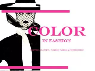
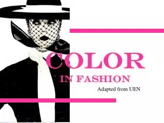
Color in Fashion. The Colour wheel. Is the basic tool we use when working with color Is based on the standard color theory known as Brewster/Prang. Color. Colour Types. PRIMARY COLORS Are red, yellow, and blue CANNOT BE MIXED FROM OTHER PIGMENTS. Colour Types. SECONDARY COLORS

E N D
The Colour wheel • Is the basic tool we use when working with color • Is based on the standard color theory known as Brewster/Prang
Colour Types • PRIMARY COLORS • Are red, yellow, and blue • CANNOT BE MIXED FROM OTHER PIGMENTS
Colour Types • SECONDARY COLORS • Are orange, green, and violet • ARE MADE BY MIXING EQUAL AMOUNTS OF TWO PRIMARY COLORS
Colour Types • TERTIARY COLORS: • Are red-orange, red-violet, blue-green, blue-violet, yellow-green, and yellow-orange • ARE ALSO KNOWN AS INTERMEDIATE COLORS • THERE ARE SIX OF THEM • ARE MADE BY MIXING AN EQUAL AMOUNT OF A PRIMARY COLOR AND A SECONDARY COLOR
YOUR TASK: homework • Please complete a “Creating a Color Wheel” assignment. • Mix any two media: You may use water colors, crayons, pastels, pencil crayons, cut up magazines, fabrics or another medium of your choice to fill in the color chart with primary, secondary and tertiary colors.
COLOR • To maintain or decrease attention and apparent size, to appear taller and slimmer • Cooler hues • Darker values • Duller intensities • Close contrasts • Examples: navy, khaki, grape, charcoal, mauve
color • To increase attention and apparent size, to appear shorter and heavier • Warmer hues • Lighter values • Brighter intensities • Strong contrasts • Examples: shocking pink, pumpkin, tangerine, raspberry
Color personalities!! • To appear refined, romantic • Warm to cool hues • Lighter values • Dull, muted to medium intensities including pastels • Close contrasts, subtle • Examples: shell pink, lavender, misty rose, orchid, blue, peach, all pastels
Color Personalities!!! • To feel and appear happy, youthful, sportive • Warmer hues • Light to dark values • Medium to bright intensities • Strong contrasts, bold • Examples: coral, red, khaki, ivory, brown, camel, cinnamon, brick
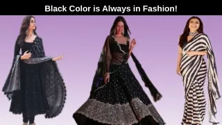
Color personalities!!! • To appear mature, serious, somber, classic • Cool hues • Dark values • Dull intensities • Examples: navy blue, taupe, charcoal, maroon, gray, black
Color personalities!! • To feel and appear dramatic/exotic • Warm to cool hues • Dark values, deep • Bright intensities, rich • Strong contrasts, bold • Magenta, fuchsia, emerald green, royal blue, regal purple, sapphire, amethyst
Monochromatic • Mono means “one”, refers to the tints tones and shades of one color • Possible color combinations are limitless! • Mint green and forest green • Generally calming, however it depends on the hue
Analogous • Often referred to as adjacent. Two, three, or four hues that lie next to one another on the color wheel. All hues have one hue in common. • Possible colors (Can include tints, tones & shades) • Yellow-green, yellow, yellow-orange, orange • Feeling created: can be calming or exciting depending on whether they come from the cool or warm side of the color wheel. • This color scheme is most effective if one of the hues repeats some aspect of your personal coloring… eyes, hair…
Complementary • Combine two colors from the opposite side of the color wheel. • Possible colors: red & green, blue & orange • Feeling associated: stimulating due to opposite visual characteristics. By dulling the intensity or value, calming effect may be achieved. • Can be very flattering to personal coloring, and versatile
Triad • Three colors equally spaced on the color wheel • Possible colors: tints, tones and shades of primary or secondary colors • Very exciting and stimulating if used in full strength.
Neutral • One, two, or three achromatic neutrals, may or may not vary in the degree of warmness or coolness, lightness or darkness, brightness or dullness • Possible colors: black and white, combination of browns • Effect: vary in mood depending on the degree of light and dark value contrast • Are most effective if the degree of lightness or darkness in your hair and/or skin coloring is repeated in the lightness or darkness of the clothing
Accented neutral • One color added to other neutrals to form a scheme. • Possible colors: black, white & red, browns with light blue • Effect: draws attention to the one added hue
Now: Your Task PERSONAL SHOPPER IN-CLASS ASSIGNMENT As a Personal Shopper, you are approached by a client to create a basic wardrobe. First, figure out her “season”. Then, consider her color scheme, and create a collage of wardrobe basics for her. • Accent pieces (jewellery, shoes, scarves, bags) • Business casual • Formal wear • Casual wear (for shopping, hanging out with friends)