Download
1 / 26
260 likes | 288 Vues
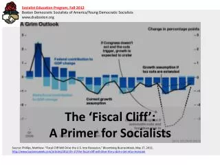
For a few weeks now, the Washington Post has posted a gallery of charts to help explain what is meant by the ‘Fiscal Cliff’ (http://goo.gl/V46U6). Although the 7 charts are a collection of simple bar charts, from a data visualization perspective they leave a lot to be desired. In this slide deck, I've redesigned all 7 charts.

E N D
The ‘Fiscal Cliff’ explained in charts A critical review of a recent gallery of charts from the Washington Post Jonathan A. Schwabish jschwabi@yahoo.com @jschwabish
The Set Up For a few weeks now, the Washington Post has posted a gallery of charts to help explain what is meant by the ‘Fiscal Cliff’: http://goo.gl/V46U6 Although the 7 charts are a collection of simple bar charts, from a data visualization perspective they leave a lot to be desired
The Challenge This slide deck contains my redesign of all 7 charts. I followed 5 basic rules: 1. Use the actual data 2. Do not overly modify text or labels 3. Use a single color scheme and font 4. Only use Microsoft Excel 5. Apply good data visualization principles
Use the Actual Data (and do not add extra data elements) Except for Slide #6—”Sequester cuts to the FEMA budget”—all of the data were either available on the source websites or in the gallery itself (for slide #6, I eyeballed the values)
Do not overly modify text or labels (unless absolutely necessary) Even though some of the labels were shorthand or incomplete, the objective of the challenge was to improve the visualizations, not correct syntax
Use a single color scheme and font The gallery is a collection of charts from multiple sources (4 appear to have been made directly by Post staff) so the color schemes vary as do the fonts A single design scheme can improve the appearance and clarity of the gallery (I use the ‘Corbel’ throughout)
Only use Microsoft Excel Because many people use Excel extensively, I wanted to show that creating quality data visualization does not require complex software or knowledge of programming languages
Apply good Data Visualization Principles My redesigns incorporate simple strategies: • keep data and labels close together • deemphasize tick marks, gridlines, axes (i.e., ‘chartjunk’) • where possible, include data directly on the chart
Final Notes Each of the redesigned charts is preceded by a copy of the original chart, either from the source website or as a screen shot from the Washington Post (hence the blurriness in some of the images) These redesigns are a start. Please feel free to add comments to this SlideSharepage or contact me directly with thoughts, critiques, or suggestions
A Detailed Parenthetical I just wanted to insert a detailed note about the first two charts from the Tax Policy Center (TPC). In the first chart, I chose to focus on the distributional analysis and sacrifice the imagery of the rising average federal tax rate as incomes rise (that is, the height of the bars). I didn’t get much of the distributional story from the original TPC distributional chart because it was just a mess of stacks and colors. The second chart—Average Federal Tax Rates by Income Quintile—tells me that basic story more clearly anyways. An alternative approach would be to use several small charts (‘small multiples’) and stack them together in some way, but I chose to stick to the spirit of the challenge and only redesign the single chart. Plus, had TPC made a series of small charts, it’s not clear to me the Washington Post would have picked it up.
The ‘Fiscal Cliff’ Explained in Charts
Fiscal Cliff Components (Percentage) AMT Patch 2001-03 low/middle cuts Estate Tax Extenders Stimulus Credits 2001-High Income cuts 2003 -High Income capital gains and dividends Health reform taxes Payroll Tax Lowest Second Middle Quintile Fourth Highest 80-99% Top 1% All
Average Federal Tax Rate, by Cash Income Percentile, 2013 (Percent) 40 Increase due to tax changes 7.2 Baseline 30 5.8 5.1 5.0 20 4.2 3.8 31.2 25.2 22.8 4.1 10 19.4 17.4 14.0 8.0 3.7 0.6 0 Lowest 2nd Middle 4th Highest 80-99% Top 1% All Quintile
Size of Components of the "Fiscal Cliff" (Billions of dollars) Bush Tax Cuts 221 Payroll Tax Cut 95 Debt Ceiling Deal 65 AMT/Other 65 Unemployment Benefit Expansion 26 ACA Taxes 18 "Doc fix" expiration 11 0 50 100 150 200 250
Marginal Tax Rate Increase Under the Fiscal Cliff, by Income Bracket (Percent) Thousand dollar increments <10 64.4 10-20 26.5 20-30 5.6 30-40 2.8 40-50 2.2 50-75 7.8 75-100 16.7 100-200 8.5 200-500 6.2 500-1,000 26.2 >1,000 16.4 0 10 20 30 40 50 60 70
Economic Impact of Fiscal Cliff, Zandi Multipliers (Billions of dollars) 500 435 Budget Impact Economic Impact 400 300 201 196 200 181 158 150 130 100 69 60 50 30 29 23 20 0 Tax Cuts Sequester Jobs Measures AMT Patch Tax Extenders ACA Taxes Doc Fix
Sequester Cuts to the FEMA Budget (Millions of dollars) 600 580 400 200 175 75 25 25 0 Disaster Relief State, local programs Salaries and expenses Emergency food, shelter Flood hazard mapping
Effect on Fiscal Cliff Components on Deficit and GDP Effect on GDP (Percentage) Effect on Deficit (Billions of dollars) 24 Payroll /UI 0.4 40 Bush cuts (high) Bush cuts (low/middle) 42 0.4 0.1 108 Nondefense 0.7 Total Effect: $503 billion Total Effect: 2.9% Defense 288 1.3
Contact me www.slideshare.net/jschwabish jschwabi@yahoo.com @jschwabish