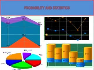
Probability and Statistics
Probability and Statistics. Representation of Data Measures of Center for Data Simple Analysis of Data. Overview. In this module you’ll be learning about the basics of statistics:


Probability and Statistics
E N D
Presentation Transcript
Probability and Statistics Representation of Data Measures of Center for Data Simple Analysis of Data
Overview In this module you’ll be learning about the basics of statistics: Statistical Displays – Data can be displayed graphically in different ways. You will learn how to choose displays by the type of date and the message to be delivered to the audience. Some “do not” examples will also be covered. Measures of Center – A single number or data is commonly used to describe an entire set of data. You will explore the different types of “averages” and learn why you might choose one over another. Analysis – This module covers the simple analysis of the data. You will look at what information can be obtained from the data and how to make comparisons of various data sets.
Topics An Introduction to statistics Types of data Displaying data How NOT to display data Arithmetic Mean Median Mode Weighted Mean Types of distributions Measures of center vs. variation
Introduction to Statistics Statistics: An Introduction • The first page at this site gives an explanation of how statistics is used. Clicking on the “Continue” link on the bottom right of the page will take you to the section on “Revealing Patterns Using Descriptive Statistics”. It may be worthwhile to read the first page of this section to review some of the common terms/vocabulary used in describing data. Return to this presentation when you are ready. • (On the right of the web page, you will notice additional information that is beyond the scope of this module. Feel free to come back at a later time to explore further.) Statistics is the set of mathematical tools for collecting, organizing and analyzing data; and then interpreting the information to make decisions
Types of Data What is Data? • Read the text on the web site. Answer the nine questions at the bottom of the page to check your understanding of the topic. Return to this presentation when finished. Data can be qualitative, describing distinct categories, or quantitative, describing numerical counts or measurements. Qualitative data can be nominal, where no natural order exists between the categories, or ordinal, meaning an order does exist. Quantitative date can be divided into continuous, when data are values within a range, and discreet, when the measurements are integers.
Types of Data (cont.) Another explanation of Types of Data If you are still unsure about recognizing qualitative and quantitative data, click on the link above to review how to distinguish between these two variables. When you have completed the “Progress check” at the bottom of the web page, return to this presentation. You should now be able to classify data as qualitative nominal, qualitative ordinal, quantitative discrete or quantitative continuous, and are ready to explore how to display data. Continue to the next slide!
Types of Graphs Common Graphs Visit the above website for a brief description and representation of ten of the most common graphs. You should have a basic idea of the types of graphs that can be created to display data. As you move on through the slides, you will learn how to create these graphs and how to determine which graph gives the best representation of the data you want to display.
Types of Graphs (cont.) Math Dictionary • This web site is home to a mathematics dictionary. It has examples to the graphs listed below. Return to this presentation when finished. There are various ways to display your data. The differences arise from the type of data and the information and/or message you want to deliver. Following is a list of the more traditional types of graphs. Line graph Box plot Scatter plot Line plot/Dot plot Pictograph Stem & Leaf plot Bar graph Histogram Pie graph
Bar Graphs Bar Graphs Click on the link above to learn how to create a bar graph. After reading the information on bar graphs, answer the ten questions in the“Your Turn” section at the bottom of the page. One way to graphically represent data is by using a bar graph/chart. What type of data is best represented by a bar graph? What information about a data set should you be able to interpret from a bar graph?
Histograms Histograms Read about histograms by following the link above. Check your understanding by answering the ten questions in the “Your turn” section at the bottom of the web page. Histograms can be used to represent continuous data. You should be able to identify data that is continuous and be able to create a histogram to represent that data.
Histograms Create a Histogram (video) This video demonstrates how to take a data set and create a histogram. Histograms are best used when the data variable on the x-axis is quantitative. The bars most often represent a range of values. Each bar could also represent an individual value. In this case, the histogram would more accurately be called a frequency distribution graph.
Histograms (cont.) A Histogram is NOT a Bar Chart It is important to distinguish the difference between a histogram and a bar chart. This is the first of several sites that will help you determine when to display data as one or the other. Read the information on the first page and then return to this presentation. Histograms and bar charts can look similar even though they display very different representations of the data. After reading the information on the web page linked above, you should be able to identify three differences between histograms and bar charts.
Histograms (cont.) Bar Charts and Histograms (includes a video) This webpage has additional information on when to use a bar chart or histogram to display your data. You can also view the video which shows how to create a bar chart and histogram.
Histograms (cont.) Histograms vs. Bar Graphs Click on the link above to read more about the differences between histograms and bar charts. The information is set up as a conversation between a teacher and student reasoning through how each graph can be used to display specific types of data. When you have finished reading the discussion, please return to this presentation. Can you answer the following questions? • What type of data would be best represented by a histogram? • What information should you be able to identify when data is represented in a bar graph?
Pie Charts Pie Charts Read about how to create a pie chart and what type of data displays best in this format. Be sure to complete the questions at the bottom of the web page in the “Your turn” section and then return to this presentation! Pie charts represent data as a part-to-whole relationship.
Pie Charts (cont.) Pie Charts This site looks at how NOT to use pie charts, along with showing many examples found in the news, in business reports and other media. You should be able to answer the following question regarding pie charts: • What is the best type of data to represent graphically in a pie chart? • When interpreting information from a pie chart, what are three areas you should pay attention to in the representation?
Scatterplots What is a Scatterplot? This site will introduce you to scatterplots. Click the blue “View Video” button to see how to make and read scatterplots. Once you have watched the video and read through the information on this webpage, return to this presentation. Main points: • A scatterplot is used to graph the relationship between two quantitative variables or bivariate data; • Scatterplots may show patterns – weak or strong, positive or negative correlations; • Correlation does not indicate cause and effect.
Scatterplots (cont.) Scatterplots and Correlation This site presents another view of scatterplots and correlation. After reading this information, answer the nine question in the “Your turn” section at the bottom of the page. Explore further… At the above website, under the correlation graphs, is a link More About Correlation. Here you will see how correlation is calculated. In most cases, you will use a calculator or software function for this; however, it’s beneficial to know how the correlation coefficient is derived.
Line Graph Line Graph This website gives many examples of line graphs and explains what makes a line graph different from a scatter plot. Read through this information and then return to this presentation. Main ideas: • Line graphs help to determine the relationship between two sets of values; • Value sets represent an independent variable and an independent variable; • Line graphs are useful in showing trends and making predictions.
Line Graph (cont.) Line Graphs Check your understanding in interpreting line graphs by answering the ten “Your turn” questions at the bottom on this webpage. You should now be able to answer to following questions: • What are the main differences between scatterplots and line graphs? • What type of data is best represented in a line graph?
Box Plot Box Plots (YouTube video) This video introduces you to Box Plots, as it demonstrates how to create a box plot and defines the vocabulary terms listed below. When you have finished viewing the video, return to this presentation. Vocabulary to understand box plots: • Distribution • Median • Average (Mean) • Extremes • Quartiles • Interquartile Range
Box Plot Quartiles / Interquartile Range / Box and Whisker Plot This webpage gives another look at the breakdown of Box Plots. Once you have read through the information, try answering the ten “Your turn” questions at the end of the page. (Tip: It will be helpful to have scrap paper available) At this point, you should be able to: • determine the lower, middle and upper quartiles of a data set; • calculate interquartile range; • construct a Box and Whisker Plot to represent the data; • compare box plots from two data sets and make observations about the distributions.
Box Plot Boxplot (aka, Box and Whisker Plot) If you need additional information to understand boxplots, click on the link above and “View Video”, which gives more details on how to read a boxplot. When you have finished reading through Boxplots Basics and How to Interpret a Boxplot, return to this presentation.
Stem & Leaf Plot Stemplots (aka, Stem and Leaf Plots) Click the blue button to View Video and then read the information on stem and leaf plots. For additional explanation about this type of graph, proceed to the next slide. • Use to display quantitative data • Best used with small sets of data • Shows shape of distribution • Stem values can have any number of digits • Leaves can only be represented by one digit • Limitations displaying decimals
Stem & Leaf Plot Stem and Leaf Plots This site provides additional details on “splitting the stems” and “splitting stems using decimal values”. You should now know: • under what circumstances stems should be split; • how to organize decimal data in a stem and leaf plot; • how to interpret data by looking at a stem plot.
Line Plot / Dot Plot Line Plot (YouTube Video) View this video on how to make a Line Plot then return to this presentation. Vocabulary: • Clusters • Gaps • Outliers
Line Plot / Dot Plot Dot Plot vs. Line Plot (YouTube Video) This YouTube video does a good job describing the similarities and differences between a line plot and dot plot. Then return to this slide and click here to re-enforce what you have have learned about Line and Dot plots.
Picture Graph / Pictograph Pictographs Read the information on Pictographs and then answer the nine “Your turn” questions at the bottom of this webpage. In a Pictograph, symbols are used to display statistical data. Symbols can be misleading if not accurately proportioned or if the symbols can not be divided evenly to represent fractional parts.
Types of Graphs Comparing Graphs Test your understanding of the graphs covered in this unit. At this website, read through the problems and decide which graph most clearly represents the data and what information is to be conveyed to the reader. Also, work through the five questions at the bottom of the page. Most data can be represented using multiple graphs. Decisions on the most appropriate display should be make based on what information you want the reader to draw from the graph.
An Advanced Display of Data Hans Rosling Probably one of the most informative and modern displays of data can be seen from the work of Hans Rosling. The link above shows a video of his TED talk in 2006. It is a 20 minute video and it gets very interesting about 4 minutes into the video. Watch it all if you have time but we recommend at least 10 minutes. The point of this experience is not that we expect you to duplicate this extraordinary presentation, but that you appreciate the power of displaying data in a clear and understandable method. Any enhancement of the display should be for the purpose of clarity and not just distracting visuals.
How NOT to Display Data Misleading Line Graphs by Khan Academy The above link is by Salman Khan, founder of the Khan Academy. In his video he highlights the misleading visual displays of a line graph (5 min). Return to this presentation when finished. Often times a data display can mislead the reader. At times this may be intentional when the creator wants to persuade the reader in some way. Other times it may be unintentional when the creator tries to make the display more visually appealing and causes the reader to misinterpret the results.
How NOT to Display Data Misleading Graphs by Wikipedia The above link by Wikipedia, shows various ways a graphic display can mislead its intended audience. Return to this presentation when finished. Typically the displays we see are technically accurate but they use visual “tricks” to mislead the reader who may not pay close attention to the details of the graphic display.
Measures of Center Definitions of these terms If you are not familiar with the terms listed below, follow the link above to familiarize yourself with these terms. (The above site includes other measures of center that are beyond the scope of this presentation) Different ways to measure the center of data • Arithmetic mean (commonly called average or just mean) • Median • Mode • Weighted mean
Measures of Center Central Values The link above gives some simple examples of measures of center and compares the mean, median, and mode. Check your understanding with the ten questions at the bottom of the page before returning. What is meant by “Measure of Center”? Sometimes we want to describe a group of data (numbers, values) by a single number. The advantage of this is the ability to more easily compare different groups of data. The disadvantage is when you describe a data set by a single number you lose the details and could mislead someone.
Arithmetic Mean The mean of a set of data is found by adding all the data values and dividing that answer by the number of points. (often referred to as “n”) Strengths • Its calculation includes all the data • It is common and more likely understood by others • It is often used in other statistical formulas
Arithmetic Mean Weaknesses • Sometimes you don’t know all the data points needed to calculate the mean (data may be in a graph only) • An extremely large data set may be difficult to calculate. • It can be influenced by outliers, those values much larger or smaller than the rest of the data. • It is often a value that is different than any of the data values When best to use • The mean is best used when you data is continuous and symmetrical. • Often necessary for use in other statistical measures.
Lessons on Arithmetic Mean How to Find the Mean Visit the web site above to learn more about the arithmetic mean. After reading the lesson make sure and check your understanding by answering the ten questions at the end. In case you missed it, make sure and check out the “mean machine”. Run this virtual machine to see the relationship between the data points and the mean value.
Median Wikipedia defines median The web site above give a very detailed definition of median. (Many of the examples are beyond the scope of this presentation) The median of a set of data is found by arranging all the data in numerical order and then selecting the data point in the middle. If the data has an even number of values the median is the mean of the two central values. Strengths • Requires little if any mathematical calculation • It is not effected by outliers (large or small data points) • It can be approximated from a frequency distribution or a distribution graph
Median Weaknesses • Arranging a large set of data in order can be very difficult. When best to use • The median is usually preferred when the data distribution is skewed • It is used with ordinal data when the mean cannot be used
Lessons on Median How to Find the Median Value Visit the following web site to learn more about the median. After reading the lesson make sure and check your understanding by answering the ten questions at the end.
Comparing Mean & Median Mean / Median Applet The link above gives you the ability to see how the mean and median change as the data points change. The applet allows you to drag data points on the line or move data points on the line. Take some time and play with this applet and see how the mean and median change and compare. You can also check the box for “box plot” to see how a boxplot would look with the data that shows on the line. When you have finished, jot down the patterns you have observed and then return to this presentation
Comparing Mean & Median Seeing Statistics Use the link above for a more comprehensive lesson on the attributes and differences between the mean and median. The link will take you to an introduction of the web interphase. When you think you are familiar with how to navigate the system, click on the icon in the left column. When the table of contents show, click on lesson #3 “Describing the Center”. You can advance from one page to the next by clicking on the icon in the top, right corner of the page. Return to this presentation when you finish.
Mode Wikepedia defines mode The web site above give a very detailed definition of mode. (Many of the examples are beyond the scope of this presentation) The mode of a set of data is found by identifying the data element that occurs most often. Many people remember this by associating the word “most” with mode. Strengths • Depending on the display of the data or the size of the data, it is often easy to identify • It is the ONLY measure of center you can use for non-numeric data (nominal data). Example: What is the best measure of center for the eye color of this group of people?
Mode Weaknesses • Sometimes the data set could have more than one mode or even multiple modes. • Often the data does not have any data element that is more numerous than any other. • Sometimes the mode is nowhere near the center of the data. When best to use • It is the only measure of center valid with nominal data (Example: data on student’s eye color) • It can support the validity of the mean and median if it has a similar value. If the data is perfectly normal, mean=median=mode
Mode How to Find the Mode Value Visit the web site above to learn more about the mode. After reading the lesson make sure and check your understanding by answering the ten questions at the end.
Weighted Mean Wikipedia defines weighted mean The web site above give a very detailed definition of weighted mean. (Many of the examples are beyond the scope of this presentation) • Sometimes certain values in a data set contribute more to a measure of center than other values. In this situation, we calculate a weighted mean.
Weighted Mean Dr. Math explains weighted mean (weighted average) The web site above gives examples of calculating a weighted mean or weighted average. A simple example: • Consider a university that teaches two classes. One class has 10 students, the other has 100 students. If you ask the university the average (mean) class size they respond with 55. (100+10)/2. However, if you ask every student what size class they are in to find the mean you would get 91.8. [(100 * 100) + (10 * 10)] / 110 • The 100 students in the larger class carry more WEIGHT that the 10 students in the smaller class.