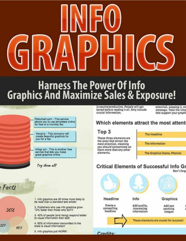
Infographics
Infographics. Bianca Woods @ eGeeking. Telling Your Story With. T. ext ext ext. Poll!. What’s your experience with infographics?. Infographics. …and why we seem to like them. Can simplify & compress content. Visually engaging. Less boring than plain tables & text.

Infographics
E N D
Presentation Transcript
Infographics Bianca Woods @eGeeking Telling Your Story With T ext ext ext
Poll! What’s your experience with infographics?
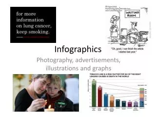
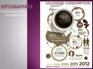
Infographics …and why we seem to like them Can simplify & compress content Visually engaging Less boring than plain tables & text Texttexttexttexttexttexttexttexttexttext Texttexttexttexttexttexttexttexttexttext Texttexttexttexttexttexttexttexttexttext Texttexttexttexttexttexttexttexttexttext Image Credit: LokeshDhakar http://www.lokeshdhakar.com/coffee-drinks-illustrated/
But not all infographics work Sometimes they’re a complete mess
Poll! Out of the infographics you’ve seen, what percentage were actually effective?
So when should you use an infographic? …or NOT to infographic? To infographic…
Tie together related data Simplify large amounts of content Tell a story that’s best told through data Consider using an infographic if you need to…
Use it just because it’s shiny & new Need to tell a linear narrative story Attempt to link data that actually isn’t connected You’re better off using something else if you need to…
Discussion What topics from your own work might make good infographics?
Where do people tend to go wrong when they make infographics? ? ? ? ? ? ? ?
Unclear point But what does it mean?!
Data & information is poorly displayed Well, that doesn’t tell me anything!
Confusing (or just plain ugly) graphic design Ahhh! My eyes!
Discussion When you’ve seen weak infographics, what stuck out as a reason why?
Discussion How about great infographics? What about them stuck out as particularly effective?
So what does a GOOD infographic have? Well-designed graphics Clear narrative and point Logical information How much pie have I eaten so far? That’s some good looking pie! a history of pie consumption up to this point of time
What’s my story? Essay Approach Research Approach Data & Info Topic
Can I thoroughly support my story? Main Idea Data Data Data Data Data Data Data
The hard task of sorting Data Data Data Data Data Data Data Data Data Data Data Data Data Data Data Somewhat Related SlightlyRelated Mostly Related Strongly Related Story
Try it out for yourself Topic “How conferences help you build your skills.”
What do I keep? “How conferences help you build your skills.” 1. 2. 3. 4. 5. 6. The percentage of people from your company who attended conferences over the past 5 years Quotes from employees about what memorable things they learned at recent conferences A chart showing how the number of conferences has increased over the past 10 years A list showing a selection of industry conferences and when during the year they’re held A set of statistics on how learning professionals rate the value of conferences Study results on the value of conferences for people in executive roles
Types of graphs Type: Bubble Best Suited For: Showing patterns between threevariables throughout a large number of data points. Type: Pie Best Suited For: Showing the portions of a whole. Capturing a moment of time Type: Bar/Column Best Suited For: Comparing different items/categories Showing changes over time Type: Stacked Bar/Column Best Suited For: Comparing different categories while also showing the components of each category Type: Line Best Suited For: Showing results over time. Comparing the results from several sources over time Type: Scatter Best Suited For: Showing patterns between two variables throughout a large number of data points. D A Length of Time City Has Been Infected (in months) Units Sold (in millions) C E B People Infected (In millions) Jun Dec
Misleading information Choosing the Wrong Graph Type Missing and Confusing Labels Inconsistent or Misleading Design 25 20 15 10 Time on the job 8 6 4 2 Comparing Brands Over Time
Other ways to show information Titles Here’s a bunch of text that gives this infographic more context When asked what drink was their favourite, the 14 surveyed customers replied… 73% 55% 90% Images Maps Text “Adding a related quote here” Colour Aren’t sure why they should care Don’t know what that means Want to run away Pop Tea Coffee Juice Water 90% Some info about this statistic 55% Some info about this statistic 73% Some info about this statistic Some text to explain why this graph is important
Cite your sources! Infographic credit: http://infographiccommons.com/view/could-samsung-take-down-apple.html
What isn’t working? During a recent survey, participants replied: 1-100 101-200 201-300 301-500 501-700 750-1000
ColourScheme Main Colours Main Colours Main Colours Main Colours
Contact & license info Infographic credit: http://infographiccommons.com/view/tedtalks-info.html
How can I find out more? Hmm… tell me more!
Books Cool Infographics Randy Krum White Space is Not Your Enemy Kim Golombisky Rebecca Hagen Information is Beautiful and The Visual Miscellaneum David McCandless
Websites that show great infographics www.informationisbeautiful.net www.coolinfographics.com visual.ly
Tools for creating your own visual.ly Infogr.am PowerPoint
Additional Resources http://biancawoods.weebly.com/infographics.html http://e-geeking.blogspot.ca @eGeeking