Essential Rules for Effective Typography in Video Production
Discover the fundamental principles of typography to enhance your video productions. In this informative guide, we cover essential rules such as ensuring font readability on screen, selecting fonts that match your theme, and adhering to the 5x5 rule for text presentation. Avoid common pitfalls like using overly complex or showy fonts, and learn the importance of consistency in your choices. Whether you're designing lower thirds or titles, these tips will help you create visually appealing and legible text that complements your video content.

Essential Rules for Effective Typography in Video Production
E N D
Presentation Transcript
Type for Video RAHS Video Productions
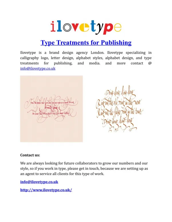
The Rules of Type in Video • 1. Make sure the font is readable on screen. • 2. Make sure that it fits your theme. • http://www.youtube.com/watch?v=fbMa4MGFCOg
SimpleBetter • Centered • Lower third • 5 X 5 rule: 5 words or less/no more than 5 lines • Keep it longer than you’d like • Since time is important, over black might be avoided
Use the same font! • Keep it consistent • Avoid default font • Too showy is noticeable • Too complex unreadable
Things to Avoid: • Star Wars titling • Too quick/Too long • Too small • Too showy • Too much animation • ANYTHING that is there because its cool


