Leaflet
Leaflet. Robin Marsh. Leaflet Research.

Leaflet
E N D
Presentation Transcript
Leaflet Robin Marsh
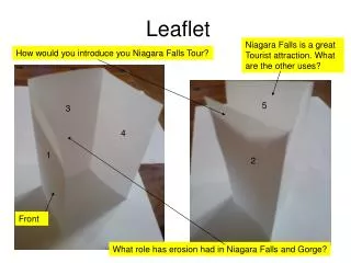
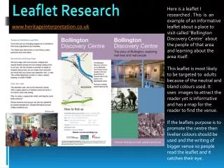
Leaflet Research This leaflet has a consistent purple colour scheme as well as the same font used through out. It provides images relevant to the company and fills up any blank spaces in the leaflet making the brochure appealing and selling drawing the customer in. Useful contact information is provided as well as any extra info that could be helpful for the user. Background history is included on ‘Dumbarton’ to give the reader a proper ‘feel’ to what the leaflet is selling. This leaflet has information about what the company does and the services included. Contact information and an application for a donation is provided so that the user can donate easily. The leaflet uses a blue and green colour scheme through out and uses oval shapes which make it look consistent and professional, as well as individual to the company. Pictures of the patients at ‘Cancer Care’ and quotes from them are provided to show that anyone is welcome to the organisation and give a viewpoint from someone who uses them. This leaflet has information on what the tours are about, the price and contact information. It also provides a relevant map which is suitable for the ‘guided tours’ company. The headings all follow a consistent theme and images are provided of the tour and sites that would be seen. Their Twitter and Facebook is also mentioned which allows their publicity to be more visible in the modern day.
1st Draft • Feedback: • The leaflet could use more colour to follow the theme from the other publications • The application form needs to be more detailed with the payment method • The logo needs to be included on the leaflet • The homemade headings are original and the Wild Care title provides a wildlife theme • There is lots of content in terms of animal profiles and the adoption scheme • The font is consistent from the other publications • To improve: • I will apply colour to the leaflet and improve the application form with some thought to the payment method
2nd Draft • Feedback: • More detail about paying by card needs to be provided, such as how to pay by card • The back of the tear off form needs to be considered (try to avoid too much white space) • The blue header background matches that of the membership card – keeping a consistent theme through the publications • The colours follow the wildlife theme • The payment method options make the application look official/professional • To improve: • I will provide more payment options and leave space for the customers telephone number if they need to be contacted