DTP Font Rules
DTP Font Rules. DTP RULES. How many fonts are too many for one project and how do you know where to draw the line? accepted practice is to limit the number of different typefaces to three or four. That doesn't mean you can't use more but be sure you have a good reason to do so.

DTP Font Rules
E N D
Presentation Transcript
DTP RULES • How many fonts are too many for one project and how do you know where to draw the line? • accepted practice is to limit the number of different typefaces to three or four. That doesn't mean you can't use more but be sure you have a good reason to do so.
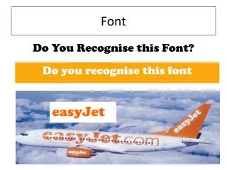
How to choose fonts • Choosing fonts is both an art and a science. The designer must understand how to choose fonts that set the tone for a design, provide the best readability, and convey the right image. There are certain established guidelines and best practices that allow designers to quickly and effectively mix and match fonts for the best results.
What is the best way to choose or mix and match fonts? • There are no absolutely right or wrong ways to choose fonts or mix different fonts. However, there are a few accepted standards that can speed up the font selection process and generally result in typographically attractive and readable compositions.
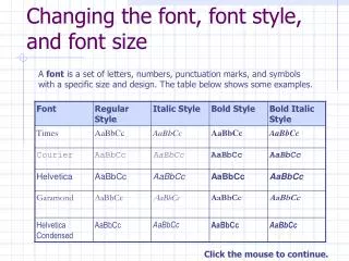
Fundamentals • Use Serif Text with Sans Serif HeadlineWhen in doubt, pair a serif font for body text and a sans serif font for headlines. • Use Proportional FontsAvoid monospaced typefaces for body copy. They draw too much attention to the individual letters distracting the reader from the message.
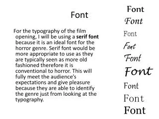
Top 10 Fonts • In general, the top ten list includes • Arial, Frutiger, • Futura, Gills Sans, • Helvetica, Lucida, • Optima, Palatino, • Agfa Rotis, Univers.
Reason Why • The reason these fonts are so popular is because they are simple and easy to read • Easy to design and apply effects
Last Suggestions • If you have no idea about fonts, how they translate to your Design, or how they will affect your clients and ultimately sales, then you should definitely stick with the top ten list.