Download
1 / 2
20 likes | 155 Vues
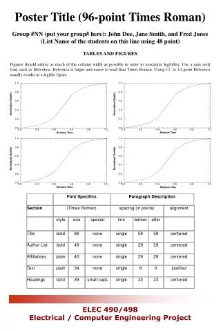
Font Specifics. Paragraph Description. Section. (Times Roman). spacing (in points). alignment. style. size. special. line. before. after. Title. bold. 96. none. single. 58. 58. centered. 1.0. 1.0. 1.0. 1.0. Author List. bold. 48. none. single. 29. 29. centered. 0.8.

E N D
Font Specifics Paragraph Description Section (Times Roman) spacing (in points) alignment style size special line before after Title bold 96 none single 58 58 centered 1.0 1.0 1.0 1.0 Author List bold 48 none single 29 29 centered 0.8 0.8 0.8 0.8 0.6 0.6 0.6 0.6 Normalized Quality Normalized Quality Normalized Quality Normalized Quality Affiliations plain 40 none single 29 29 centered 0.4 0.4 0.4 0.4 Text plain 34 none single 8 0 justified 0.2 0.2 0.2 0.2 0.0 0.0 0.0 0.0 0.0 0.0 0.0 0.0 0.2 0.2 0.2 0.2 0.4 0.4 0.4 0.4 0.6 0.6 0.6 0.6 0.8 0.8 0.8 0.8 1.0 1.0 1.0 1.0 Headings bold 39 small caps single 23 23 centered Relative Time Relative Time Relative Time Relative Time Poster Title (96-point Times Roman) Group #NN (put your group# here): John Doe, Jane Smith, and Fred Jones (List Name of the students on this line using 48 point) TABLES AND FIGURES Figures should utilize as much of the column width as possible in order to maximize legibility. Use a sans serif font, such as Helvetica. Helvetica is larger and easier to read than Times Roman. Using 12- to 14-point Helvetica usually results in a legible figure.
INTRODUCTION • The introduction serves to attract the reader’s attention. As a general rule, use a 34 point font for your poster presentation. Otherwise, your audience will have difficulty reading your interesting poster. This paragraph uses a 34 point font Times New Roman. • Here you will tell in brief bulleted statements the main points of your project (as will discussed in your report) • Clearly state what the motivation and objectives behind this project • Tell what are the challenges encountered with this project • Present the main topology that has been used in the project that you focus on in your report • Your poster should be a summary of your report – not something separate. • Be sure to include the proper illustration in your poster • ANALYSIS • Here your poster presentation highlights the key parts of your analysis. You can use bulleted points or a brief paragraph. Remember, however, that bulleted points are easier to read than paragraphs. • Depending on the complexity of your issue, your analysis might use two or more columns. • You might present your comparisons, contrasts, problems etc. that are revealed in your investigation • CONCLUSIONS AND RECOMMENDATIONS • Your recommendations should flow logically from the • Issue(s) you have presented about your project • The analysis – in which you may have revealed pros/cons, strengths/weaknesses, or contrasts between facts, and values (or other critical thinking). • Present recommendations clearly and succinctly. Be sure the reader understands why you have come to these recommendations. • In a sense, your recommendations are the conclusion of your project. This is where you present what you think needs to be done based on what others have recommended on the issue (i.e., what you’ve cited) and your own ideas. • REFERENCES • As with any document, you should provide references. • For references, you can shrink your font down to 16 or 18 point font. You can also copy and paste your APA references from your project into the poster. Of course, given that the poster is a trimmed version of your paper, you might not need to include all the references from the paper. Just include those that you cite in the poster. • Remember to use a hanging indent and APA formatting for references. • TEMPLATE NOTES • -Please do NOT use background colours on your poster • -Colours are not always perfectly colour matched on a printout, if you want a nice glossy photo, it is suggested to print it on a photo printer, then attach it to your poster


![[Poster Title]](https://cdn3.slideserve.com/5382651/poster-title-dt.jpg)