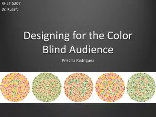
Web design for color blind users
Web design for color blind users. Presented by Rajalekshmy Usha HCI assignment 4 12/11/2001. Hereditary genetic disorder Afflicts 8 percent men and 0.5 percent women Most services and companies use no or less consideration for this group. For example,

Web design for color blind users
E N D
Presentation Transcript
Web design for color blind users Presented by Rajalekshmy Usha HCI assignment 4 12/11/2001
Hereditary genetic disorder Afflicts 8 percent men and 0.5 percent women Most services and companies use no or less consideration for this group. For example, some instructions say “press the red button” Color coded pills Red warning and green safety light on some machines Color Blindness
Types of Color Blindness • Red-Green Color Vision Deficiency: • Most commonly referred to as “color vision deficiency” since the sufferers are not entirely blind to colors • Total Color Blindness: • Rare, but is present across all ethnic groups • Two types: • Typical : complete failure to discriminate colors • Atypical : low color sensitivity, only clear colors detected
Statistics and facts on color blindness • Approximately 10 million people in United States are blind and visually impaired • At least 1.5 million blind and visually impaired Americans use computers (source :American Foundation for Blind) • Males are more prone to color blindness • 7 percent males and 0.4 percent females suffer from red-green color blindness
A Simple Color Blind Test • A normal person sees a 5 revealed among the dots • A red-green color blind person sees a 2 revealed in the dot
Web Design Analysis • Most of the current web designers give little or no consideration for color blind users • Not willing to sacrifice minor design elements for the majority of the users • However popular web sites are simple and not overloaded with colors
Examples of web-sites with poor readability • http://www.moviephone.com/ • Light orange background in the left navigation menu • Different color links with green and orange which blends in • http://www.wired.com/: • garish colors • too much even for normal users • Red and green backgrounds are kept together
Examples of web-sites with good readability • http://www.amazon.com/ • Simple and elegant • Used distinct colors for menus, images etc • No red and green colors together • http://www.hotmail.com/ • The butterfly icon may not be that distinct • http://www.whitehouse.gov/: • Again simple and plain • but fonts on the menu tab could have been larger
My Goal for this Web Design • Make internet accessible to color blind users • Provide an opportunity for web-designers, system developers and for all society
Acid Test on the readability of color combination -Represent worse-case scenario since the fonts are small and the backgrounds are highly saturated -Brightness of the font increases from top to bottom and the brightness of the background increases from left to right - I will use this color swatch for web designing
Click on the red button My web design guidelines for color blind users • Use ALT = ‘…’ text for all the images. • Use JavaScript Mouse over events to describe the status event description of all the images • Use blue, yellow, white and black to really distinguish items • Provide numerous links with a text version , if you cannot do without graphics • Provide labels next to any colored indicators • Emphasize important with larger fonts, color highlight(proper ones!) and outlining boxes • Provide visual cues like icons or arrows if there are no underlining for text links Next
My web design guidelines for color blind users - 2 • Provide strong contrast between background and the foreground colors Effective and non-effective hue contrast is shown in the picture alongside.
What are not allowed … DON’T : • Use red/purple/gray/brown/green next to or to the top of red/purple/gray/brown/green • Use various shades of one color • Use single light bulb that changes color from red to yellow or green to yellow under any circumstances • Use colors in images to denote special areas, such as bar charts, maps, and navigation bars • Overload the web site with large number of visually striking buttons, garish colors and extreme imageries. AAAAA AAAAA ( good format ) hotel phone water (email icon - bad format! )
What are not allowed …2 DON’T : • Use decorative , complicated or cursive fonts • Roman typefaces are effective • Decorative typefaces are not effective • Condensed typefaces are not as effective • Sans serif type faces are effective • Extensive use of italics – oblique or condensed • Upper and lowercase of a typeface is more readable • Italics and bold types are not as effective
Interface Designs to be considered • Give information feedback by giving instructions, which refers to objects e.g. “press the button marked “ON” or “wait for the light on the left” • Strive for consistency throughout while designing the websites • Do regular usability testing – it provides opportunity for revision and improvement • Compactness and branching factors of web page
Conclusions • Black and white works best • Never solely rely on colors • Enhance each use with an image, shape, positioning or text • Use bright colors – they are easiest to tell apart • Use the appropriate back ground so you can make even the less safe color visible • E.g. red against white, green against black,turquoise against black, magenta against black.
Internet Resources for Web design for Color Blind Users : • www.firelily.com/opinions/thumb.html • http://www.firelily.com/opinions/color.html • www.vischeck.com • http://newmanservices.com/colorblind/default.asp • http://members.aol.com/nocolorvsn/color5.htm • http://www.visibone.com/colorblind/ • http://trace.wisc.edu/world/web/