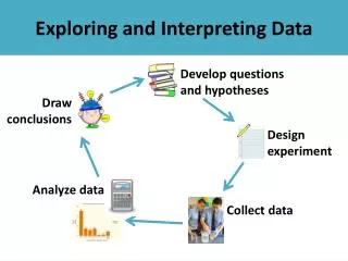
Interpreting Data
Interpreting Data. Level 3 to 4 Booster Lesson 8. Interpreting Data. Oral and Mental Starter. Learning Objectives Interpret diagrams and graphs Draw simple conclusions Vocabulary bar chart mode maximum. Goals Scored by Harriers OHT 8.1.

Interpreting Data
E N D
Presentation Transcript
Interpreting Data Level 3 to 4 Booster Lesson 8
Interpreting Data Oral and Mental Starter • Learning Objectives • Interpret diagrams and graphs • Draw simple conclusions • Vocabulary • bar chart • mode • maximum
Goals Scored by Harriers OHT 8.1 This bar chart shows the number of goals scored by Harriers in last season’s matches. 5 What was the highest number of goals Harriers scored in a match?
Goals Scored by Harriers OHT 8.1 This bar chart shows the number of goals scored by Harriers in last season’s matches. 2 2 6 5 4 1 How many matches in total did Harriers Play? 20
Goals Scored by Harriers OHT 8.1 This bar chart shows the number of goals scored by Harriers in last season’s matches. 4 1 In how many matches did Harriers score more than three goals? 5
Goals Scored by Harriers OHT 8.1 This bar chart shows the number of goals scored by Harriers in last season’s matches. 2 What was the most common number of goals scored (mode)?
Goals Scored by Harriers OHT 8.1 This bar chart shows the number of goals scored by Harriers in last season’s matches. How likely are Harriers to score seven goals in a match when they play in the same league this season? Very unlikely
Interpreting Data Main Teaching • Learning Objectives • Extract and interpret data in tables, graphs,charts and diagrams • Interpret diagrams and graphs (including pie charts), and draw simple conclusions • Vocabulary • Pie chart
Distances OHT 8.2 This table shows the distances between towns Distances in miles Which two towns are the shortest distance from each other? Bangor and Hull
Distances OHT 8.2 This table shows the distances between towns Distances in miles Mrs Davis drove from Bangor to Exeter. What is the distance between Bangor and Exeter? 289 miles
Distances OHT 8.2 This table shows the distances between towns Distances in miles Mrs Davis then drove from Exeter to Dover. What is the distance between Exeter and Dover? 248 miles
Distances OHT 8.2 This table shows the distances between towns Distances in miles How far did Mrs Davis drive altogether? 289 + 248 =537 miles Why is this answer different from the distance from Bangor to Dover in the table?
Train tickets OHT 8.3 The ticket office at Exeter station keeps a record of the type of ticket it sells. The tickets sold on a Friday in December are shown in the table below How many different types of ticket are sold? 9
Train tickets OHT 8.3 The ticket office at Exeter station keeps a record of the type of ticket it sells. The tickets sold on a Friday in December are shown in the table below How many First-class saver tickets are sold? 11
Train tickets OHT 8.3 The ticket office at Exeter station keeps a record of the type of ticket it sells. The tickets sold on a Friday in December are shown in the table below + + How many return tickets are sold? 89
Train tickets OHT 8.3 The ticket office at Exeter station keeps a record of the type of ticket it sells. The tickets sold on a Friday in December are shown in the table below + + + + 30 80 How many more Standard tickets than First-class tickets are sold? 50
Train tickets OHT 8.3 The ticket office at Exeter station keeps a record of the type of ticket it sells. The tickets sold on a Friday in December are shown in the table below Why do you think a lot of student tickets are sold?
Travellers OHT 8.4 children men women The ticket office also records whether each traveller is a man, woman or a child. The results are shown in the pie chart Are there more men passengers than women passengers?
Travellers OHT 8.4 children men women The ticket office also records whether each traveller is a man, woman or a child. The results are shown in the pie chart How many child passengers are there? What other information would we need to know to find the answer? When is it better to use a pie chart than one of the other types of graph? Explain your answer.
Favourite colour OHT 8.5 John and Sandip collected some data on favourite colour from a group of children. blue red yellow green
Favourite colour OHT 8.5 John and Sandip collected some data on favourite colour from a group of children. blue red yellow green I think the pie chart is best as you can easily see which is the most popular.
Favourite colour OHT 8.5 John and Sandip collected some data on favourite colour from a group of children. I think the bar chart is better as you can compare easily. blue red yellow green
Favourite colour OHT 8.5 John and Sandip collected some data on favourite colour from a group of children. About half of the children chose blue. blue red yellow green
Favourite colour OHT 8.5 John and Sandip collected some data on favourite colour from a group of children. blue red yellow Yellow and green are about the same in popularity. green
Favourite colour OHT 8.5 John and Sandip collected some data on favourite colour from a group of children. blue red yellow green I could work out how many children were asked from the pie chart.
Favourite colour OHT 8.5 John and Sandip collected some data on favourite colour from a group of children. blue red yellow Red is the least popular colour and it is easy to see from both diagrams. green
By the end of the lesson Pupils should be able to: • extract data from a variety of sources • interpret data and give a reason for any conclusion.