Interpreting data …
This guide explores how to calculate quartiles and interpret box and whisker diagrams (box plots) to compare datasets effectively. Learn to identify key components like the minimum, maximum, median, and interquartile range (IQR) to find outliers. Through a practical example involving the weights of 15 children, you'll see how these diagrams provide a clear summary of data, showcasing the distribution of values and their skewness. Master essential terminology and enhance your data interpretation skills with visual representations.
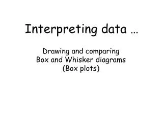

Interpreting data …
E N D
Presentation Transcript
Interpreting data … Drawing and comparingBox and Whisker diagrams(Box plots)
Learning objectives • Calculate quartiles and draw box and whisker diagrams • Interpret box and whisker diagrams and use to compare datasets • Use all terminology and use IQR to find “outliers”
A list of data • The weights (KG) of 15 children:37, 42, 31, 35, 48, 29, 50, 36, 44, 28, 63, 35, 41, 52, 43 Difficult to UNDERSTAND what thesechildren look like from the list …
Another useful summary • A diagram to show: min (28KG), max (63KG), median (41KG) … Max Min Median
Median • ½(n + 1)th piece of data (ordered) 28, 29, 31, 35, 35, 36, 37, 41, 42, 43, 44, 48, 50, 52, 63 15 items of data … n = 15 ½(n + 1) = ½(15 + 1) = 8th item
Lower Quartile • ¼(n + 1)th piece of data (ordered) 28, 29, 31, 35, 35, 36, 37, 41, 42, 43, 44, 48, 50, 52, 63 15 items of data … n = 15 ¼(n + 1) = ¼(15 + 1) = 4th item
Upper Quartile • ¾(n + 1)th piece of data (ordered) 28, 29, 31, 35, 35, 36, 37, 41, 42, 43, 44, 48, 50, 52, 63 15 items of data … n = 15 ¾(n + 1) = ¾(15 + 1) = 12th item
Add that to our box plot • A diagram to show: min (28KG), lower quartile = 35KG max (63KG), upper quartile = 48KG median (41KG) … Median UQ LQ Max Min
Some terminology Q2 Q3 Q1 Q0 Q4 Median UQ LQ Max Min Alternative names for quartiles
Some terminology UQ – LQ = Interquartile Range (IQR) Max – Min = Range
Some terminology Positive skew: median closer to LQ than UQ Negative skew: median closer to UQ than LQ Symmetrical distribution
Interpreting the box plot • Easily see lightest / heaviest and range • The ‘box’ contains the middle 50% of people (the most ‘representative half’) • The ‘whiskers’ show the lightest 25% and heaviest 25% of people (extremes)