Designing Graphical User Interfaces
Designing Graphical User Interfaces. Components of GUIs – icons, cursors, menus, dialogue boxes, form fillin, error messages Interface hardware - keyboards, pointing devices, speech, displays. Direct Manipulation Interfaces.

Designing Graphical User Interfaces
E N D
Presentation Transcript
Designing Graphical User Interfaces Components of GUIs – icons, cursors, menus, dialogue boxes, form fillin, error messages Interface hardware - keyboards, pointing devices, speech, displays
Direct Manipulation Interfaces • Use of a pointing device to directly manipulate visible objects on the screen resulting in real-time feedback • Examples • Graphical user interfaces • Office applications - wordprocessors and spreadsheets • Desktop/windows interfaces for operating systems • Web browsers • 3D interfaces - virtual reality and games • Tangible interfaces
Advantages of direct manipulation • Continuous representation of objects and actions relies on recognition rather than recall • Meaningful visual metaphors - can guess what to do and generalise from a few examples • Rapid actions through physical actions rather than complex syntax - offload cognitive effort onto motor skills • Immediate and reversible system response
Disadvantages of Direct Manipulation • Focuses the user on only the simple/most obvious parts of the interface • May encourage action rather than planning • Can be time consuming for repetitive tasks • May be difficult to combine commands into new commands • Requires space for a large display and pointing device
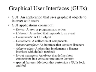
Graphical User Interfaces (GUIs) • Dominant style of interface today • Composed of widgets ... Window Icon Cursor Menus Slider Form Dialogue Box Buttons Toolbar Hotlinks
For how not to do it • Check out the Interface Hall of Shame from from Isys Information Architects • http://homepage.mac.com/bradster/iarchitect/shame.htm
Designing icons • Represent object/action in a familiar manner • Limit number of different icons • Make icons stand out from background • Ensure that selected icon is visible from nearby unselected icons • Design icon movement animation • Add detail to show properties of the object • Design combinations of icons (e.g. file and trashcan) • Make part of a harmonious family normal selected dragging
Designing Cursors • Design the cursor to provide feedback as to appropriate actions and progress
Designing Menus • Choice of menu structure • How to arrange items • How to present items • How to label items
Open Save Load Close Small single-level menus • Pull-down and pop-up varieties • Highlight potential selection • Use natural ordering if there is one • Don’t change positions of items • Grey-out rather than remove unavailable options • Offer keyboard short-cuts for experienced users • Pie menu can give rapid selection
Simplemenus Pull down What is going on here? Pop up
Small menus using buttons • Menus can be made using buttons • Radio buttons support one selection only • Check boxes support multiple selections • Embedded links in hypermedia • Iconic menus and palettes • Provide default selections
Large single level menus • Multiple columns where content allows • Scrolling menus - one or two dimensional • Alphasliders: A C DE G H J KN O RS TV Z Actor: Connery, Sean
Structured Menus • Menu sequences guide users through complex decisions one part at a time • Tree structured menus are commonly used for many choices with natural groupings • Speed up access for experienced users with: • type-ahead (BLT approach) • bookmarks, menu macros and toolbars
Task Related Grouping • Use information from Hierarchical Task Analysis • Guidelines for forming menu trees • create groups of logically similar items • form groups that cover all possibilities • make sure that items are non-overlapping • use familiar terms, but ensure items remain distinct • Guidelines for presenting items at each level • consider ordering – importance or frequency • keyword on the left
Breadth or depth? • Depth = number of levels • Ideally, no more than 3 to 4 levels • More levels leads to navigation problems • Breadth = number of items per level • Ideally, no more than 8 items/level • More than this leads to scanning problems
Beyond this, broad generally better than deep N = number of items B = branch factor at each level D = tree depth Time to select item at each level, t = k + c * log b Total traversal time, T = D * t • However, also balance breadth and depth according to system response time and display rate • slow response time suggests shallower • slow display rate suggests narrower D N = BD B
A word about response times • System response times may vary greatly, especially when networks are involved • Too slow - users are frustrated • Too quick - users make mistakes • The ideal varies with user and task • Visual indication of progress and estimated wait time is important for longer response times (e.g., web interfaces)
Menu maps and menu networks • Users may benefit from: • printed menu maps • cross-links that turn trees into graphs • But watch out for extra cognitive overhead
Designing Dialogue Boxes • Dialogue boxes used for complex actions and may combine menus, buttons and forms • top-left to bottom-right sequencing • clustering and emphasis • small enough not to obscure background • display close to appropriate background items • clear how to complete and cancel
Designing Form Fillin • Meaningful title • Comprehensible but short instructions • Logical grouping and sequencing of fields • Visually appealing layout • Familiar field labels • Consistent terminology and abbreviations • Visible space and boundaries for data entry • Convenient cursor movement • Error correction for characters and fields
Error prevention • Error messages for unacceptable values • Optional fields clearly marked • Explanatory messages for fields • Completion signal • Special formats for coded fields • Telephone • Times • Dates • Currency • But watch out for multiple nationalities
Designing Error Messages • Avoid words such as: • ILLEGAL, BAD, ABORTED, ERROR, FATAL • Positive tone and suggest how to correct • Enable additional information to be quickly accessed • Opinions divide over optimum placement • near to source of error • consistent position on screen • dialogue box in middle of screen • Careful use of sound may help • Do not embarrass the user
Repair Mechanisms • UNDO/REDO commands should be pervasive, applying to any operation where this is logically possible • UNDO/REDO should be inverse operations • UNDO/REDO sequences can be useful
Style Guides • Detailed guidelines for a specific software or organisational environment • Microsoft: msdn.microsoft.com/library • Apple: developer.apple.com/techpubs/macosx/Essentials/AquaHIGuidelines • Example guidelines from apple • Use pop-up menus to present up to 12 mutually exclusive choices that the user doesn’t need to see all the time • Don’t use pop-up menus • For more than 12 items; use a scrolling list • For 4 or fewer items; use radio buttons • When more than one selection is appropriate (such as text styles in which you can select bold and italic); use checkboxes or pull-down menus in which checkmarks appear
Devices • Keyboards • Pointing devices • Visual displays
Keyboards • Layout • Scholes (QWERTY) • Dvorak and ABCDE
Function keys, arrow keys and number pads • Phone? • Calculator? • ATM?
Pointing devices • Direct • lightpen • touchscreen • Indirect • mouse • trackball • joystick • Touchpad and nipples
Visual Displays • Display technologies include: • Raster-scan cathode ray tubes (CRT) • Liquid crystal displays • Plasma panels • LEDs • Video projection
Speech input • Speech input • Single word versus continuous text • Speaker dependent versus independent • Useful when • hands are busy and/or eyes are occupied • mobility is required • difficulties using hands • harsh or cramped conditions preclude use of keyboard
Speech output • Maybe useful when • user has limited vision • message is simple and short • environment badly lit or vibrating • user is mobile • user is experiencing high G forces or anoxia • Watch out for • interfering with human-human communication • publicly revealing private interaction • Note use of sound as well as speech

