Representation of Data Using Stem-and-Leaf Diagrams
Learn how to represent data effectively with stem-and-leaf diagrams, including twin stem-and-leaf diagrams, calculating median and inter-quartile range, identifying outliers, and creating box plots. Understand the significance of medians, quartiles, and outliers in data analysis.
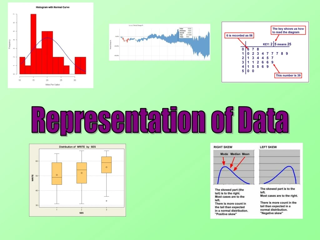

Representation of Data Using Stem-and-Leaf Diagrams
E N D
Presentation Transcript
Representation of Data Stem and Leaf Diagrams You will have seen stem and leaf diagrams on your GCSE. They are also on A-level, but you will be asked more questions on them. 20, 9, 17, 12, 28, 31, 22, 24, 17, 25, 24, 24, 26 Stem Leaf Stem Leaf 0 9 0 9 1 7 2 7 1 2 7 7 2 0 8 2 4 5 4 4 6 2 0 2 4 4 4 5 6 8 3 1 3 1 The leaf will usually be the last number, and the stem the rest. Make sure the data is in order! 4A
Representation of Data Twin Stem and Leaf Diagrams Sometimes you will have 2 sets of data on one diagram. The following numbers represent flower widths for 2 different plants of the same species (cm). Plant 2 Stem Plant 1 Key: 6 | 2 | 1 1 5 9 9 Means 2.1 for plant 1 and 2.6 for plant 2 9 7 6 2 1 2 4 5 7 5 3 1 0 3 0 2 0 4 4A
Representation of Data Twin Stem and Leaf Diagrams Calculate the Median and Inter-quartile range for the following Stem and Leaf diagram. n 2 13 2 Q2 Q1 Q3 Q3 – Q1 6.5 (7th term) 38 Stem Leaf 2 3 6 n 4 13 4 3.25 (4th term) 3 1 5 7 7 8 9 35 4 0 3 3 4 3n 4 39 4 5 2 9.75 (10th term) 43 13 Numbers 43 - 35 = 8 4A
Representation of Data Twin Stem and Leaf Diagrams Calculate the Median and Inter-quartile range for the following Stem and Leaf diagram. n 2 14 2 Q2 Q1 Q3 Q3 – Q1 7 (7.5th term) 71.5 Stem Leaf 6 1 2 5 5 8 n 4 14 4 3.5 (4th term) 7 0 1 2 3 6 7 65 8 1 4 3n 4 42 4 9 0 10.5 (11th term) 77 14 Numbers 77 - 65 = 12 4A
Representation of Data Outliers An outlier is an extreme value that lies outside the overall pattern of data. An outlier is any value that is; Bigger than; Upper Quartile + (1.5 x Inter-quartile Range) Q3 + 1.5(IQR) Smaller than; Lower Quartile – (1.5 x Inter-quartile Range) Q1 – 1.5(IQR) So basically, work out ‘1.5 x IQR’. Then add it to the upper quartile, subtract it from the lower quartile and you have the acceptable range of values. The rules above are standard but you may be given a different rule to apply in the exam. 4B
Representation of Data Outliers For the Stem and Leaf diagram below, calculate the quartiles and find any outliers. n 2 30 2 Q2 Q1 Q3 Q3 – Q1 15 (15.5th term) 3.8 Key: 3 | 1 means 3.1 Stem Leaf 2 2 2 3 3 5 7 n 4 30 4 7.5 (8th term) 3 1 2 6 7 7 7 8 8 8 8 9 9 9 3.2 4 0 0 0 0 4 5 6 7 8 5 1 5 3n 4 30 4 22.5 (23rd term) 30 Numbers 4.0 4.0 – 3.2 = 0.8 4B
Representation of Data Outliers For the Stem and Leaf diagram below, calculate the quartiles and find any outliers. Q1 = 3.2 Q2 = 3.8 Q3 = 4.0 IQR = 0.8 Key: 3 | 1 means 3.1 Lowest acceptable value Highest acceptable value Stem Leaf 2 2 2 3 3 5 7 3 1 2 6 7 7 7 8 8 8 8 9 9 9 Q1 – 1.5(IQR) Q3 + 1.5(IQR) 4 0 0 0 0 4 5 6 7 8 3.2 – 1.5(0.8) 4 + 1.5(0.8) 5 1 5 2 5.2 30 Numbers So 5.5 is the only outlier. 4B
Representation of Data Box Plots and comparing data Any outliers are plotted as crosses outside the main plot Each ‘section’ contains 25% of the observations in the sample Smallest value Lower Quartile Upper Quartile Largest value Median Outlier 25% 25% 25% 25% 10 20 30 40 50 60 70 80 4C/4D
Representation of Data Drawing the box plot Q1 = 3.2 Q2 = 3.8 Q3 = 4.0 IQR = 0.8 Lowest acceptable value Highest acceptable value Key: 3 | 1 means 3.1 Stem Leaf 2 2 2 3 3 5 7 Q1 – 1.5(IQR) Q3 + 1.5(IQR) 3 1 2 6 7 7 7 8 8 8 8 9 9 9 3.2 – 1.5(0.8) 4 + 1.5(0.8) 4 0 0 0 0 4 5 6 7 8 2 5.2 5 1 5 So 5.5 is the only outlier. 2 2.5 3 3.5 4 4.5 5 5.5 4C/4D
Representation of Data • Drawing the box plot The blood glucose level of 30 males is recorded. Below is a summary of the results. Given that there was only one outlier, draw a box plot for the data. IQR = 4.7 – 3.6 = 1.1 Max value = 4.7 + 1.5(1.1) = 6.35 Min value = 3.6 – 1.5(1.1) = 1.95 So 1.4 is the outlier. Lower Quartile = 3.6 Upper Quartile = 4.7 Median = 4 Lowest Value = 1.4 Highest Value = 5.2 As we do not know the actual lowest value, we use the lower boundary (1.95) 1 2 3 4 5 6 4C/4D
Representation of Data Comparing Box Plots When you compare 2 box plots you should always comment on the Median and the Inter-quartile range. This is because Median is a measure of location (average), and the Inter-quartile range is a measure of spread. The median is higher for males, and they also have a larger Inter-quartile range. This indicates that males have a higher blood glucose level on average, and also have a wider range of values. Females Males 1 2 3 4 5 6 Glucose Level 4C/4D
Representation of Data Histograms A Histogram is similar to a bar chart but there are 2 major differences There are no gaps between bars (continuous data) The area of a bar is proportional to the frequency When drawing a Histogram, use Frequency Density rather than frequency. You may also need to use the following formula when interpreting a Histogram. Area of Bar = k x Frequency Usually the Area of the bar is equal to the frequency. But it may be that all areas have been halved (ie k = 0.5) in order to make the diagram smaller. Frequency Density Frequency = Class width 4E
Representation of Data Frequency Density Frequency Histograms The following table shows how long a sample of 200 students took to complete their homework. Draw a Histogram to represent the data. = Class width 14 12 Time (mins) Frequency Frequency Density 10 25-30 55 11 8 (55 ÷ 5) Frequency Density 30-35 39 7.8 (39 ÷ 5) 6 35-40 68 13.6 (68 ÷ 5) 4 40-50 32 3.2 (32 ÷ 10) 2 50-80 6 0.2 (6 ÷ 30) 0 20 30 40 50 60 70 80 90 Time (mins) 4E
Representation of Data Histograms Use the Histogram to estimate the number of students whose times were between 36 and 45 minutes. As Area represents Frequency, we need to calculate the Area of each Rectangle we are including. Rectangle 1: 4 x 13.6 54.4 students Rectangle 2: 5 x 3.2 16 students 36 to 45 14 13.6 12 10 Frequency Density 8 1 6 Overall our estimate would be 70.4 (70) students between 36 and 45 minutes. 4 3.2 2 2 0 20 30 40 50 60 70 80 90 Time (mins) 4E
Representation of Data Histograms The Histogram to the right shows the time taken (s) for a group of children to complete a puzzle. Why has a Histogram been used? Time is Continuous Data What is the underlying feature of each bar? It is proportional to the group Frequency 14 16 18 20 22 24 26 28 30 32 Time (s) 4E
Representation of Data Histograms The Histogram to the right shows the time taken (s) for a group of children to complete a puzzle. Bar A represents 78 children. What Area represents 1 child? Area represents Frequency 2 x 27.3 54.6cm2 27.3 A 78 Children = 54.6cm2 ÷ 78 14 16 18 20 22 24 26 28 30 32 1 Child = 0.7cm2 2 Time (s) 4E
Representation of Data Histograms The Histogram to the right shows the time taken (s) for a group of children to complete a puzzle. 1 Child = 0.7cm2 If the Area is 210cm2 in total, how many children were surveyed? x 0.7 1 Child = 0.7cm2 ? Children = 210cm2 14 16 18 20 22 24 26 28 30 32 ÷ 0.7 Time (s) 210cm2 ÷ 0.7 = 300 Children 4E
Representation of Data Skewness and Comparisons The Skewness of data can be described using diagrams, measures of location and measures of spread. Data which is spread evenly Symmetrical Data which is mostly at the lower values Positive Skew Data which is mostly at the higher values Negative Skew Symmetrical Positive Skew Negative Skew 4F
Representation of Data Skewness and Comparisons There are several ways of comparing Skewness. Sometimes you will be told which to use, and sometimes you will have to choose one depending on what data you have available. You can see shape of the data from a box plot. You can also look at the quartiles Q1 Q2 Q3 Symmetrical Q2 – Q1 = Q3 – Q2 Q1 Q2 Q3 Positive Skew Q2 – Q1< Q3 – Q2 Q1 Q2 Q3 Negative Skew Q2 – Q1> Q3 – Q2 4F
Representation of Data Skewness and Comparisons There are several ways of comparing Skewness. Sometimes you will be told which to use, and sometimes you will have to choose one depending on what data you have available. Another test uses the measures of location: Symmetrical mean = median = mode Positive Skew mean > median > mode Negative Skew mean < median < mode Low mode = lots of low values ie) Positive Skew High mode = lots of high values ie) Negative Skew 4F
Representation of Data Skewness and Comparisons There are several ways of comparing Skewness. Sometimes you will be told which to use, and sometimes you will have to choose one depending on what data you have available. The final test is a formula: A value of 0 implies that mean = median Symmetrical Data A positive value implies that median < mean Positive Skew A negative value implies that median > mean Negative Skew The further from 0 a positive or negative value is, the more skewed the data is. 3(Mean – Median) Standard Deviation Negative Skew Symmetrical Positive Skew 0 4F
Representation of Data Skewness and Comparisons Find the 3 Quartiles for this data on test marks for 50 students. Q2 Q1 Q3 Key: 6 | 1 means 61 Stem Leaf n 2 50 2 25 (25.5th term) 2 1 2 8 60 3 3 4 7 8 9 4 1 2 3 5 6 7 9 n 4 50 4 12.5 (13th term) 5 0 2 3 3 5 5 6 8 9 9 46 6 1 2 2 3 4 4 5 6 6 8 8 8 9 9 7 0 2 3 4 5 7 8 9 3n 4 150 4 37.5 (38th term) 8 0 1 4 69 4F
Representation of Data Skewness and Comparisons Given the two values below, calculate the Mean and Standard Deviation of the data. Key: 6 | 1 means 61 Stem Leaf 2 1 2 8 3 3 4 7 8 9 4 1 2 3 5 6 7 9 Mean Standard Deviation 5 0 2 3 3 5 5 6 8 9 9 6 1 2 2 3 4 4 5 6 6 8 8 8 9 9 7 0 2 3 4 5 7 8 9 8 0 1 4 Q1 = 46 Q2 = 60 Q3 = 69 (2dp) 4F
Representation of Data Skewness and Comparisons Use the formula below to calculate the Skewness of the data. Key: 6 | 1 means 61 Stem Leaf 2 1 2 8 3(Mean – Median) 3 3 4 7 8 9 Standard Deviation 4 1 2 3 5 6 7 9 5 0 2 3 3 5 5 6 8 9 9 3(57.46 - 60) 15.67 6 1 2 2 3 4 4 5 6 6 8 8 8 9 9 7 0 2 3 4 5 7 8 9 -7.62 8 0 1 4 15.67 Q1 = 46 Mean = 57.46 = -0.486 Q2 = 60 Standard Deviation = 15.67 So the data is Negatively Skewed! Q3 = 69 Mode = 68 4F
Representation of Data Skewness and Comparisons Use another two methods to show the data is Negatively Skewed. Key: 6 | 1 means 61 Stem Leaf 2 1 2 8 1) Q2 – Q1 = 14 3 3 4 7 8 9 Q3 – Q2 = 9 4 1 2 3 5 6 7 9 5 0 2 3 3 5 5 6 8 9 9 Q2 – Q1 > Q3 – Q2 6 1 2 2 3 4 4 5 6 6 8 8 8 9 9 Negative Skew 7 0 2 3 4 5 7 8 9 8 0 1 4 2) Mean < Median < Mode Q1 = 46 Mean = 57.46 57.46 < 60 < 68 Q2 = 60 Standard Deviation = 15.67 High mode implies many higher values… Q3 = 69 Mode = 68 Negative Skew 4F
Representation of Data Skewness and Comparisons A company runs two manufacturing lines, A and B. They both make 2cm rods in different ways. Samples are taken from both lines and data summarised in the following table. Which manufacturing line is best in this situation? • The rods need to be accurate… • Standard Deviation measures spread • The rods from line A have a lower Standard Deviation • Line A is therefore more reliable 4F
Representation of Data Skewness and Comparisons This table shows data on pupils taking a Statistics and Mechanics Paper. Which will be easier to set fair grade boundaries for? • A higher standard deviation means the marks are more spread out • Therefore the grade boundaries will be more spread out for Statistics • And will therefore be fairier! 4F
Summary • We have looked at using Stem and Leaf diagrams and Histograms to represent data • We have looked at comparing data using these, as well as box plots • We have learnt what outliers are • We have learnt what Skewness is and used several measures to test it