Mastering Graphs: Easy Steps for Effective Data Representation
130 likes | 241 Vues
Learn how to select and create different types of graphs like line graphs, bar graphs, pie charts, and histographs. Understand the importance of titling your graph, labeling axes correctly, checking the scale, and drawing the graph accurately to analyze and represent data effectively. Enhance your data analysis skills with clear visualizations!

Mastering Graphs: Easy Steps for Effective Data Representation
E N D
Presentation Transcript
Step 1- Selecting Graph Type • Line graphs compare 2 variables (temp. vs time, # living organisms vs. pH). • Bar graphs are used for comparing two or more values that were taken over time or on different conditions, usually on small data sets. • Pie charts used to show data as part of 100%. • Histographs used to show age grouping vs. # organisms in each group.
Line Graph • Independent Variable goes on the X-axis • Dependent Variable goes on the Y-axis
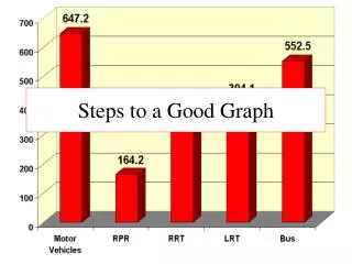
Bar Graph Data sets (groups being compared) on X-axis # on Y-axis
Pie Graph % out of 100%
Histograph Show how many people are living in different age groups.
Step 2 – Title your Graph • All graphs need a title explaining what you are graphing.
Step 3 – Label Your Axes • Make sure you label your X-axis with the name of the independent variable. • Label the Y-axis with the name of the dependent variable.
Step 4 – Check your Scale • Make sure that you equally space your values on the X and Y axes.
Step 5 – Draw the Graph • Make sure you connect the dots or make the bars. • If using more than 1 data set, create a key with colors or symbols.
Graphing data Why does it help analyze the results?