Making a good graph
Crafting a good graph is crucial for clear data presentation. Begin with a title formatted as "The dependence of (dependent variable) on (independent variable)." Ensure that the x-axis represents the independent variable, while the y-axis represents the dependent variable. Always label both axes clearly and include appropriate units. Utilize a line graph; do not connect the dots. Graph your data as large as possible within the available space. Avoid ambiguities—absence of titles, labels, and units leads to confusion. Follow these guidelines for a clear and informative visual representation.

Making a good graph
E N D
Presentation Transcript
STEP 1 • Always give your graph a title in the following form: "The dependence of (your dependent variable) on (your independent variable).
STEP 2 • The x-axis of a graph is always your independent variable and the y-axis is the dependent variable.
Step 3 • Always label the x and y axes and give units.
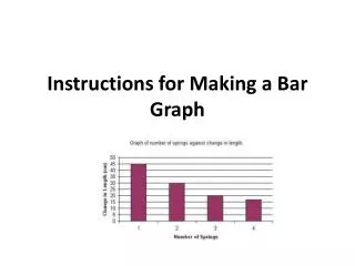
Make sure your data is graphed as large as possible in the space you've been given.
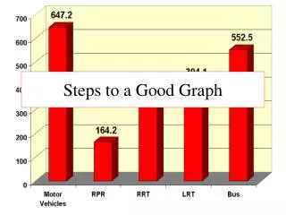
There's no title. What's it a graph of? Who knows? • There are no labels on the x or y axis. What are those numbers? Who knows? • There are no units on the x or y axis. Is this a graph of speed in miles per hour or a graph of temperature in Kelvins? Who can tell? • Somebody played "connect the dots". This should be a nice straight line which goes through the points or a curve that tends to follow them.