Download
1 / 23
230 likes | 345 Vues
Explore the contrast between RGB and CMYK in various file formats like indexed, Bitmap, Duotone, and LiveTrace. Discover the benefits of vector graphics for scalable designs. Dive into clock face sketches, pop art, typography grids, and self-portrait reconstruction exercises.

E N D
Exercise 1 Understanding file formats: VECTOR and RASTOR
RGB / CMYK 291 KB 1,07 MB In this example you can clearly see the difference between RGB and CMYK. Also, the size differs a lot. For use on-screen choose RGB, for print your better of with CMYK.
Indexed / Save For Web 216 KB 39,4 KB Visually no big difference from the RGB. Even the size is about the same in the Indexed example. But as you can see, “Save for web” really gets the size down. This is important when saving for web. (obvious?)
Bitmap / Duotone 11,9 KB 256 KB These on the other hand is very different from the first examples. Bitmap is clearly smaller in file size and in visual quality. The duotone is about the same size, but contains only 2 colors (or 2 tones).
LiveTrace 35,3 KB This is an example of a LiveTrace. This is now presented in vector graphics, which means that it doesn’t loose any quality when zoomed or stretched to a bigger size. Vector is very good to use while making logos or other scalable graphics.
Exercise 2 ClockFacesketches
Sketches Here are some sketches I’ve made. I just drew what came into mind, and I’m pleased with the result. The sketch to the left contains to watches. I misunderstood the task, but made clock faces for all categories later on. Though I do like the watches too.
Sketches First here is the signature clock face. It’s a classic style, with day and month showing in the middle of the clock. Second sketch is another time-zone example. 2 sets of hands as you can see, illustrating 2 different zones.
Sketches The fantasy clock face I sketched here is the one I chose to illustrate in Photoshop. I like the concept, and it’s not too complicated. And here are my third time zone concept. Turn the dial to show the time. Easy!
Final design Fantasy clock face This is my final clock face. A fantasy clock face, where the back rotates to show what time of day it is. In the day it’s showing a nice sunny day, and in the night the moon gets up, along with the stars.
Exercise 3 Composition / Layout
Pop art Not too much to say here. Played around with color and tracing. I was aiming for the style Warhol used in his pop art.
5 layerscomposition This composition was made using the 3 images shown on this page. It’s made up by severallayers, and by editingthepictures to get the effect I wanted. It looks like a dream world, with the earth in the skies in the background.
Exercise4 Typography
4x4 grid (Letter a) Playing around with the letter “a” in a 4x4 grid. I tried different fonts and sized and mixed around with a lot, but these are the ones I ended up using.
4x4 grid (Letter s) Playing around with the letter “s” in a 4x4 grid. I tried different fonts and sized and mixed around with a lot, but these are the ones I ended up using.
Exercise5 Self portraits (reconstruction)
Line drawing This is my line drawing portrait. Filtered out details in photoshop, and made it more sketchy. Also added a background to give it more of a sketchy feeling.
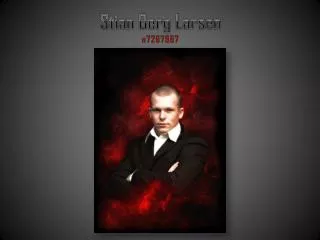
Chiaroscuro And my chiaroscuro. Had to use a photo we took earlier, as I was smiling too much in all the shots from the photoshoot. The background is made in Photoshop, using several clouds. Made them red, and toned them down. Overall a photo/composition I’m very happy with. I do think it could be a littlebit more contrast in the face to make it even more chiaroscuro, but thats easier to do with lightning while taking the photo.
Caricature Caricature. Not too much to say here. To be honest I didn't really know what to do. I would love to hand in a sketch made by hand, but I’m terrible at hand drawing, so that's not going to happen. This is my approach on a big-head caricature. Meanwhile I’ll practice my hand drawing skills, and maybe next time I’ll be able to present some sketches that way.
Comic character Comic character. I was thinking about simpsons, and thought I’d give it a shot. This was an attempt to make me look like Homer Simpson, from the tv series The Simpsons. Used liquify and other tools inside of photoshop to get this.