Exploratory Data Analysis
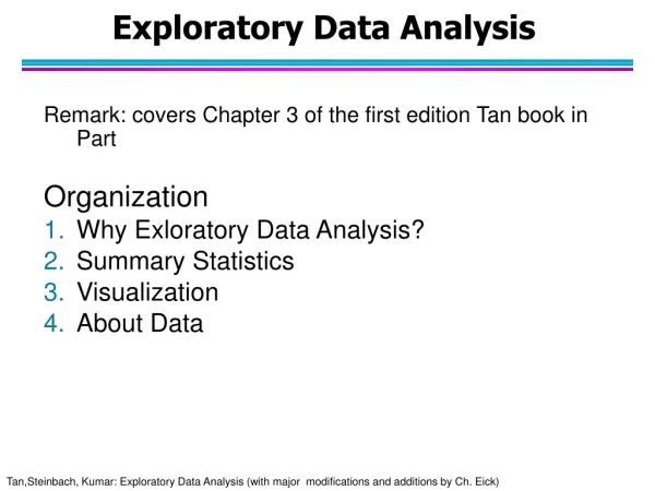
Exploratory Data Analysis. Introduction. Applying data mining (InfoVis as well) techniques requires gaining useful insights into the input data first We saw this in the previous lecture Exploratory Data Analysis (EDA) helps to achieve this EDA offers several techniques to comprehend data

Exploratory Data Analysis
E N D
Presentation Transcript
Introduction • Applying data mining (InfoVis as well) techniques requires gaining useful insights into the input data first • We saw this in the previous lecture • Exploratory Data Analysis (EDA) helps to achieve this • EDA offers several techniques to comprehend data • But EDA is more than a library of data analysis techniques • EDA is an approach to data analysis • EDA involves inspecting data without any assumptions • Mostly using information graphics • Modern InfoVis tools use many of the EDA techniques which we study later • Insights gained from EDA help selecting appropriate data mining (InfoVis) technique. Computing Science, University of Aberdeen
Descriptive Statistics • Descriptive statistical methods quantitatively describe the main features of data • Main data features • measures of central tendency – represent a ‘center’ around which measurements are distributed • e.g. mean and median • measures of variability – represent the ‘spread’ of the data from the ‘center’ • e.g. standard deviation • measures of relative standing – represent the ‘relative position’ of specific measurements in the data • e.g quantiles Computing Science, University of Aberdeen
Sum all the numbers and divide by their count x = (x1+x2+ … +xn)/n For the example data Mean = (2+3+4+5+6)/5 = 4 4 is the ‘center’ The information graphic used here is called a dot diagram 0 2 1 3 4 5 7 8 10 6 9 Mean Computing Science, University of Aberdeen
The exact middle value When count is odd just find the middle value of the sorted data When count is even find the mean of the middle two values For example data 1 Median is 4 4 is the ‘center’ For example data 2 Median is (3+4)/2 = 3.5 3.5 is the ‘center’ 0 2 1 3 4 5 7 8 10 6 9 Median Data 1 Data 2 0 2 1 3 4 5 7 8 10 6 9 Computing Science, University of Aberdeen
When data has outliers median is more robust The blue data point is the outlier in data 2 When data distribution is skewed median is more meaningful For example data 1 Mean=4 and median=4 For example data 2 Mean=24/5 and median=4 0 2 1 3 4 5 7 8 10 6 9 Median VS Mean Data 1 Data 2 0 2 1 3 4 5 7 8 10 6 9 Computing Science, University of Aberdeen
Computation steps Compute mean Compute each measurement’s deviations from the mean Square the deviations Sum the squared deviations Divide by (count-1) Compute the square root σ = √(∑(xi-x)2)/(n-1) 0 2 1 3 4 5 7 8 10 6 9 Standard Deviation Data 1 σ σ Mean = 4 Deviations: -2, -1, 0, 1, 2 Squared deviations: 4, 1, 0, 1, 4 Sum = 10 Standard deviation = √(10/4) = 1.58 Computing Science, University of Aberdeen
Median is the 2nd quartile 1st quartile is the measurement with 25% measurements smaller and 75% larger – lower quartile (Q1) 3rd quartile is the measurement with 75% measurements smaller and 25% larger – upper quartile (Q3) Inter quartile range (IQR) is the difference between Q3 and Q1 Q3-Q1 Quartiles 25% 25% 25% 25% IQR Q1 Q3 Computing Science, University of Aberdeen
This plot organizes data for easy visual inspection Min and max values Data distribution Unlike descriptive statistics, this plot shows all the data No information loss Individual values can be inspected Structure of the plot Stem – the digits in the largest place (e.g. tens place) Leaves – the digits in the smallest place (e.g. ones place) Leaves are listed to the left of stem separated by ‘|’ Possible to place leaves from another data set to the right of the stem for comparing two data distributions Stem and Leaf Plot Data 29, 44, 12, 53, 21, 34, 39, 25, 48, 23, 17, 24, 27, 32, 34, 15, 42, 21, 28, 37 Stem and Leaf Plot 1 | 2 7 5 2 | 9 1 5 3 4 7 1 8 3 | 4 9 2 4 7 4 | 4 8 2 5 | 3 Computing Science, University of Aberdeen
Graphical display of frequency distribution Counts of data falling in various ranges (bins) Histogram for numeric data Bar chart for nominal data Bin size selection is important Too small – may show spurious patterns Too large – may hide important patterns Several Variations possible Plot relative frequencies instead of raw frequencies Make the height of the histogram equal to the ‘relative frequency/width’ Area under the histogram is 1 When observations come from continuous scale histograms can be approximated by continuous curves Histogram/Bar Chart Data 29, 44, 12, 53, 21, 34, 39, 25, 48, 23, 17, 24, 27, 32, 34, 15, 42, 21, 28, 37 Computing Science, University of Aberdeen
Distributions of several data sets are bell shaped Symmetric distribution With peak of the bell at the mean, μ of the data With spread (extent) of the bell defined by the standard deviation, σ of the data For example, height, weight and IQ scores are normally distributed The 68-95-99.7% Rule 68% of measurements fall within μ – σ and μ + σ 95% of measurements fall within μ – 2σ and μ + 2σ 99.7% of observations fall within μ – 3σ and μ + 3σ Normal Distribution Computing Science, University of Aberdeen
Standardization • Data sets originate from several sources and there are bound to be differences in measurements • Comparing data from different distributions is hard • Standard deviation of a data set is used as a yardstick for adjusting for such distribution specific differences • Individual measurements are converted into what are called standard measurements called z scores • An individual measurement is expressed in terms of the number of standard deviations, σ it is away from the mean, μ • Z score of x = (x- μ)/ σ • Formula for standardizing attribute values • Z scores are more meaningful for comparison • When different attributes use different ranges of values, we use standardization Computing Science, University of Aberdeen
A five value summary plot of data Minimum, maximum Median 1st and 3rd quartiles Often used in conjunction with a histogram in EDA Structure of the plot Box represents the IQR (the middle 50% values) The horizontal line in the box shows the median Vertical lines extend above and below the box Ends of vertical lines called whiskers indicate the max and min values If max and min fall within 1.5*IQR Shows outliers above/below the whiskers Box Plot Data 29, 44, 12, 53, 21, 34, 39, 25, 48, 23, 17, 24, 27, 32, 34, 15, 42, 21, 28, 37 Computing Science, University of Aberdeen
Scatter plots are two dimensional graphs with explanatory attribute plotted on the x-axis Response attribute plotted on the y-axis Useful for understanding the relationship between two attributes Features of the relationship strength shape (linear or curve) Direction Outliers Scatter plot of iris$Petal.Width against iris$Petal.Length (refer to practical 1 about IRIS data) is shown here Scatter Plot Computing Science, University of Aberdeen
When multiple attributes need to be visualized all at once Scatter plots are drawn for every pair of attributes and arranged into a 2D matrix. Useful for spotting relationships among attributes Similar to a scatter plot Scatter plot matrix of IRIS data is shown here Attributes are shown on the diagonal Later in the course we learn to use parallel coordinates for plotting multi-attribute data Scatter Plot Matrix Computing Science, University of Aberdeen
EDA Answers Questions • All the techniques presented so far are the tools useful for EDA • But without an understanding built from the EDA, effective use of tools is not possible • A detective investigating a crime scene needs tools for obtaining finger prints. • Also needs an understanding (common sense) to know where to look for finger prints • Door knobs better places than door hinges? • EDA helps to answer a lot of questions • What is a typical value? • What is the uncertainty of a typical value? • What is a good distributional fit for the data? • What are the relationships between two attributes? • etc Computing Science, University of Aberdeen

