Presentation Tips
140 likes | 391 Vues
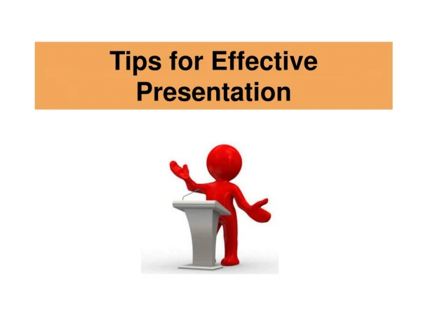
Presentation Tips. RHRC Consortium Monitoring and Evaluation ToolKit Sharing Project Information – Professional Presentations. Learning objectives. At the conclusion of this presentation, the audience will: Know 3 good things to do during a presentation

Presentation Tips
E N D
Presentation Transcript
Presentation Tips RHRC Consortium Monitoring and Evaluation ToolKit Sharing Project Information – Professional Presentations
Learning objectives At the conclusion of this presentation, the audience will: • Know 3 good things to do during a presentation • Know 3 bad things to avoid during a presentation This presentation has examples of good and bad slides. Which are which?
When you speak …. • Speak slowly • Look at your audience • Don’t read your presentation • Practice enough so you don’t have to read • Practice with microphone
When preparing slides …. • It is not usually a good idea to write long sentences on the slide, and then read them to the audience. When there are many, many words on the slide, the audience will read the slide and will not listen to you. Besides, since they can read the slide for themselves, they don’t need you. • Instead, use brief bullets to illustrate point • Then, add oral information as needed Do NOT put this much text on a slide!
When preparing slides …. Use 36 or 32 point text, and use Arial or other clear font. • Use big font size • This is 36 point • This is 32 point • This is 28 point • This is 20 point • Use clear font styles • This is Arial • This is Times New Roman
Confernece presentation guidelines Text too small Misspelled word How many times have you been at a conference and looked forward to a presentation only to be shown slides of tables or graphs that you could not read? Or presented with transparencies with print so small, you had to squint in order to see them? Now it’s your turn. You’re giving a presentation in front of colleagues and strangers. You’re excited and nervous. Your work deserves to be presented well and the audience deserves a good, clear presentation. Using good visual aids during an oral presentation serves several purposes. They illustrate the points made in the talk. They help the audience follow the presentation. They provide a visual complement to the spoken words. They help the presenter keep on track. They hold the audience’s interest. Poorly designed visual aids confuse the audience. As they peer at the slides, they miss what the speaker is saying. They miss the main points of the talk. Note: There are two aspects to presenting a paper at a meeting or conference: content and presentation. The presenter must pay ample attention to both. If you have nothing interesting to say, the best visual aids won’t help. By the same token, the importance of significant project findings can be lost in a confusing or unappealing presentation. How can you ensure that your visual aids will enhance and clarify your presentation? These Guidelines offer suggestions on creating effective slides and transparencies as visual aids. What is wrong with this slide? Too many words
M&E Program Workshops This table might be OK in a report, but it is much too detailed for an oral presentation. See next slide for a better suggestion.
Number of M&E Program Workshop Participants Charts are often easier to understand than tables. Keep the chart simple.
When preparing slides …. This is a dark background, so white or yellow letters are best. • Use visible colors • Light on dark • Dark on light • Need contrast • Not blue, green, black, redon dark
When preparing slides …. This is a white background, so black or other dark letters are best. • Use visible colors • Use dark on light • Use blue, green, brown, red on light • Not white, yellow, pink on light
When preparing slides …. • Don’t overdo animation • Too much animation distracts from your explanation • Animation should add to your talk This slide has TOO MANY effects!
Handouts … or not ??? • Not required, but useful • Often requested by audience • You can hand out • PowerPoint handout • Narrative project summary (1-2 pages) • Full project report • Contact information • Plan on 25-50 copies
During your presentation …. • KEEP TO TIME !!!!!! • Moderator will tell you when to stop • 5 minute warning • 2 minute warning • 1 minute warning Then you must stop. • PRACTICE !!!! • With friends • In front of a mirror
When you are well-prepared …. • The audience will learn from you • You will enjoy giving your presentation!