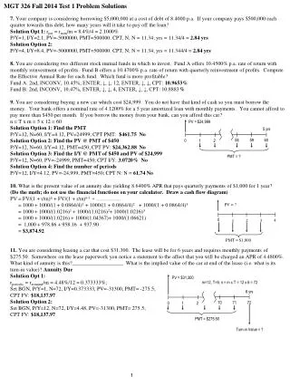
The function PMT
The function PMT. Calculates the payment for a loan based on constant payments and a constant interest rate. PMT (rate, nper, pv, fv, type). rate: the interest rate for the loan. nper: the total number of payments for the loan.

The function PMT
E N D
Presentation Transcript
The function PMT Calculates the payment for a loan based on constant payments and a constant interest rate.
PMT (rate, nper, pv, fv, type) rate: the interest rate for the loan. nper: the total number of payments for the loan. pv:the present value, or the total amount that a series of future payments is worth now; also known as the principal. fv: the future value, or a cash balance you want to attain after the last payment is made. If fv is omitted, it is assumed to be zero, that is, the future value of a loan is 0. type: the number 0 (zero) or 1 and indicates when payments are due.
NOTE THAT: Set type equal toIf payments are due 0 or omitted At the end of the period 1 At the beginning of the period Remarks Make sure that you are consistent about the units you use for specifying rate and nper. If you make monthly payments on a four-year loan at an annual interest rate of 15 percent, use 15%/12 for rate and 4*12 for nper. If you make annual payments on the same loan, use 15 percent for rate and 4 for nper.
CHARTS A chart is a graphic representation of data in a worksheet. The chart is based on descriptive entries called category labels, and on numeric values called data points. The data points are grouped into one or more data series that appear in row(s) or column(s) on the worksheet.
CHART TYPES Line chart: chart that plots one or more data series in lines that connect the data points.
Pie chart: effective for showing proportions. That means not a lot of information. * Exploded pie chart: pie chart that separates one or more slices of the pie for emphasis* 3D pie chart: pie chart that has a dimension for the height of the chart. Can be exploded or non-exploded format.
Column chart: most commonly used chart type and is used to show the changes in data over a period of time or illustrate comparisons among items. * 3D column chart:a column chart that has a dimension of depth to the columns. * Stacked columns: chart that displays multiple data series in stacked columns as opposed to side by side.
Step 1: Identify category labels, data values and data range Category Labels (X axis) : Descriptive category (e.g. / B3:E3) Data Values (Y axis) : Quantitative category (e.g. / B7:E7) Data Range : Category Labels, Data Values (e.g. / B3:E3, B7:E7)
How To Draw Charts In Excel 2010First of all make sure that there is some data in your excel sheet and that your excel sheet does not contain any blank cells between the different columns, then click the Insert menu and choose the chart type that you wish to draw.
Once the chart is drawn, it becomes very easy to change the attributes, right-click the chart and you will see the options for changing chart types, data, and other formatting.
ANATOMY OF A CHART • Category axis • Chart Area • Chart Title • Value Axis • Series 1 • Plot Area • Major gridlines (Scale) • Data Series (Series 1) • Data Labels (Show value) • Legend • Chart Options (Step 3 of chart wizard)
Chart Plot Area The area that is covered by a specific chart is called the chart plot area. By default Excel draws charts according to the default configuration, but its very easy to edit the plot area, simply right-click the chart and choose the Format PlotArea option. Now you will see a dialogue box which lets you set the chart’s fill style, borders, Glow and soft Edges, and 3-D effects.
Embedded Charts and Chart Sheets A chart can be stored aspart of a worksheetorin a separate chart sheetstill in the same workbook. In both ways the chart is linked to the source data on the worksheet, which means the chart is updated when you update the worksheet data. In order to set the chart to change while the values of some particular cells changes, right-click the chart and choose the Select Data option, and then select, and add the fields that you wish to include in this process.
MULTIPLE SERIES The charts presented so far displayed only a single data series. It is sometimes necessary to view multiple data series on the same chart.