Download
1 / 4
40 likes | 116 Vues
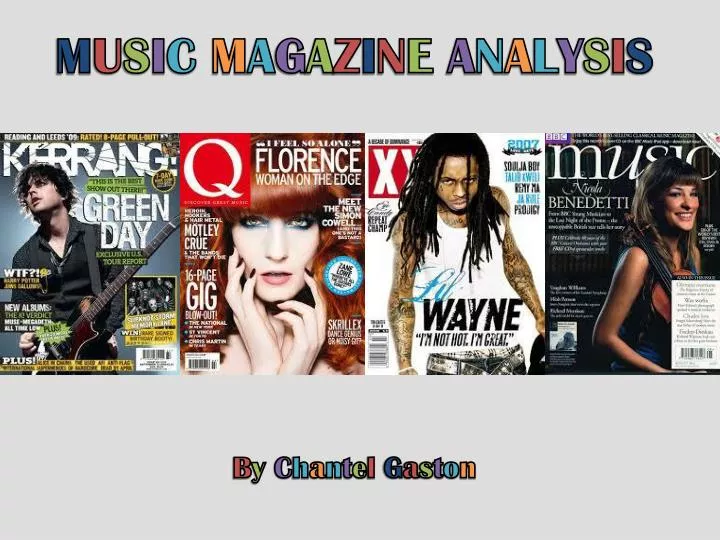
M U S I C M A G A Z I N E A N A L Y S I S B y C h a n t e l G a s t o n. K E R R A N G M A G A Z I N E A N A L Y S I S.

E N D
MUSICMAGAZINEANALYSIS ByChantelGaston
KERRANGMAGAZINEANALYSIS The magazine title ‘Kerrang!’ is a use of onomatopia connotes the twang of a guitar, and the magazine is based on bands/artists that regularly play guitars because they are usually rock/punk/pop-punk. It also has a smashed glass effect which makes that title have an edge and links to the explosive features. The red underlay behind the text also gives it a slight 3D effect and makes it pop out more to the reader. The use of dynamite in her hand and the fiery orange, red and yellow background link to the caption of this artist setting ‘the world on fire’, they also link to the caption ‘get ready to explode’. All this reference to explosion and fire connote that the artist is new but have obviously become very popular very quickly in the pop-punk world. The hand has a slight 3D effect which looks like it’s coming out of the picture, this grabs the reader and makes them feel more targeted.
ROLLINGSTONEMAGAZINEANALYSIS Her head covering the title shows that it’s a well known magazine and doesn’t need to have it’s title as a focus of the cover. It’s quite a simplistic cover, not much writing, just a few bold headlines. Black and white with splashes of red that link with the ‘rolling stone’ title. She’s shielding her face from the sun, it’s quite a casual action, makes the photo less posed. The darkness by the side of her and the shadow cast behind her makes her look brighter and more of a focus on the page. Modern day icon contrasts with the black and white style of the cover. Also, her swimsuit and whole style looks quite vintage, perhaps 50’s inspired.
BILLBOARDMAGAZINEANALYSIS “Future’s so bright” links to the diagonal stream of light as it could connote that the bright future is shining on him, or it could connote that his bright future is breaking through. The white font contrasts with the deep vivid colours in the background and of the artist. The yellow connotes brightness and happiness, so adds more colour to the cover. Him wearing sunglasses shields his eyes and creates an air of mystery to the photo. The colours are very vivid and bright and make the cover look more eye-catching and bold and Bruno Mars definitely stands out more against the page. The text is very minimal on this cover because it’s dominated by the title, the artists name and the picture of the artist.