Math In The Science Classroom
This guide provides essential strategies for educators to minimize math errors in the classroom. Key practices include keeping a clear paper trail of information, using visual aids like arrows, and ensuring answers are stated clearly with units. It also addresses common misconceptions, such as misunderstandings around number size and units of measurement. The guide emphasizes critical concepts in statistics and probability, including the interpretation of graphs and the importance of accurate data presentation. By understanding these principles, teachers can foster better mathematical understanding among students.


Math In The Science Classroom
E N D
Presentation Transcript
Guidelines for Preventing Math Errors • Keep track of all information (paper trail). • Use visual keys, such as arrows. • Keep track of units. • State answer clearly, WITH UNITS. • Check that your answer makes sense.
You have a bowl with 2 oranges and 3 apples. If you reach into the bowl without looking, what is the probability that you will grab an orange? Or is it 2/3?
Examples of Math Misconceptions • 1/3 vs. 1/8 - which is bigger? • Belief - Larger denominator is bigger. • 2.36 vs. 4.2 - which is bigger? • Belief - Numbers with more digits are bigger. • g vs. mg - which is bigger? • Belief - More letters mean bigger units.
Examples of Math Misconceptions • Numbers with more digits are bigger • 2.36 vs. 4.2 • More letters mean bigger units • g vs. mg • Multiplication by 10 adds a zero • 2.36 x 10 = 2.360
Powers of Ten – Gahh! Distances Dilutions Environmental Science
Statistics:Correlation vs. Causation • Belief: Fluoridated water causes cancer. • Nations that add fluoride to their water have a higher cancer rate than those that don't. • Belief: Marriage is bad for your health. • In Alabama, counties with higher divorce rates generally have lower death rates.
Probability Misconceptions • Genetic probabilities • Health probabilities
Mammography Statistics • The probability that a woman has breast cancer is 1%. • If a woman has breast cancer, the probability that she tests positive is 90%. • If a woman does not have breast cancer, the probability that she nevertheless tests positive is 9%. A woman has a positive mammogram. What is her risk of actually having breast cancer? A. Out of 10 women with a positive mammogram, ~9 have breast cancer. B. Out of 10 women with a positive mammogram, ~1 has breast cancer. C. The probability that she has breast cancer is about 1%.
"There are three kinds of lies: lies, damned lies, and statistics." Sounds more impressive than cutting the risk from 2.8% to 1.5%, doesn’t it?
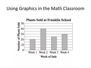
Graph Interpretation Problems • Graph vs. picture • Slope vs. height • Disconnect from data tables
What type of graph should I use? • Line Graphs • Plot related data points. • Bar Graphs • Emphasize individual data points. • Pie Charts • Compare parts, or percents, of a whole.
What’s wrong with this graph? • Inadequate (and inaccurate) title • Axes poorly labeled – units? • No grid • Inappropriate scale
What’s wrong with this graph? • No title • Axes poorly labeled – units? • Not well-gridded for interpretation • Should this be a straight line?
The Case of the Missing Workers Measurements Graphing
What do we need to know? • Where is the ulna? • How will we measure it? • How will we analyze the data?
I have not failed. I've just found 10,000 ways that won't work. - Thomas A. Edison