Principles of Composition
520 likes | 711 Vues
Principles of Composition. Helping to create successful photographs. What is photographic composition?. Photographic composition is the pleasing arrangement of subject matter elements within the picture area. Why do my photographs need good photographic composition?.

Principles of Composition
E N D
Presentation Transcript
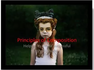
Principles of Composition Helping to create successful photographs
What is photographic composition? • Photographic composition is the pleasing arrangement of subject matter elements within the picture area.
Why do my photographs need good photographic composition? • By developing photographic compositional skills, you can produce photographs that suggest movement, life, depth, shape and form, recreating the impact of the original scene.
What makes the composition good? • Good or correct composition is impossible to define precisely. • There are no hard-and-fast rules that ensure good composition in every photograph. • There are only the principles and elements that provide a means of achieving pleasing composition when applied properly.
Principles and Elements Of Good Photographic Composition
Centre of Interest (Focal Point) • The area of a picture which first captures the viewer’s attention. • Each picture should have only one principal idea, topic, or centreof interest to which the viewer's eyes are attracted. • When the picture has one, and only one, dominant "point of interest," the viewer quickly understands the picture.
Where is the Centre of Interest in this photograph by Brian Day? Centre of Interest
Where is the Centre of Interest in this photograph by Susanna Majuri? Centre of Interest
Subject Placement • Sometimes good composition is obtained by placing the centreof interest in the centreof the picture, creating a formal and balanced photograph. Sally Mann TerezaVlckova WARNING: BE CAREFUL as it can sometimes divide the picture into equal halves and make the picture uninteresting.
The Rule of Thirds • Is a good general guide for placing your centre of interest. • In the rule of thirds, the intersection of lines that divide the picture area into thirds are marked by O’s (fig.5-5). One of these points is a good location for the center of interest.
How has Benoit Paille used the Rule of Thirds to compose this photograph? Centre of Interest
How has Nick Knight used the Rule of Thirds to compose this photograph? Centre of Interest
Simplicity • Simplicity is the key to most good pictures. The simpler and more direct a picture is, the clearer and stronger is the resulting statement. • Instead of photographing an entire area that would confuse the viewer, frame in on some important element within the area. • A last point of simplicity-tell only one story. Select a viewpoint that eliminates distractions so the principal subject is readily recognized.
Photographers using Simplicity to create effective photographs: Loretta Lux ShirinNeshat Fiona Pardington
Viewpoint and Camera Angle • The proper viewpoint or camera angle is an important factor in good composition. It can also help to change the ‘reading’ we have of the subject matter. • “Viewpoint” is the camera position in relationship to the subject. • "Camera angle" is the angle in which the camera lens is tilted.
Elliot Erwitt used a Low Viewpoint (worms-eye view). This adds interest to the photograph and makes the subject more imposing to the viewer.Notice he has used a straight camera angle.
Susanna Majuri also employed a Low Viewpoint (worms-eye view) when composing this photograph.Notice that the camera angle is slightly tilted-up.
Wolfgang Tilmans & AbelardoMorell used a High Viewpoint (birds-eye view). This captures a different range of information and makes the viewer feel more powerful and perhaps voyeuristic over the subject matter.
Balance • Balance in photographic composition is a matter of making pictures look harmonious. • Composition is kept in balance by two different methods: symmetrical, or formal, balance and asymmetrical, or informal, balance.
Symmetrical balance • Symmetrical, or formal, balance in a photograph is achieved when elements on both sides of the picture are of equal weight. • The idea of formal balance can be related to a seesaw. When there are two equally weighted objects on the seesaw and they are equidistant from the pivot point, the board will be in balance.
Ruud Van Empel & Erwin Olaf both employ symmetrical balance in composing their photographs.
Asymmetrical balance • Asymmetrical, or informal, balance is usually much more interesting than symmetrical balance. • Instead of mirror images on each side of the picture area, the subject elements are notably different in size, shape, weight, tone, and placement. • Asymmetrical balance is introduced when the presumed weight of two or more lighter objects is equalized by a single heavier object placed on the other side of the imaginary pivot point.
Francesca Woodman & Oleg Oprisco both employ asymmetrical balance in composing their photographs.
There are many other factors to consider in order to make pictures appear balanced. Some of these are as follows: • Objects in the upper part of a picture seem heavier than objects of the same size in the lower part of a picture. • An object far from the center of the picture seems to have more weight than one near the center. • Isolation seems to increase the weight of an object • Intensely interesting objects seem to have more compositional weight. • Elements on the right side of an asymmetrical picture appear to have more weight than elements of the same size on the left side of the picture. • Regular shapes seem to have more weight than irregular shapes. Philippe Halsman
Lines • Lines can be effective elements of composition, because they give structure to your photographs. • Lines can unify composition by directing the viewer's eyes and attention to the main point of the picture or lead the eyes from one part of the picture to another. • Lines that lead the eye or direct attention are referred to as leading lines. A good leading line is one that starts near the bottom corner of the scene and continues unbroken until it reaches the point of interest.
Laurence Aberhart used leading lines to direct the viewers eye to the centre of interest, the angel.
Vertical, diagonal, horizontal, and curved lines create different moods: Vertical lines communicate a sense of strength, rigidity, power, and solidarity to the viewer as seen here in Wilma Huskainen’s photograph.
Vertical, diagonal, horizontal, and curved lines create different moods: Horizontal lines represent peace, tranquillity, and quietness as seen in HengkiKoentjoro’s photograph.
A generally accepted practice is to use a vertical format for pictures having predominantly vertical lines and horizontal format for pictures having predominantly horizontal lines. Again, this is a generally accepted practice, NOT a rule. RiittaPäiväläinen and Olivia Parker ‘break the rules’.
Vertical, diagonal, horizontal, and curved lines create different moods: Diagonal lines represent movement, action, and speed. A picture with diagonal lines conveys a feeling of dynamic action even when the subject is static, as seen in James Welling’s photograph.
Vertical, diagonal, horizontal, and curved lines create different moods: Curved lines present a sense of grace, smoothness, and dignity to a photograph. The most common curved line is the S curve as seen in Werner Bischof’s photograph.
Pattern • Creating your pictures around repeating elements or patterns provides picture unity and structure. • Pattern repetition creates rhythm that the eyes enjoy following.
Motoi Yamamoto & Gabriele Basilico both capture repeating elements that create a sense of pattern in their photographs.
Lighting • Lighting is also an important creative element of composition. • By controlling the light and directing it where you want it, you can subdue objects or distracting elements in the scene to give more emphasis to the main point of interest.
Camille Vivier uses lighting to highlight her centre of interest and to diminish the importance of the negative space/background.
Shadows can help to create a sense of 3 dimensionality in photographs. From a compositional standpoint, black shadows can be very useful in balancing a scene and directing attention to the point of interest. Abelardo Morrell uses shadow to heighten the sense of drama and theatricality to the photograph.
Texture • Texture helps to emphasize the features and details in a photograph. By capturing "texture" of objects being photographed, you can create form.
Peter Peryer and Marcel Christ both capture varying textureswithin their photographs.
Tone • Tone may consist of shadings from white-to-gray-to-black, or it may consist of darks against lights with little or no grays. • The use of dark areas against light areas is a common method of adding the feeling of a third dimension to a two-dimensional black-and-white picture. • The interaction of light against dark shades in varying degrees helps to set the mood of a composition.
Aaron Siskind & NelliPalomaki have differing tonal ranges in their photographs. The strong contrast in Siskind’s work helps to heighten the sense of drama. Palomaki’sgentle tonal-range gives form and softness to the photograph.
Contrast • Positioning of subject elements to create contrast gives them added emphasis and directs the viewer's attention. • When we speak of contrast as it relates to composition, we are referring to tonal contrast, as in black-and-white photography; contrast is the difference in subject tones from white-to-gray-to-black or from the lightest tone to the darkest tone.
Olivia Parker & Damion Berger have different contrasts in their photographs. Their is strong contrast in Berger’s work and much less in Parker’s.
Framing • Framing is another technique photographers use to direct the viewer's attention to the primary subject of a picture. • Positioned around the subject, a tree, an archway, or even people, for example, can create a frame within the picture area. • Subjects enclosed by a frame become separated from the rest of the picture and are emphasized.
Arthur Tress uses architecture to frame off a distant figure, drawing attention to that area of the photograph. Annette Messager uses actual frames to suspend cropped images of the human body in a photography installation.
Foreground • A large percentage of otherwise good pictures is ruined, because they include unnecessary or distracting foreground. • This common fault is usually the result of the photographer standing too far away from their subject. • BE VERY CAREFUL!
David Hilliard ensures that everything in the foreground and background is pleasing compositionally and adds meaning and balance to the photograph.
Perspective • In photography, perspective is another illusion you use to produce photographs of quality composition. • Use all elements to create perspective • Line (ie vanishing point) • Height on the foreground (the higher up an element is physically on the foreground the further away it looks) • Overlapping elements • Diminishing size (elements of the same size will appear smaller the further away from the viewer they are) • Lighting (darker / greyer objects appear further from the viewer)
RiittaPäiväläinen uses lines of perspective to create a sense of space and vastness in her photograph. Lines of perspective and diminishing scale create a sense of 3-dimensionality.