Download
1 / 63
630 likes | 800 Vues
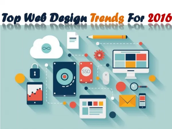
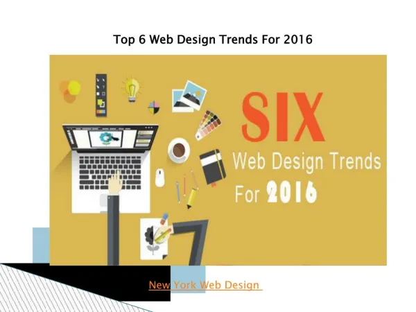
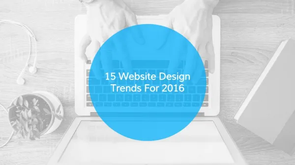
If you’re not ahead of the times, you’re behind them. Welcome to the visual guide to web design trends in 2016. The web teems with innovative design and content approaches, so we’re sure we missed something. Let us know what you’ve seen this year — and what you’d like to see even more of. To Know more visit us at: https://maansoftwares.com/!

E N D
Hottest Trends That Will Shape Web Design Come 2016 • Trends in web design, like fashion trends, come and go. Sometimes trends are dictated by necessity (like responsive design). Other trends are industry shifts, such as the change from skeuomorphism to flat design. • It’s tough to predict which exact trends will draw the greatest attention. Yet recent history shows a pattern of trends that have been growing like wildfire. We’ve organized some unique trends that have gained traction over 2015 and will likely continue well into 2016. • As time inches forward with each passing year, many new design trends loom on the horizon. The field of web design is always changing with new tools, workflows, and best practices for constructing usable layouts • These 15 trends — 14 for this year, plus 1 for the future — respond directly to the evolving ways we move through the web.
1. Microinteractions
“There are three responses to a piece of design – yes, no, and WOW! Wow is the one to aim for.”
Microinteractions • Well-designed microinteractions can be defining because, despite their simplicity, they’re often very powerful. • Pinning an inspirational photo, liking a witty status, and retweeting a powerful message have become so common we don’t even need to name the websites that birthed them. • When done right, microinteractions offer an intuitive way to interact with a website. When done wrong, they can cause frustration through unexpected functionality — or downright quirkiness. As we designers streamline our web experiences, we’ll see — and create — more microinteractions to help us simplify the actions we need to take.
2. Reliance on images over text
“Content precedes design. Design in the absence of content is not design, it’s decoration.”
Reliance on images over text • Solid copy strengthens any website, but if it can be said with a photo, animation, or short video, it might be a really good idea to do so. • In general, text works best for removing the ambiguity that visual methods of communication are prone to. • If you want to design and publish in an accessible way that prioritizes every user’s experience, you’ll want to pair visual and written content. That way, everyone can experience your content in the best way for them.
3. Designing with real data
“Create your own visual style… let it be unique for yourself and yet identifiable for others.”
Designing with real data • Like the appliances in a model home, mockups are about as functional as a cardboard television. • Designing with real data gives us a deeper understanding of how a page will function. In part because it surfaces all the “problems” designers strive to avoid in their mockups, such as long headlines, low-quality images, etc. • Designing with real content gives both writers and designers better insight into what they need to do.
4. Scroooooooooolling
“Great web design without functionality is like a sports car with no engine.”
Scroooooooooolling • With the multitude of screen sizes out there, the term “above the fold” has lost significance. • Eye-catching transitions and differentiated section designs transform what could be a monotonous trudge into a delightful process of discovery. • Long scrolling changes UX design, opening the door for more narrative approaches and simpler interaction models.
5. Conversational/bot websites and apps
“It’s through mistakes that you actually can grow. You have to get bad in order to get good.”
Conversational/bot websites and apps • Nobody wants to navigate a complex series of menus to get something done. Conversation makes for a much easier experience. • Apps and other web services are using this more natural approach to make ordering goods, getting financial advice, or booking a hotel room as easy as sending a few text messages. • Plus, various tools have popped up to help non-coders make their own bots, so we’re likely to see tons more of these over the coming years. • After all, in most cases, there’s already a well-built design wrapping the conversational experience. That means the words themselves become the core UI.
6. The death of the hamburger menu
“Intuitive design is how we give the user new superpowers.”
The death of the hamburger menu • Hamburger menus are polarizing. Much like election-year politics, we don’t recommend discussing them after a few drinks in mixed company. Especially if said company includes UX designers. • But from a usability standpoint, hamburger menus have their problems. Few people even recognize the icon. And even those who do recognize it don’t know what to expect when the menu opens, given all the ways that interaction can unfold. • Finally, they also conceal a site’s breadth, thereby voiding individual page’s context and place within the larger whole. • With navigation visible on-screen, people can easily get the lay of the land and see their options. Without it, that big-picture orientation gets much harder.
7. Desktop push notifications
“Never fall in love with an idea. They’re whores. If the one you’re with isn’t doing the job, there’s always, always, always another.”
Desktop push notifications • We’ve all experienced the power of push notifications. No matter where you are or what you’re doing, it’s so hard to ignore that little ding or buzz. So hard to not whip out your phone and engage with whoever’s pinging you. • many websites are trying to bring that power to the desktop. If you haven’t seen it yet, this usually manifests as a little modal-like element sliding down from the top of the browser, asking you if the site can send you desktop notifications, a la Slack. • It makes perfect sense: after all, here you are on the site, ready to engage with it. Why hope you’ll sign up for the newsletter and then hope you’ll actually open it, when they can just hit you up right here and now? • Perhaps the next year will see this technique refined to be more effective and helpful.
8. Product explainer videos
“Being good in business is the most fascinating kind of art. Making money is art and working is art and good business is the best art.”
Product explainer videos • Clocking in at around 90 seconds, product explainer videos offer a quick, concise way to tout the virtues of a given product. • With informative voiceovers and clever animations, product explainer videos can work for any-sized company in letting people know just why their products are great. • One thing brands will have to keep in mind when using such videos is their inaccessibility to some audiences if captions aren’t included. • Plus, many people simply refuse to watch videos on marketing sites, so you don’t want to lean on videos to explain everything.
9. Duotones
“Design is a plan for arranging elements in such a way as best to accomplish a particular purpose.”
Duotones • Duotone images are created by “printing” a grayscale image with a second, non-black color. The technique has its origins in printing and fits well within a minimalist web design aesthetic. • Duotone images make great hero backgrounds because they add some life without unduly distracting from the content, or creating legibility issues. • A simple duotone color scheme can also be a great way to create a clean, consistent-looking page — particularly when you’re trying to present several very-different images in the same place (such as logos or team member headshots).
10. Custom illustration and iconography
“The life of a designer is a life of fight. Fight against the ugliness. Just like a doctor fights against disease. For us, the visual disease is what we have around, and what we try to do is cure it somehow with design.”
Duotones • Yes, you can find tons of well-designed stock visuals to use in your designs. But to really set yourself apart, you need to create something unique. • Having someone create visuals and iconography customizes your website and projects your personality. Plus, it shows that you really put time and care into this design. • Stock graphics are one of the hallmarks of the boring homogeneity many people perceive in the web design world. • Creating custom visuals that speak directly with and to your content offers one way out of the fast food design trap. Here’s hoping we see much, much more of this.
11. Stylized typography
Stylized typography • A minimalist design approach leaves room for more artistic uses of type. Extremes in sizing, custom typefaces, traditional fonts used in unconventional ways, and highly stylized lettering can all have a huge impact. • Combining font sizes can have a huge impact on the look and organization of a page. Single words can take up an entire page. • Using vastly different sized fonts creates hierarchy, which in turn supports people in their efforts to understand a website and find the content they want. • It can be overkill to fill a page with flourish-rich fonts, but when used tastefully, this kind of typography can create a strong mood and bring life to a page. • While custom fonts help create a dramatically more diverse and beautiful web, they can also negatively impact performance. Let’s just be thankful that today’s system fonts are a far cry from Arial and Helvetica.
12. Vibrant color schemes
“Never fall in love with an idea. They’re whores. If the one you’re with isn’t doing the job, there’s always, always, always another.”
Vibrant color schemes • As flat and minimalist design have gained popularity, bright colors have been on the rise too. • As noted by sitepoint.com, these more vibrant color schemes aren’t limited to just web design, but can be found in fashion design, weathercast graphics, and interior design. • Card or container layouts have become more popular and using vibrant colors in these blocks creates a bold layout. • Bright colors also help UI elements like buttons and navigation jump out from a page. Finally, bright palettes can have a strong brand affect — you can’t really think of Huge without thinking “bright pink,” or Google without “primary colors.”