Understanding Data Analysis in Physics
Learn about measuring and recording data, scientific laws and theories, precision vs. accuracy, types of graphs in physics, and how to determine relationships in scatter plots. Enhance your data analysis skills!

Understanding Data Analysis in Physics
E N D
Presentation Transcript
SCIENCE is… The search for relationships that explain and predict the behavior of the universe.
PHYSICS is… The science of matter and energy and of interactions between the two.
There is no such thing as absolute certainty of a scientific claim. • The validity of a scientific conclusion is always limited by: • The Experiment • design, equipment, etc... • The Experimenter • human error, interpretation, etc... • Our Limited Knowledge • ignorance, future discoveries, etc...
Scientific Law a statement describing a natural event Scientific Theory an experimentally confirmed explanation for a natural event Scientific Hypothesis an educated guess (experimentally untested)
Metric System developed in France in 1795 a.k.a. “SI” - International System of Units The U.S. was (and still is) reluctant to “go metric.” very costly to change perception of “Communist” system natural resistance to change American pride
The SI unit of: length is the meter, m time is the second, s mass is the kilogram, kg electric charge is the Coulomb, C temperature is the degree Kelvin, K an amount of a substance is the mole, mol luminous intensity is the candle, cd
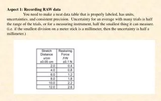
All measurements have some degree of uncertainty. Precision single measurement - exactness, definiteness group of measurements - agreement, closeness together Accuracy closeness to the accepted value accepted - observed accepted % error = x 100%
Example of the differences between precision and accuracy for a set of measurements: Four student lab groups performed data collection activities in order to determine the resistance of some unknown resistor (you will do this later in the course). Data from 5 trials are displayed below. Suppose the accepted value for the resistance is 500 Ω. Then we would classify each groups’ trials as: Group 1: neither precise nor accurate Group 2: precise, but not accurate Group 3: accurate, but not precise Group 4: both precise and accurate
Histograms This type of graph is usually used to compare amounts in various categories that do not make a sequence. I only put this graph here because some of you will want to draw one. I cannot think of a time in our class when we will use a histogram. Don’t do it.
Line Graph While common in economics classes, line graphs are unusual in physics, except during the first month of the course. We will use these graphs to show idealized distances, speeds, and accelerations when doing kinematics problems. Draw this type of graph when you have a simple kinematics problem that gives idealized data. You will not draw this type of graph to analyze data taken from an experiment.
Scatter Plot This is the most common type of graph used. 99% of the time, when I say to draw a graph, this is the type of graph I mean. Physicists and other scientists use these graphs as a tool to analyze their data, not just as a display method for their results. This type of graph has data points individually marked on the graph, without any connecting lines. This way you only show the actual data points you took during the experiment. In physics, time is never on the vertical axis of a graph. Time is the ultimate independent variable because we have no control over it. So when time is one of the values you are graphing, it always goes on the x-axis.
Scatter Plot Notice that the points do not all line up on a simple line. Whenever you do an experiment, there is some amount of uncertainty. But we always assume that there is a simple relationship underlying the complex data. To get at that simple relationship, we use the graph to determine a best-fit line. The equation of the best-fit curve then gives us what we take to be our simple relationship.
Scatter Plot Determining a best-fit line for a collection of data: • The simplest way is to just use a ruler to “eyeball” a straight line that comes as close to as many of your data points as possible. Then you can use the line on your graph paper to calculate the slope and y-intercept for your best-fit line. • You can also use computer or calculator programs to mathematically figure a best-fit line.
Using the Scatter Plot Graph Once you have the best-fit line and the slope/intercept equation, you are not finished. The most important part of your analysis is to translate from the math equation into a physics relationship.
Goal is to take data put it into a graph to identify the relationship using y=mx+b To find the relationship replace the x and y variables with the physics quantities they represent and then figure out a physical meaning for the slope and y-intercept. In the graph, the equation of the line is y = 1.3x + 0.64.
Using the Scatter Plot Graph Once you have the best-fit line and slope/intercept equation, you are not finished. The most important part of your analysis is to translate from the math equation (y= mx + b) into a physics RELATIONSHIP. That means to replace the x and y variables with the physics quantities they represent, and then to figure out a physical meaning for the slope and y-intercept.
Analyzing the Graph Step 1 Whatever quantity you plotted on the vertical axis Step 8 Use the units from Step 6 to figure a physical meaning for the slope Step 2 Whatever quantity you plotted on the horizontal axis Step 7 The value of the y-variable when the x-variable is zero Step 3 The units from the vertical axis Step 4 The units from the horizontal axis Step 5 The units from the vertical axis (always the same as Step 3) Step 6 The units from Step 3 divided by the units from Step 4 Now as you read across the line titled “Physic words,” it reads as a complete sentence. Thus your conclusion about physical quantities!
Analyzing this Graph Step 1 Step 8 Step 2 Step 7 Change in speed per time Speed Time Initial speed Step 3 Step 4 Step 5 Step 6 m/s m/s/s s m/s
What if the line isn’t straight? The trick is to change one of the axes of the graph so that your new graph does look like a straight line, then analyze it just as we did above. In the graph shown here, the data points are curving upward, meaning that the distance is increasing faster than the time. In other words, when the time doubles, the distance more than doubles. In this case we need to increase the time axis somehow so that it “keeps up with” the distance.
What if the line isn’t straight? You might have to try several graphs with different time axes, but eventually you’ll find that if you graph distance vs. the square of the time, the line will come out straight. Then we analyze that graph as usual, remembering that the x-axis is not time in this case, but the square of time.