T3 Gadget magazine
60 likes | 332 Vues
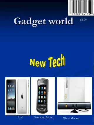
T3 Gadget magazine. Magazine analysis. Layout. Masthead. Main Image. The layout of the magazine as very simple and clear which makes it easier for the ‘target audience’ to pick out the magazine from a selection.

T3 Gadget magazine
E N D
Presentation Transcript
T3 Gadget magazine Magazine analysis
Layout Masthead Main Image • The layout of the magazine as very simple and clear which makes it easier for the ‘target audience’ to pick out the magazine from a selection. • The main picture (the girl) is centred and in it’s own space so it is ‘the centre of attention’. • The masthead (title) of the magazine is at the top so you can see it easier in a shop. • Like on the magazine the barcode is positioned on the front so customers can see the price easier. Barcode
Use of images • At the centre of the magazine there is a very obvious picture of a model. The purpose of this is to draw people into looking at the magazine. More people see it, more people buy it. • Dotted around the magazine are also pictures of the gadgets featured within the magazine. The use of the pictures gives the audience a ‘preview’ of what’s going to be inside a magazine. Also if your looking for a magazine, in particular to do with iPhones, a picture is more likely to catch your attention rather than lots of text.
Text • The number 50 at the bottom is in a large text size. This acts as almost a sell line showing the customer there's lots in the magazine. • All the text on the front cover is at a maximum of a few words, which enables for a cleaner look and easier read. • The top banner of the magazine showcases what it’s about, generally this is the case with most magazines.
Colour and fonts • On the front cover of this magazine there are a lot of different fonts, sizes and colours. Personally I think there’s slightly too much variation in the fonts, also some don’t seem to merge very well together. Although saying this the fact they don’t merge together makes certain parts stick out like ‘iPhone killers’ which would draw my attention. • T3 has a colour scheme based around six different colours within their magazine. Red is used for titles as it stands out more than a lighter colour would over a background. The subtitles and small details are in orange. At the top of the page the text switches tones in between black and white. This is probably to give a more artistic/interesting effect and also helps it stand out from the white background.
Target audience • The target audience of this magazine is most likely an age range in the 40’s and for people who of course are interested in gadgets and technology. Although the picture of the girl show’s no relevance to both the magazine or target audience it draws peoples attention to the magazine which would lead to more sales. Also including apple, particularly the iPhone ,would draw a ‘gadget lovers’ attention.. For example the ‘iPhone killer’ even if you dislike iPhones you would still be intrigued about what would kill off such an iconic phone, thus drawing you into buying the magazine.