Download
1 / 10
100 likes | 210 Vues
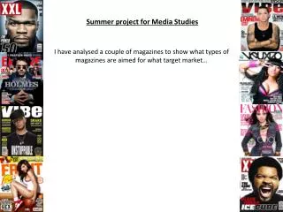
In this analysis by Sam Hill, we explore the essential design elements of a celebrity magazine. Focusing on the front cover's gridded layout that organizes stories and engages readers, the piece discusses the importance of vibrant imagery that evokes happiness and encourages purchases. Additionally, the article examines the strategic use of color, such as red, blue, and white, to convey freshness and emotional resonance. We delve into font choices that enhance readability and establish a sophisticated tone, while emphasizing the need for compelling content within the magazine to maintain reader interest.

E N D
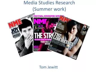
Media Studies Summer WorkMagazine Analysis By Sam Hill
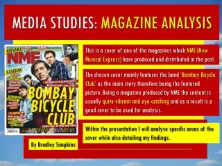
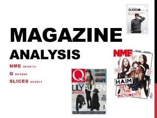
The Layout As you can see, the layout of the front cover is using a gridded technique to separate the different stories. Using this method as well as others being used, such as the style of the writing having a mixture of fonts. Not only does that make it look funky and relevant to the reader but it shows professionalism.
Use of Images Producing Images on a celebrity magazine has a very important job. If the reader see’s boring images, he/she isn’t going to buy it. The magazine is inducing me to buy it. For obvious reasons it is showing happy people, giving the mood of happiness to the reader to open the magazine. The images have also done very well to blend into the text used.
Choice of Colour Nobody wants to see a black and white magazine with boring features do they? What colours can you see on this front cover?The types of colours used, decides the mood of the magazine. In this magazine, red, blue and white suggest the magazine being fresh and new. It also fits in with the relationship photos of celebrities (red being the colour of love)
The cover Would you buy this magazine? Most girls would… To me, this magazine took my attention straight away. It’s colourful, neat, has a happy feel to it and looks interesting to read. The front cover consists of…..
Sell Line Masthead Dateline Main image Other cover lines Main Cover line Barcode
The Choice of font Using the colour black on the text, shows there page is not here to mess around and the text needs to be read. The font is very lady like and eloquent, suitable for the person reading to feel privileged to read it, so they feel they are getting their moneys worth. The font changes in different sections of the page. This separates the topics it wants to talk about to the reader.
Within the Magazine Now within the magazine you will find a mixture of stories about celebrities, fashion tips, advertisements on products to buy and much more… What’s inside the magazine is almost as important as the outside. Now if the reader picked up the magazine and found out that it was written by blind monkeys rather than professionals, the interest level is 0.
Within the magazine 2 Now it’s always great to see more than just text inside the magazine otherwise the reader gets bored and it might as well just be a celebrity newspaper. The Media love to follow up in current events, such as the London 2012 Olympics. If you are going to get customers, you must have something relevant that the reader can follow up on and relate to.