Download

1 / 42
420 likes | 555 Vues
For the Practice Change Fellows Program September 28, 2007 Washington, DC Dennis A. Ehrich, MD, FACC Vice President for Medical Affairs St. Joseph’s Hospital Health Center Syracuse, New York. Measurement for Improvement. Agenda for the Morning. 1-Why Do We Measure in Health care?

E N D
For the Practice Change Fellows Program September 28, 2007 Washington, DC Dennis A. Ehrich, MD, FACC Vice President for Medical Affairs St. Joseph’s Hospital Health Center Syracuse, New York Measurement for Improvement
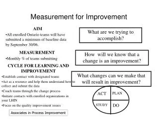
Agenda for the Morning 1-Why Do We Measure in Health care? 2-The Model for Improvement 3-Selecting one’s measures 7-Time ordered statistics and understanding variation 8-The run chart 10-Practical exercises 11-The control chart (if time permits)
The Model for Improvement Set aims that are measurable, time-specific, and apply to a defined population Establish measures to determine if a specific change leads to improvement Select changes most likely to result in improvement Test the changes T. Nolan et al. www.ihi.org
The Use of Iterative PDSA Cycles Implementing the Changes “Rapid-cycle CQI” T. Nolan et al. www.ihi.org
Spreading the Change 1-Planning and set-up 2-Spread within the target population 3-Continuous monitoring and feedback on the spread process T. Nolan et al. www.ihi.org
Donabedian’s Quality Triangle-It’s Relevance to Process Improvement -Avedis Donabedian, MD, MPH (1919-2000)
Donabedian’s Triad • Structure • Organization • People • Equipment/Technology • Process • The actual steps taken in accomplishing the change • Results must be client-focused • Must deliver results reliably • Outcomes • Clinical • Client perception or satisfaction • Financial
The Three Domains of Measurement Donabedian • Structural Measures • Process measures • Outcomes Measures • Balancing measures
The Three Domains of Measurement Donabedian • Structural Measures • Describe the environment. How many? • Square footage of a clinical unit • Number of staff • Staff qualifications and competencies • Presence or absence of technology and its characteristics • Process Measures • Process cycle time • The percentage of patients for whom the process achieves its desired result
The Three Domains of Measurement Donabedian • Outcome Measures • The impact of the change initiative on mortality, readmissions to the hospital, ED visits • The satisfaction scores of clients and staff • The cost per case, average LOS, revenue per case • Balancing Measures • Unintended outcomes that are consequences of the new program • Unanticipated mortality, morbidity or cost • Has the shifting of resources in an organization compromised other client or patient populations?
Aim Selecting A Measure Operational Definitions Data Collection Plan Data Collection Data Analysis The Quality Measurement Roadmap ACTION Modified from Lloyd, Robert: “Quality Health Care A Guide to Using Indicators”
Selecting a Measure: -When selecting a measure, have clarity as to whether the measure is one of structure, process or outcome -And select a balanced panel of indicators that reflect the dimensions of performance being evaluated and the change concept(s) being employed
What Dimension of Performance do You Want to Measure? Joint Commission (1996) Appropriateness Availability Continuity Effectiveness Efficiency Respect and caring Financial/Viability Safety Time lines
What Dimension of Performance do You Want to Measure? IOM: Crossing the Quality Chasm (2001) Safety Effectiveness Patient-centeredness Timeliness Efficiency Equity
What is the “Change Concept”? The Improvement Guide by Langley, Nolan, Nolan, Norman and Provost. Jossey-Bass Eliminate waste Improve work flow Shorten a waiting list Change the work environment Improve the Provider/Client interface Manage time Focus on variation Error proofing a process Focusing on product or service
Establishing Operational Definitions That Are Agreed Upon By All Stakeholders
Operational Definitions • Is clear and unambiguous • Specifies the measurement method, procedures and equipment when appropriate • Clinical data (chart reviews) vs. administrative data • Client logs vs. a computer database • Define specific criteria for the data to be collected • Define all inclusions and exclusions • For percentages or rates, or ratios, define the criteria for inclusion in the numerator and denominator • Always ask “How might somebody be confused by this definition?” Lloyd, R. Quality Health Care (2004) Jones and Bartlett
Examples of Unclear Definitions Lloyd, R. Quality Health Care (2004) Jones and Bartlett • Timely completion of the screening process • A complete medication list • The readmission rate • Medication error • Cost impact • From the acute care hospital • A patient fall • Surgical start time
Data Analysis • What descriptive statistics will be used? • Mean, median, mode • Minimum, maximum, range, standard deviation • Quantities, proportions (percentages), rates • How will data be displayed? • Bar chart, histogram, line chart, pie chart, Pareto diagram • Run chart, control chart
External Benchmarking Joint Commission CMS
Data Reporting • Data reporting plan • Who will receive the results • How often will they receive the results • How will the data be disseminated? • Printed reports • Email • Dashboard • Spider diagram
Displaying Time-Ordered Statistics and Understanding Variation
Tools for Displaying Time-ordered Data • Run charts • Plot of data over time with the median of the data set plotted as a center line • Control charts • Plot of data over time with the mean as the center line and with upper and lower control limits
Run Charts Easily constructed by hand or in available spreadsheet programs Provides a good idea of improvement in a change initiative Less sensitive to significant changes (special cause variation) than the control chart
Control Charts • More sensitive to special cause variation than a run chart • Requires specialized computer software to create • There are 9 types of control charts used in health care, depending upon whether the data collected is distributed normally, is continuous (numerical) or discreet (attributes) and whether the events measured are frequent or infrequent • Have their own set of rules to identify special cause variation
Understanding Variation • All data, collected over time, varies • Random variation (common cause) • The changes occurring are intrinsic to the process being measured • Non-random variation (special cause) • The changes are being imposed on the system by some external factor • May be unintended and un anticipated or may be by design
Hand-Drawing a Run Chart • Plot data points as a line graph on x-y axes, where “x” is the increment of time and “y” is the measurement. • Calculate the median value of the data set and draw that line on the chart • Sort the data from smallest to largest value • Count the data points. That count=N • If “N” is an odd number: Median=N+1/2. Begin counting from smallest to the largest number. When the count reaches N+1/2, that number is the median • If “N” is an even number: Median=The average of N/2 and the next number in the series. Begin counting from smallest to the largest number. When the count reaches N/2, stop and take the average of that number and the next number in the series. That average is the median
Calculating the Median Odd Number of Data Points 1 N=7 2 2 3 7 11 12 Even Number of Data Points 1 N=6 3 4 5 5 8 Median=N+1/2 =7+1/2=4 The median is the 4th number in the series, which is 3 Median=The avg. of the number that is N/2 and the next number in the series. =[4 (the third number in the series) +5 (the next number in the series)] / 2=4.5 Balestracci, D., and Barlow, J, Quality Improvement. 1998 Center for Research in Ambulatory Health Care Administration
Definitions • Sixteen of the eighteen observations are useful • There are 10 runs on this run chart • A run is 1 or more consecutive data points on the same side of the median line • A useful observation is one that does not fall on the median line
Testing for Special Cause Variation on a Run Chart Test 1. Are any runs longer than expected? If so, then that run represents a special cause. • If there are fewer than 20 useful observations, then 7 or more data points in a run indicate a special cause. • If there are 20 or more useful observations, then 8 or more data points in a run indicate a special cause.
Testing for Special Cause Variation on a Run Chart Test 2. Is there a trend? A trend is an excessively long series of consecutive increases or decreases in the data.
Applying Tests 1 and 2 Total number of data points=18 Number of useful observations=16 Test 1-Since there are < 20 useful observations it will take ≥ 7 data points in a run to cause a run to be “too long” defining special cause variation Test 2-Is there a trend? For 18 total data points, it will take ≥6 consecutive ascending or descending data points to define a trend.
Testing for Special Cause Variation on a Run Chart Test 3. Are there too few or too many runs in the data? • Determine the number of useful observations in your data set. • Use the following table to determine whether the number of runs in your data are within the expected range. If the number of runs is above or below the expected range, the data suggest special cause variation
Applying Test 3 Are there too many runs? Useful observations= 24. Number of runs= 8. Expected number of runs = 8-17. Therefore there is no evidence for special cause variation.
Testing for Special Cause Variation on a Run Chart KQC=Key Quality Characteristic Test 4. Fourteen or more points alternating above and below the median line is a saw tooth pattern indicate a special cause. When this pattern is seen, it indicates either that two different processes are operating at the same time and have been measured together; in which case stratification of the data would be helpful. Or, it may indicate tampering