Download
1 / 17
170 likes | 189 Vues
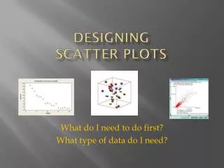
Learn how to create a scatter plot in Excel to visualize the relationship between weight and position. This example demonstrates how to multiply the weight values by the acceleration due to gravity and customize the chart's layout and properties.

E N D
In this example, the position of a hanger on a spring was measured (with respect to a Motion Sensor) as a function of the mass on the hanger.
Weight versus Position • We want to plot weight versus position so we multiply the masses by g=9.8 m/s2. • Also when we say weight versus position, we want weight on the y axis and position on the x axis. In Excel the quantity on the x axis should be in the first column used to make the graph. • So we will introduce a third column that is 9.8 times the numbers in the first column.
Data with third column and desired order – x data, then y data
Highlight the data columns (numbers only), and click the Insert tab, and in the Chart section , choose Scatter. Since we will add a “fit” to the data, we will choose Scatter with only Markers option (no lines).
With the chart highlighted, click on Layout in the Chart Tools section. Then choose Chart Title and make a selection (in this case Above Chart).
With the chart highlighted, click on Layout in the Chart Tools section. Then choose Axis Titles/Primary Horizontal Axis title and make a selection (in this case Title Below Axis).
With the chart highlighted, click on Layout in the Chart Tools section. Then choose Axis Titles/Primary Vertical Axis title and make a selection (in this case Rotated Title).
If you want to change what the Legend says, right click on it and choose Select Data …
Select a Series from the Select Data Source dialog box and click Edit. Then enter a name for the Series in the Edit Series dialog box.
To change the range of numbers and other properties of the axis, right click on the axis and choose Format Axis.
To control the range, chose the Fixed option and then enter the desired number.
With the chart highlighted, click on Layout in the Chart Tools section. Then choose Trendline/More Trendline Options
To change the font size of the fit equation, highlight it and choose the Home tab and use the font-size drop-down list.
If you want vertical gridlines – with the chart highlighted, click on Layout in the Chart Tools section. Then choose Gridlines/Primary Vertical Gridlines and make a selection (in this case Minor Gridlines).