Enhancing Student Engagement with Effective PowerPoint Presentations
This presentation by Lynne Pelletier explores how to create effective PowerPoint presentations that resonate with students. The focus is on avoiding common pitfalls, like overloading slides with information and prioritizing aesthetic appeal over core teaching goals. Pelletier shares insights on how the design of slides affects student engagement and retention, emphasizing the difference between business presentations and educational content. Strategies for improving slide design and content delivery are discussed to ensure presentations are informative and engaging.

Enhancing Student Engagement with Effective PowerPoint Presentations
E N D
Presentation Transcript
Make Presentations That Students Will Lve Lynne Pelletier lpelletier@walpole.k12.ma.us
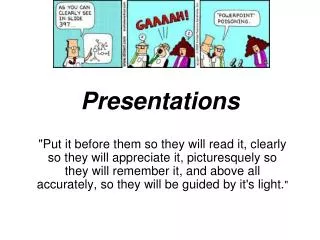
Powerpointless? PowerPoint is a tool that can be used well or poorly. More often than not, we unwittingly choose the latter.
Before we begin… A small caveat… • While PowerPoint has been around since 1989, the concept of studying PowerPoint’s effectiveness in the classroom is surprisingly new. • The research is kind of thin and is based mostly on student perceptions and performance in large, undergraduate lecture classes. • So, take everything I am about to tell you with a HUGE grain of salt.
One other caveat… • The suggestions that I offer in this presentation… I am not going to follow …
Our PowerPoint evolution We all start the same way: We learn how to create simple presentations, ones in which the message is more important than the medium. • These presentations are usually black text on a (default) white background with a mess of bullet points. • Remember?
Our PowerPoint evolution But, as our skills with PowerPoint improve, our focus shifts from the message to “gilding the lily.” • Content takes a back seat to the new goal of entertaining the audience. • We spend HOURS looking for the right sounds, pictures, or backgrounds to beautify our presentations.
Fixing the blame Part of the blame for this “lily gilding” focus lies with ourselves. • PowerPoint’s bells and whistles are downright sexy. • We (mistakenly) assume that bells and whistles improve our presentations—our presentations look better, so they must be better teaching tools.
Fixing the blame • Along the way, we forget that the primary goal of any classroom PowerPoint presentation isn’t to entertain but rather to teach. • And there is a HUGE difference between a business PowerPoint presentation and a classroom PowerPoint presentation.
The problem with PowerPoint • PowerPoint was originally designed for business communication, not teaching. • Business communication is all about entertaining. There’s practically no teaching involved. • Microsoft added those fancy backgrounds, animations, builds, transitions, etc. to PowerPoint not for you and me but for the business community.
The problem with PowerPoint • Why? Because by using PowerPoint’s fancy backgrounds, animations, builds, transitions, etc. a businessperson can • Impress you. • Close the sale. • Obscure the facts. • But somewhere along the way we became convinced that we needed to use PowerPoint’s special effects as well.
Time to be honest… When you create a PowerPoint presentation, do you spend more time on the content or on the bells and whistles?
Fixing the blame • So, part of the blame lies with us. • But, part of the blame also lies with the trainers and marketeers. • A four year old can create a basic PowerPoint presentation. • To create an “advanced” presentation, however, requires training or even special software (both at a price).
Too much writing • Common Problem:
& writing Too small • It was one of those summery days when the air is heavy and warm and nobody wants to do very much. Jonathan and Robbit were resting on top of one of Moley's hummocks, relaxing and watching the rest of the world go by. Jonathan could feel the sun's warmth through his shell and it was making him feel comfortable and drowsy. He wriggled contentedly. Last night, before he'd gone to bed, Jonathan had taken off his shell and given it a special polish, and this morning it gleamed in the sunlight. Beside him on the soft warm molehill, Robbit lay on his back, his paws behind his head, gazing up at the clear blue sky, thinking about things in his own rabbity way. • "Why do nettles have stings?" He asked suddenly • Jonathan had just begun to doze off, and woke with a start • "Why do nettles have what?" He asked, not quite awake. • "Stings," Robbit scratched one of his ears in a comfortable, absent-minded sort of way. • Jonathan pondered, his head tilted to one side as he thought. • "I suppose," He said eventually, "They have stings so nobody will eat them." • "That's silly," Said Robbit, "Nobody'd want to eat a rotten old nettle, anyway: they're all tough and stringy."
Common Mistake: • People tend to put every word they are going to say on their PowerPoint slides. Although this eliminates the need to memorize your talk, ultimately this makes your slides crowded, wordy, and boring. You will lose your audience's attention before you even reach the bottom of your....
Common Mistakes: • Many people do not run speelcheek before showing their presentation - BIG MISTAK!!! Nothing makes you look stupider then spelling erors.
Common Mistakes • Avoid • And • Term • Excessive • Your • Bullet-point • Bullet-pointing. • Key • Comes • Only • Messages • From • Bullet • Will • People • Your • NOT • Firing • Key • Stand • Points. • Guns • Out. • Too Many • In-fact • At • Bullet-points • Annoying • The • Presenters.
We’ve all seen… HORRIBLE PowerPoint presentations, ones that actually impede or inhibit learning. For example…
clicktoaddtitle.com Leslie Harpold – Round 2 Lorem Ipsum Dolor “Neque porro quisquam est qui dolorem ipsum quia dolor sit amet, consectetur, adipisci velit…”
Lorem Ipsum Dolor • Curabitursed • Nullampretium • Maurismetus • Curabitursed
Lorem ipsum dolor sit amet, consectetuer adipiscing elit. Nam erat justo, sagittis vitae, commodo ut, rhoncus lacus mit nonummy, ante. Duis ligula augue, aliquam sit amet, rutrum a, gravida quis, lacus. Mauris quam. Phasellus a felis quis ipsum tincidunt vehicula. Morbi elementum dapibus est. Lorem Ipsum Dolor
Lorem Ispum Dolor! “Nam erat justo, sagittis vitae, commodo ut, rhoncus nonummy, ante. Duis ligula augue, aliquam sit amet, rutrum a, gravida quis, lacus. Mauris quam. Phasellus a felis”
What’s the point? • Awful, isn’t it? • How many times have you had to sit through PowerPoint presentations that look (and sound) like that? • The point I am trying to make is this: The fancier the PowerPoint presentation, the less valuable the ideas being presented. (Lovelace, 2001)
Student perception What do your students feel about you using PowerPoint to teach?
Student perception • Even with the endless steam of bad PowerPoint presentations we inflict on our students, students still prefer PowerPoint presentations to presentations from transparencies (Cassady, 1998; Perry & Perry, 1998; Susskind & Gurien, 1999; West, 1977) or even from a blackboard or whiteboard. (Frey & Birnbaum, 2002) • Why?
Student perception • One reason is that students believe PowerPoint has a positive effect on lectures, especially in helping them take notes and study for exams. (Frey & Birnbaum) • More specifically, students perceive professors who deliver PowerPoint lectures as being more organized. (Frey & Birnbaum) • Now, let’s rain on your parade.
Student performance Does student perception equal reality?
Three types of presentations • Before we can answer that, let’s agree on some common definitions. • According to Bartsch & Cobern (2003), there are three types of teacher-created “multimedia” presentations used in most classrooms: • Transparencies • Basic PowerPoint, which only includes text information • Expanded PowerPoint, which includes pictures, sounds, movies, transitions, builds, etc.
Ready for a shock? • There is no significant difference in scores on quizzes that come from transparencies and basic PowerPoint lectures. (Bartsch & Cobern) • Students do 10% worse on quizzes that come from expanded PowerPoint lectures. (Bartsch & Cobern)
The contrast problem • Many of PowerPoint’s built-in templates use light text (like a white or yellow) on a dark background (like blue or red). • The problem is that when light text is placed on a dark background, the text may seem to “glow” (or “halate”), making the text harder to read. (AT&T, 1989) • Ambient light also tends to wash out PowerPoint presentations with dark backgrounds, totally throwing the contrast (and legibility) out of whack.
Suggested contrast combinations • Instead of light text on a dark background, try dark text on a light background. • If your projector is “too hot” or the room is too bright, you’ll lose the background (the frills) but the text will still be legible. • Three decent color combinations: • Green text on a yellow background • Black text on a yellow background • Black text on a white background
Which font should you use? • The US State Department recently banned the use of Courier New 12 in all official correspondence. • Beginning February 1, 2004, all State Department correspondence must be in Times New Roman 14. • So, should we follow the lead of our friends at State and use Times New Roman in all of our PowerPoint presentations?
Subjective test results In subjective tests measuring how people judge the screen readability of different typefaces (from 0 to 5, I think), most people prefer Verdana. (Hoffman, 2004)
Screen v. print font • Verdana, Trebuchet, Georgia, Geneva, and New York are all examples of screen display fonts, fonts specifically designed to look good on a computer screen. • Times New Roman, Arial, and Helvetica are actually print display fonts, fonts specifically designed to look good on paper. • People strongly and consistently judge screen display fonts to be easier to read than print display fonts. (Hoffman)
Subjective v. objective • Is there a difference between screen display and print display fonts when it comes to reading speed or accuracy? • Nope! (Hoffman) • The difference in reading speed of screen presentations that use Verdana, Trebuchet, Arial, Times, or Helvetica is statistically non-significant. (Hoffman) • And there is no difference at all in reading accuracy between those five type faces. (Hoffman)
In English… • The font you use in your PowerPoint presentation will probably have no impact on your student’s reading speed or accuracy. • But, people THINK Verdana and Trebuchet are easier to read. • So try to use Verdana or Trebuchet (or some other sans-serif screen display font).
Serif v. sans-serif • On paper, people prefer reading serif fonts—fonts with a “tail” (like Times New Roman.) • On screens, however, prefer sans-serif fonts—fonts without a tail (like Verdana). • So, use serif fonts (like Times New Roman) for your handouts and a sans-serif font (like Verdana or Arial) for your on-screen presentation.
Comic Sans: threat or menace? • Comic sans is a both a screen display font and a sans-serif font, so you should use it liberally, right? • WRONG! Unless you are creating presentations for VERY small children, you should avoid comic sans like the plague. • Not only does comic sans look unprofessional, it “was NOT designed as a typeface… [and] [t]here was no intention to include the font in other applications other than those designed for children.” (Connare)


