
Creating a Stem-and-Leaf Plot for Baseball Home Run Data
E N D
Presentation Transcript
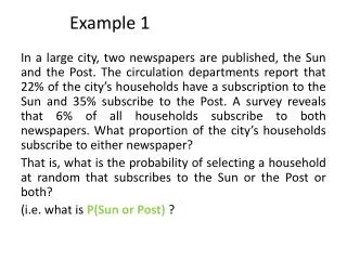
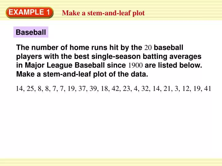
EXAMPLE 1 Make a stem-and-leaf plot Baseball The number of home runs hit by the 20 baseball players with the best single-season batting averages in Major League Baseball since 1900 are listed below. Make a stem-and-leaf plot of the data. 14, 25, 8, 8, 7, 7, 19, 37, 39, 18, 42, 23, 4, 32, 14, 21, 3, 12, 19, 41
EXAMPLE 1 Make a stem-and-leaf plot SOLUTION Separate the data into stems and leaves. STEP1: Home Runs
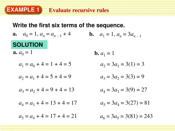
EXAMPLE 1 Make a stem-and-leaf plot Write the leaves in increasing order STEP2: Home Runs
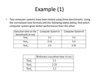
1. U.S. HISTORY for Example 1 GUIDED PRACTICE The years in which each of the first 20 states were admitted to the Union are listed below. Make a stem-and-leaf plot of the years. 1788, 1787, 1788, 1816, 1792, 1812, 1788, 1788, 1817, 1788, 1787, 1788, 1789, 1803, 1787, 1790, 1788, 1796, 1791, 1788
Stem Leaves 178 7 7 7 8 8 8 8 8 8 8 8 9 179 0 1 2 6 180 3 181 2 6 7 Key: 178 | 8 = Year 1788 for Example 1 GUIDED PRACTICE ANSWER Years
2. REASONING ANSWER The data are clustered from 3–19. Over half of the values are from 3–19. for Example 1 GUIDED PRACTICE In Example 1, describe the distribution of the data on the intervals represented by the stems. Are the data clustered together in a noticeable way? Explain.