Download
1 / 7
70 likes | 268 Vues

E N D
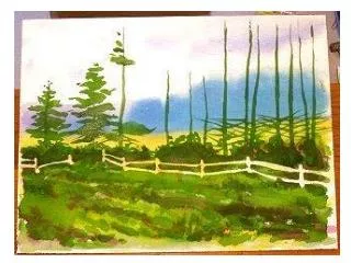
Step Five: Trees are green, right? I mixed a large amount of green. I mean a lot. Using sap green and hooker green dark I looked at the middle and foregound areas and decided to treat the whole of the two as a single plane of color. I washed the same intensity of wash across the foreground field, up through the bushes and over the fence and into the details of the tree forms. I split the work between a #10 and a #6 round red sable.I stopped at this stage so you could see how I was constructing the actual tree shapes. There are certain symbolic brush strokes you find for different kinds of trees. Study different trees and how other artists handle tree shapes. Develop your own internal artistic symbol library for those times when you don't have the real thing in front of you. Stare at nature.
Step Six: Bough break is over I finished painting the basic tree shapes in the single color, all the while using my reference photo (or sketch) to see what shapes made these trees hold together. Note that the larger trees on the right had more of their lower branches bare. I switched to a #5 rigger and added more branch detail to this area.
Painting a line of Pines - Part 2 OBJECT: A watercolor experiment with complementary colors and contrasts. Painting Pine trees with fence. • Step Seven: Yangin' out When I started this painting I decided to have fun and try some new techniques. At this step I mixed a very, very dark wash of hooker's green dark and alizarin crimson and using a cut-out approach I painted all the darkest darks in the painting, solid. This enhanced the silhouette of the treeline.
Step Eight: A little landscaping I grabbed the #8 round sable and dipped into the sap green and hooker's green dark, painting the details in the foregound field.Using my #6 round I mixed several different wells of medium strength washes. In one was cobalt blue, followed by a dioxazine purple, burnt sienna, and permanent rose puddle. I first dipped into the cobalt blue and started painting the fence from left to right. I rinsed and dipped into the purple, and flowed it out of the last color. I continued to pull connecting washes like a rainbow across the whole fence area. The color sequence was chosen to reinforce the place of the fence in the middleground. The cooler colors on the left push the fence further into the plane and the warmer tones to the right pull it forward. Don't they?
Step Ten: Itchy and Scratchy When I saw how boring the shadows were, being all one color and tone, I resigned myself to my fate. With the painting perfectly dry (use a blow dryer) I flowed clean water over top of all the shadow areas using the 1 1/2" brush. You have to coat it heavily, quickly, and evenly. One stroke a pass, two strokes could disturbed the colors softened from the first pass. It will run so hold a tissue or paper towel in your other hand and dab any spills or splatters.I watched the surface drying and when it had a satin half-dry look I used the beveled end of another brush and scratched branches and textures into the shadowed area. The bushes underneath were scrubbed with a soft brush and blotted to add highlights.
Step Twelve: All Done! • To wrap it up I used the 1" brush to lay another darker green wash over the foreground. I thought it was too light and detracted from the silhouette effect of the middleground, where all the important details are...then I signed it with a #4 round. It wasn't what I had in mind, but that was the point of this lesson. Try some new approaches and see where they take you, dealing with each crisis as they arise. Show the average or good ones. No one has to know about your personal "reject bin" that holds the ones that missed the mark but you don't have the heart to throw away.