Usability Design: Developing Effective Systems
Learn how to design effective systems, evaluate usability, and understand human behavior. Develop the necessary tools and skills for creating usable interfaces. This course emphasizes the importance of usability and its impact on user experience. Improve your communication, programming, and teamwork skills.

Usability Design: Developing Effective Systems
E N D
Presentation Transcript
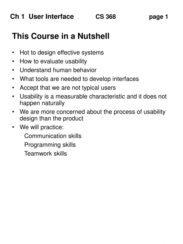
This Course in a Nutshell • Hot to design effective systems • How to evaluate usability • Understand human behavior • What tools are needed to develop interfaces • Accept that we are not typical users • Usability is a measurable characteristic and it does not happen naturally • We are more concerned about the process of usability design than the product • We will practice: • Communication skills • Programming skills • Teamwork skills
Importance of Usability • Recent survey of IT professionals: HCI was the second most neglected topic behind negotiating • Over 50% of code supports the user interface • 100% of the user experience is with the interface • Companies are aware of the competitive advantage of usable products • Apple, Google, Amazon.com • importance has grown over the past twenty years • Yet, almost none of your education considers the interface • Survey • who has a cell phone • experience with unusual platforms • why taking this course? • Group Activity: What is the best course you have taken
Examples of poor usability • Doors, push instead of pull? • Light switches • A popular text editor in the 1970s had the following problem. It was a command line editor with cumbersome names. The designers decided it would be useful to have one letter abbreviations for the most common commands. Imagine sitting down at the computer after several hours of typing and you had not saved your work. Typing EDIT had the effect of selecting everything, deleting what was selected and then going into edit mode! • Slide projector with one button. A quick press makes the slides go forward and a long press makes the slides go backward. There is no visible cue to suggest the mental model • I used an online catalogue at a major university. I typed the authors name and pressed return. Nothing happened. After carefully reading all the instructions I finally as the librarian to help me. She came over and it worked just fine for her! I tried again later and the same thing happened to me. It turns out there is a difference between RETURN and ENTER.
More Examples • I do not know how to work our phones at school. How do you put someone on hold or transfer someone? It takes just the right touch! Once again, there are no visual cues on the phone to show how to do it. • I was recently in a hotel room with a fancy interactive TV. I had the wrong remote. I could not dial out using a long distance calling card. After several calls to the front desk they just put the call through for me. Instructions were clear on how to program a wake call using my phone but I had no confidence that it would work. And it didn’t! There was no feedback to let me know is was set correctly. • Usability professionals interviewed management about a specific application. No reports had been received about problems. Experts asked the users and no reports of problems. Experts watched the users and saw they routinely deleted information by mistake. The Save and Delete buttons were too close together. The users never thought of reporting it as a problem since it was their mistake. • Watch someone ahead of me in line at supermarket. Customer is supposed to scan their own credit card. Cashier had to explain “turn the card around, no the other way”. • Older 5 inch computer disks could be inserted in any number of ways since it was a perfect square. 3 inch disks are an improvement.
User Interface • the boundary between the human and the system • allows user to interact the functional portion of the system • Examples • OS • Car • iPod • Most users are not aware of the distinction and therefore equate the interface with the system • Group Activity - design a phone interface for setting a wake up call
Characteristics • These characteristics can help the user create an effective mental model • Visibility - controls should be clearly visible. • salt and pepper shakers • door handles • A single button with multiple functionality is more difficult to use. • Feedback - let the user know the status of current actions • download progress bar • confirmation of purchase • Constraints - limit the interaction that can be done at any particular moment to prevent errors. • grayed out menu options • size and shape of floppy disks • Consistency - internal and external consistency requires actions to be performed in similar ways. • numeric layout on phones and calculators • Mapping - an appropriate relationship between controls and their effects • stove top dials • bicycle handle bars
Mapping • Relationship between controls and their movements and the results in the world • Why is this a poor mapping of control buttons?
Mapping • Why is this a better mapping? • The control buttons are mapped better onto the sequence of actions of fast rewind, rewind, play and fast forward
Activity on mappings • Which controls go with which rings (burners)? A B C D
Consistency • Design interfaces to have similar operations and use similar elements for similar tasks • For example: • always use ctrl key plus first initial of the command for an operation – ctrl+C, ctrl+S, ctrl+O • Main benefit is consistent interfaces are easier to learn and use
When consistency breaks down • What happens if there is more than one command starting with the same letter? • e.g. save, spelling, select, style • Have to find other initials or combinations of keys, thereby breaking the consistency rule • E.g. ctrl+S, ctrl+Sp, ctrl+shift+L • Increases learning burden on user, making them more prone to errors
Internal and external consistency • Internal consistency refers to designing operations to behave the same within an application • Difficult to achieve with complex interfaces • External consistency refers to designing operations, interfaces, etc., to be the same across applications and devices • Very rarely the case, based on different designer’s preference
Keypad numbers layout • A case of external inconsistency (a) phones, remote controls (b) calculators, computer keypads 8 9 1 2 7 3 4 5 6 4 5 6 8 9 1 2 7 3 0 0
Affordances: to give a clue • Refers to an attribute of an object that allows people to know how to use it • e.g. a mouse button invites pushing, a door handle affords pulling • Norman (1988) used the term to discuss the design of everyday objects • Since has been much popularised in interaction design to discuss how to design interface objects • e.g. scrollbars to afford moving up and down, icons to afford clicking on
What does ‘affordance’ have to offer interaction design? • Interfaces are virtual and do not have affordances like physical objects • Norman argues it does not make sense to talk about interfaces in terms of ‘real’ affordances • Instead interfaces are better conceptualised as ‘perceived’ affordances • Learned conventions of arbitrary mappings between action and effect at the interface • Some mappings are better than others