1 / 5
50 likes | 80 Vues
All the designers around the world need to be well aware of the fact that design is not just about good looks. It is also accountable for how users engage with a product and whether they like the presentation style or not. No matter if you run a website or an app, you will have to understand that your navigation design is more like a conversation with the visitors. Read more on https://bit.ly/3b3bxYE

E N D
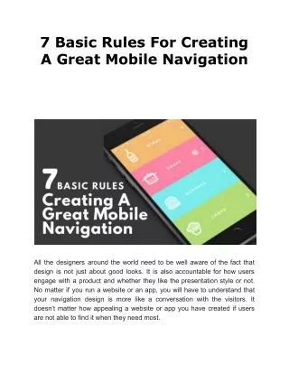
7 Basic Rules For Creating A Great Mobile Navigation All the designers around the world need to be well aware of the fact that design is not just about good looks. It is also accountable for how users engage with a product and whether they like the presentation style or not. No matter if you run a website or an app, you will have to understand that your navigation design is more like a conversation with the visitors. It doesn’t matter how appealing a website or app you have created if users are not able to find it when they need most.
Since navigation is considered as one of the important elements of a website design, it is in your best interest to make your navigation clear and simple for users. If you think your navigation is already good still you have a low conversion rate, you must consult a professional designer to resolve this issue. You can find them at our web design Los Angeles company and they will quickly identify the factors that are causing low conversions. Our highly skilled designers know well how to improve the conversion rate of websites by stunning designs and engaging content. They can even provide you unique web designs at best prices just within a few hours. In this post, I will help you in understanding the 7 basic rules for creating a great mobile navigation: 1. First of all make sure that your navigation system is simple. A good navigation is the one which feels like an invisible hand guiding users where they should go further. It is needed to prioritize content and making the app navigation easy based on the tasks mobile users will probably do. 2. Make your navigation system visually noticeable because a popular web usability consultant has said that recognizing something is easier than remembering it. It means you need to make actions and options visible to your target users in your app. Keep in mind that navigation should be available for users at all times not just when you think users might need it. If you don’t know where you should place your navigation system so that it is visually noticeable for your users, you can ask us for assistance. The experienced designers at our company will tell you where you should place your navigation system so that it draws the attention of visitors quickly. Our web design company in Los Angeles is full of web designers, web developers, marketing strategists, and many more who are committed to make your website or app highly successful.
3. Focus on making your navigation system clear and self-evident. Ensure that whatever message you want to convey to your visitors it should be conveyed in a clear and concise manner. Make sure users are able to understand what they should do if they want to go from point A to point B. They should understand everything at first glance without any outside guidance. Just for an example take a shopping cart icon, it works as an identifier for the visitors who want to check out or view items. At that point of time users don’t need to think how to navigate to make a purchase because the shopping cart directs them what they have to do next. You can also hire a web design company for this job as they have a whole team of designers and developers who work on all the aspects of website design. They will design your navigation system in such a way that it looks clear and simple to your users and guide them through the process. Alternatively you can approach our Los Angeles based web design company directly as our team combines clean aesthetics and clear navigation with intuitive user experience to generate the most leads and get higher conversions. 4. Keep your navigation system consistent and make sure it is the same for all views. Avoid changing the position of the navigation controls on different pages as it might confuse the users. Besides this keep words and action consistent as it will encourage users to keep moving ahead. Remember your navigation should be designed in such a way that it should inspire your users to engage and interact with the content that is being displayed. Changing the position of the navigation system on your website or app can be problematic for your users and they might leave the site instantly if they can’t find the navigation bar. If you want to know what would be the best position for your navigation, talk to a web design expert. At our web design company in Los Angeles, all the designers and developers have at least 5 years of experience and they are knowledgeable enough to give you effective navigation tips. We understand that great website design isn’t just
pretty to look at but it should convey a clear message to the target users as well. 5. Design your navigation system while considering the thumb zone for your users. In research it has been found that 49% of people use only one thumb to swipe, slide, or tap on something while using mobile phones. In the figure below you can get an idea about what are the easy-to-reach, hard-to-reach, and in-between areas for thumbs when mobiles are used single-handedly. The colors you see on the mobile screens are green, yellow, and red in which green indicates the easy-to-reach area, yellow indicates in-between areas (requires a stretch), and red indicates hard-to-reach areas (requires users to hold the device differently). 6. Use the bottom navigation system for the top-level destinations that are of similar importance as it requires direct access from anywhere in the app. 7. Pay attention to the size of touch targets that should be up to 9 mm square or greater (48×48 pixels on a 135 PPI display at a 1.0x scaling). However, you need to make sure that the touch targets you wish to use should not be less than 7 mm square. Touch targets make sure that it responds to the user's input when they touch a particular area of the screen. If you think that the touch targets on your app is not of standard size and you want to change its size, contact SFWP Experts. This Wordpress website design company has nearly a decade of experience in web design and development for desktop and mobile users. All the services they offer are result-oriented and can increase your sales way higher than your competitors. With our quality services, your users will be able to experience your improved accessibility standards and engage with your content interestingly. Contact Details:
213-277-9177 la@sfwpexperts.com Wordpress Developer Visit Reference Profile Websites: https://bit.ly/2V84bwi https://bit.ly/2JO1DhN https://bit.ly/34jkASG https://bit.ly/3chYRgZ https://bit.ly/3b5bF9Y https://bit.ly/2RqUUOX https://bit.ly/34z7wce https://bit.ly/39YY2bj https://bit.ly/2Xw8UL4 https://bit.ly/2y4VTh0 https://bit.ly/2wxa8KU https://bit.ly/2V4PUAF https://bit.ly/2XpwTvs