1 / 6
60 likes | 83 Vues
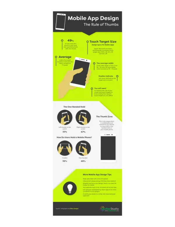
Back in 2015, Google released a mobile-friendly ranking algorithm that was designed to give priority to mobile-friendly pages in Googleu2019s mobile search results. Since then five years have already passed, still, it is a challenge for many designers to create a great mobile user experience. In fact, it can be difficult to differentiate between what makes a design truly functional for mobile users and what makes the design just visually appealing. Read more on https://bit.ly/3byUxJz

E N D
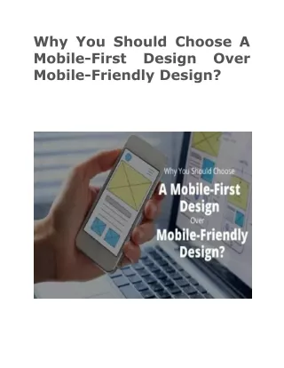
Why You Should Choose A Mobile-First Mobile-Friendly Design? Design Over
Back in 2015, Google released a mobile-friendly ranking algorithm that was designed to give priority to mobile-friendly pages in Google’s mobile search results. Since then five years have already passed, still, it is a challenge for many designers to create a great mobile user experience. In fact, it can be difficult to differentiate between what makes a design truly functional for mobile users and what makes the design just visually appealing. This is the point where a “mobile-first” strategy can be of great importance that would help designers to deliver a great mobile user experience. However it is expected that internet usage by mobile users will increase sevenfold between 2017 and 2022, it will create urgency for designers to make their websites accessible for smaller screens. Considering this statistic, you might think about adding mobile-first WordPress builders to your list of web design tools. In this article, we will discuss briefly about the differences between mobile-first and mobile-friendly approach that determines how good mobile user experience is going to be. Besides this, if you need any help with mobile-friendly designs or mobile app development, you can share your concern with SFWPExperts. It is the top-ranked web design Los Angeles company that provides effective website design, SEO, and digital marketing solutions to clients around the world. Their designers and developers have expertise in responsive web design, custom web design, user-friendly web design and so on. Let’s dive into the discussion of why you should choose a mobile-first design over mobile-friendly design: Why You Should Choose Mobile-First Design?
First, you need to understand what is the difference between a “mobile-first” and a “mobile-friendly” approach. While sometimes you might have found getting these terms used interchangeably but they are not the same; they are two different things. If you want to see some good examples of the mobile-first approach you can visit Apple’s website, YouTube, and Airbnb. These websites are well-designed for mobile and desktop users separately and that results in excellent user experience. If you want to conduct a quick test, just open these websites on a desktop and mobile device separately. If you find that differences are hard to detect or there isn’t any difference, you are seeing a live example of a mobile-first design. In YouTube, you will find the large images, minimal text, and an icon-based menu that has been used to make the viewing experience better for mobile users. Additionally, it has even replaced the traditional desktop menu structure with the “Hamburger” menu that works well on mobile screens. This is how mobile-first design works and if you want your website work in the same way contact our Los Angeles web design company today. We utilize multiple technologies and tools to create a unique experience for mobile and desktop users that increase their engagement with your website. Mobile-Friendly Design Now coming to the later part, what is the mobile-friendly design and how to identify it? The process of creating mobile-friendly design relies on coding for larger screens then using CSS to make the design compatible with mobile devices. It helps in achieving a better user experience on small screens and making the site easy for the visitors to use, navigate, or find something.
For example, if you access a mobile-friendly website on your smartphone, the code will detect your screen size, work on it, and then display a “mobile format” on the screen. Behind the scenes, the codes work to change the menus and optimize the images so that your experience becomes better while using the website on a small screen. However, you may also find some functionality inaccessible while the reformatting is being done. For instance, some elements may become hidden on the smaller screen and the graphics will occupy the space in order to accommodate a mobile layout. This kind of design is quite popular among website owners as it seems to be responsive to different devices such as mobile phones, desktops, and tablets. If you want to create a mobile-friendly design for your website, you should consider working with our Los Angeles web design company. It’s because we involve a coordinated team effort of our designers and developers to ensure the super fast delivery of projects that deal with the core activities of businesses. How Can You Benefit From A Mobile-First Design? As I have already discussed Google is giving priority to mobile-friendly pages in their search results so, you must know about their latest steps as well to prioritize mobile sites. In July 2019 they have updated their algorithm for indexing the pages on a mobile-first basis. For this reason, it has become necessary for designers to create websites keeping mobile users in mind. They test each element on their page before making the site up that if it is functioning well on smartphones or not. Now I will make you understand how you can benefit from a mobile-first design. When you design a website with a mobile-first strategy, more likely you will be using some tried and tested UX design’s best practices. That time you keep target users in mind and optimize every element so that it improves their experience. Thus it benefits your bottom line by engaging your visitors with your site for a long time and encouraging them to take
some action. When users stay on your site for more time they tend to sign up for your newsletters, purchase your products, and sometimes request a service. If your website is also not getting high traffic or having a pretty low conversion rate you should consider mobile-first design for your website. It will help you in achieving your goal and also make sure your new web design has higher ROI. At our Los Angeles web design company, the designers, developers, and marketing executives are determined to provide an excellent customer experience across the globe whether you avail of our website design, website development, or internet marketing service. Conclusion Through this blog, you would have understood the basic difference between mobile-friendly and mobile-first approach for websites. Now you can start recreating your website implementing the mobile-first strategies. Since mobile internet usage doesn’t look like it will be reducing anytime soon, I definitely recommend evaluating your current website and finding out the areas where you can implement mobile-first practices. To achieve better results you can keep these three simple tips in mind while designing your website with a mobile-first approach: 1. Keep your content easy and simple. 2. Integrate the mobile-first theme into your website design. 3. Make good use of the unique technical features of mobile phones When you follow these tips for mobile-first design, most probably your website’s user experience will be improved. And if you need to make improvements to other areas of your website you can discuss it with the representatives of our Wordpress website design company. We have
a strong team who are working very hard to ensure whatever the web design projects we deliver becomes highly successful online. Contact Details: 213-277-9177 la@sfwpexperts.com Wordpress Developer Visit Reference Profile Websites: https://bit.ly/2WNRppk https://bit.ly/2WKoSAK https://bit.ly/2QOxO4s https://bit.ly/3bs8062 https://bit.ly/2WLFZlO https://bit.ly/2wEcuHS https://bit.ly/2WQmwjV https://bit.ly/39oLadY https://bit.ly/3dxXCvr https://bit.ly/3dBZdR4 https://bit.ly/2vWFLNQ https://bit.ly/3dsjOqR https://bit.ly/3dzPPgw https://bit.ly/33RoeTv