Responsive Design Case Study
Responsive Design Case Study. June 27, 2012 Ryan Day and William Wales, GSA OCFO/BDFE. Agenda. Business drivers for mobile friendly Current approach to mobile First steps in mobile development Using responsive design Implementing Tools Testing Future plans.


Responsive Design Case Study
E N D
Presentation Transcript
Responsive Design Case Study June 27, 2012 Ryan Day and William Wales, GSA OCFO/BDFE
Agenda • Business drivers for mobile friendly • Current approach to mobile • First steps in mobile development • Using responsive design • Implementing • Tools • Testing • Future plans
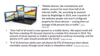
Business drivers for mobile friendly • Increasing mobile use in general public • Mobile device transition within GSA • Android • iOS • Target: portfolio of web based applications
Current approach to mobile • Not asking “will pages be viewed on mobile?” • Pages will be viewed on mobile devices. • What experience will user have when they visit?
First steps in mobile development • Started with existing content-only pages • New user guides, FAQs • Information portals • Created separate mobile pages • Redirect to “/mobile” URL • Use mobile framework (JQuery Mobile) • Sweet spot for separate pages: updates to existing sites, leave existing pages intact • Next effort: Development of new pages
Using responsive design • New pages • Desired outcomes • Consistent with look and feel of GSA sites • Modify layout based on device width • Update user interface to be more “clickable” • Limit content in some situations • Develop reusable templates • Speed future development
Implementing Mobile (0 – 480 pixels) Desktop and Tablet (481 pixels and wider)
Implementing (cont.) • Technology • HTML5 • Cascading Style Sheets 3 (CSS3) • Not currently using JavaScript
Implementing (cont.) • Responsive Design • Using fluid grid • Don’t specify pixel location • Shrink and expand to device size • Style Sheets • Base style sheet for all devices • Mobile formatting for small devices (mobile first) • Separate style sheet for desktop sites
Implementing (cont.) All devices – get base style sheet Mobile devices – additional formatting
Implementing (cont.) Wider devices – also get desktop style sheet
Tools • IDE - JBoss Developer Studio (Eclipse based) • HTML, CSS editing • Chrome Developer Tools • CSS review
Testing • Chrome browser (demo) • Resizing – test Responsive CSS • Device emulation – user-agent • W3C MobileOK Checker • http://validator.w3.org/mobile/ • Real devices – Android, iOS
Future plans • Application functionality • Mobile friendly • Perform interactive tasks • Content Management System (CMS) • Easier maintenance of pages • Consistent look and feel • Follow Digital Gov Strategy