
Responsive Design
Responsive Design. Sources: Kadlec, T. (2012). Implementing responsive design. Berkeley, California: New Riders Publishing. Marcotte , E. (2010). Responsive Web Design http://alistapart.com/article/responsive-web-design. Positioning - review.


Responsive Design
E N D
Presentation Transcript
Responsive Design Sources: Kadlec, T. (2012). Implementing responsive design. Berkeley, California: New Riders Publishing. Marcotte, E. (2010). Responsive Web Design http://alistapart.com/article/responsive-web-design
Positioning - review • CSS position property lets you control how and where a web browser displays particular elements. • CSS offers four types of positioning: • Absolute • Relative • Fixed • Static
Absolute Positioning- review • Element moves out of the normal flow of the page as determined by the HTML. • Detached from document flow. • Other elements fill-in the space vacated by an absolutely positioned element.
Browser <div id=“wrap”> no positioning - 150px - <div id=“nav”> position: absolute; left:150px; Content below fills vacated space.
Browser <div id=“wrap”> absolute or relative - 150px - <div id=“nav”> position: absolute; left:150px;
Relative positioning • Relative. Element placed relative to its current position in the normal document flow. • Other elements do NOT fill in the space vacated in the document flow. Left:250px This space does not get filled in.
Responsive Web Design • RWD is about adopting a more flexible, device agnostic approach to design for the web. • Device-agnostic because can’t know what devices people will use. • Device-agnostic – anything designed to be compatible across different device types and operating systems.
Responsive Web Design • Start by building baseline experience. • Then use fluid grids, media queries to enhance the experience for devices with varying capabilities and larger screens.
Responsive Web Design • A responsive site is not a mobile site. • A responsive site is no more a mobile site than it is a desktop site or a tablet site. • Remember - device-agnostic
Responsive Web Design • In 2010 Ethan Marcotte wrote, “Responsive Web Design”. • Used three exiting tools: • Media queries • Fluid grids • Scalable images • …to display sites on various devices of multiple resolutions
Media queries • W3C created media queries as part of the CSS3 specification. • Enhanced media types. • Allows targeting of specific physical characteristics of the device.
Media queries <link rel="stylesheet" type="text/css" media="screen and (max-device-width: 480px)" href=“min.css" /> • a media type (screen), and • the actual query enclosed within parentheses, containing a particular media feature (max-device-width) to inspect, followed by the target value (480px).
Media queries <link rel="stylesheet" type="text/css" media="screen and (max-device-width: 480px)" href="shetland.css" /> • Asking device if its horizontal resolution (max-device-width) is equal to or less than 480px.
Media queries • Multiple property values in a single query by chaining them together with the and keyword <link rel="stylesheet" media="only screen and (min-width:200px) and (max-width: 500px)" href=“small.css"> <link rel="stylesheet" media="only screen and (min-width:501px) and (max-width: 1100px)" href=“large.css">
Media queries • Can include MQ in CSS as part of a @media rule: @media screen and (max-device-width: 480px) { .column { float: none; } }
Fluid Grids target ÷ context = result Title – target width= 700px 700px ÷ 988px = 0.7085 *100 =70.85% Context Width= 988px Target column width = 329px 329px ÷ 988px =33.29%
Scalable images Scale to size of containing element ul#image-icons li img { max-width:100%}
Scalable images ul#image-icons li img { max-width:50%} Scale to size of containing element ul#image-icons li img {max-width:100%}
Mobile first • Mobile experience should be the first one created. • Spearheaded by Luke Wroblewski. • Three reasons why: • Mobile is exploding • Mobile forces you to focus • Mobile can extend your capabilities
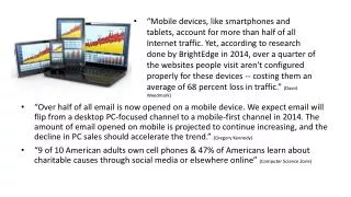
Mobile is exploding • A proliferation of mobile devices worldwide. • More and more people access Internet only through mobile devices. • Estimated by the year 2020, 12 billion mobile subscriptions. • MF ensures you have an experience available to extremely fast-growing user base - the next big computing platform.
Mobile forces you to focus • Requires design team to focus on most important content, data, and functions. • No space in a 320 by 480 pixel screen for extraneous, unnecessary elements. • Forced to focus on content that's most important to users. • What features and functionality are essential? • If it is nice to have, then does it belong on your page? • Designers must prioritize.
Mobile extends your capabilities • Mobile first allows designers to use full capabilities of device. "Saying mobile design should have less is like saying paperbacks have smaller pages, so we should remove chapters.” (Clark) • Use of geo-location to optimize the experience. • Switch layouts depending on the way they're held. • Rich, multi-touch interface. • Provide a rich user experience.


