Responsive Design
Responsive Design. Sources: Kadlec, T. (2012). Implementing responsive design. Berkeley, California: New Riders Publishing. Marcotte , E. (2010). Responsive Web Design http://alistapart.com/article/responsive-web-design. Responsive Design. Responsive Web Design.


Responsive Design
E N D
Presentation Transcript
Responsive Design Sources: Kadlec, T. (2012). Implementing responsive design. Berkeley, California: New Riders Publishing. Marcotte, E. (2010). Responsive Web Design http://alistapart.com/article/responsive-web-design
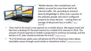
Responsive Web Design • RWD is about adopting a more flexible, device agnostic approach to design for the web. • Device-agnostic because can’t know what devices people will use.
Responsive Web Design • Start by building baseline experience. • Used three exiting tools: • Media queries • Fluid grids • Scalable images (Marcotte, E., 2010)
Media queries • Allow designers to deliver styles based on media type.
Media queries • Can include MQ in CSS as part of a @media rule: @media screen and (max-device-width: 480px) { .column { float: none; } }
Media queries • Multiple property values in a single query by chaining them together with the and keyword <link rel="stylesheet" media="only screen and (min-width:200px) and (max-width: 500px)" href=“small.css"> <link rel="stylesheet" media="only screen and (min-width:501px) and (max-width: 1100px)" href=“large.css">
Defined media types • All Suitable for all devices. • Braille Intended for braille tactile feedback devices. • Embossed Intended for paged braille printers. • Handheld Intended for handheld devices (typically small screen, limited bandwidth). • Print Intended for paged material and for documents viewed on screen in print preview mode. • Projection Intended for projected presentations. • Screen Intended primarily for color computer screens. • Speech Intended for speech synthesizers. • TtyIntended for media using a fixed-pitch character grid (such as teletypes). • TvIntended for television-type devices.
Defined media types • device-width, orientation, and resolution. @media print and (orientation: portrait) { }
Breakpoints • Point where media query delivers a new set of styles. • Some sites have just two layouts triggered at a single breakpoint. • Responsive sites often use three designs targeted at • typical phone, • tablet, • and desktop widths. • Think in terms of • single column, • wide single column, and • multiple columns, then • defining the logical breakpoints points in EMs - more future friendly.
Common Break Points This breakpoint chart shows the pixel widths of some popular devices.
Fluid Grids target ÷ context = result Title – target width= 700px 700px ÷ 988px = 0.7085 *100 =70.85% Context Width= 988px Target column width = 329px 329px ÷ 988px =33.29%
Scalable images Scale to size of containing element div#image-icons img {max-width:50% }
Scalable images • Style rule to make images scale down to fit their container: img { max-width: 100%; } • As layout gets smaller, images in it will scale down to fit width of containing element. • If container is larger than image, the image does not scale larger. • It stops at 100% of its original size. • max-width property, remove width and height attributes in the imgelements in the HTML document, or the image won’t scale proportionally. <imgsrc=“myImage.jpg” width=“640” height=“480” alt=“Image” />
src.sencha.io www.sencha.com/learn/how-to-use-src-sencha-io/ <img src='http://src.sencha.io/http://www.jma.duq.edu/classes/gibbs/jma318/test/640X480.jpg' alt='My smaller image' /> Absolute Path to image
Adaptive Layout • Two or three different fixed layout designs that target the most common device breakpoints. • May be quicker • less disruptive to produce
<!doctype html> <html> <head> <title>Web Design!</title> </head> <body> <p>Web Design!</p> </body> </html>
Page displayed much smaller on the mobile device. Why? Mobile device Desktop | Browser Web Design! Web Design!
The text is way too small to read without zooming in. Mobile Safari thinks page is 980px wide 980px Web Design! Web Design! 980px ? 320px
Mobile Safari assumed page was a document designed for the desktop. It gave website a width of 980 pixels and presented it zoomed out. Web Design! 980px ? 320px
Mobile Safari sized the 980px page to fit device Web Design! Web Design! Web Design! 980px 320px
Must tell the browser that webpage is optimized for mobile. Tell device that the device width is 320px, not the default value of 980px. Do that with meta viewport element. Best to use device-width. Let device figure out the size. Web Design! 320px <meta name="viewport" content="width=device-width, initial-scale=1.0"/>
<meta name="viewport" content="width=device-width, initial-scale=1.0"/> • Tells browser to: • set width of viewport equal to the width of the device screen (width=device-width), whatever that is. • initial-scale - sets the zoom level to 1 (100%).