Download

1 / 5
50 likes | 286 Vues
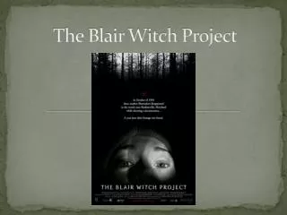
The Blair Witch Project Website Analysis . The Enter Page .

E N D
The Enter Page Before the homepage of the official website is established, the audience are presented with a small video involving the main character of the film. The relevance of this engages the audience instantly as this video is an interactive feature which instantly attracts the audience. Within this shot, we can establish a low key lighting which enables the idea of mystery to be produced. The use of location clearly establishes that the shot has been carried out within a house, through the use of props such as the TV, curtains as well as the shelf visible within the left hand corner. The character is located in the centre of the shot, and therefore this relevant feature may connote importance. Through a medium shot we can also establish the use of black clothing which the character is presented in. This idea can convey the idea of mystery and sinister connotations. Moreover, the use of low key lighting has also shadowed half of the characters face. The use of this convention may foreshadow to the audience that the character has something to hide. The overall representation of the shot may come across as mysterious; however, through the characters energized acting within the shot portrays another kind of feeling to the audience.
The Enter Page Once the introduction clip had ended, the page then faded to the shot shown on the right. As we are able to establish, all that is visible is the film’s production information of ‘Lions Gate Entertainment and Haxan Films the tenth anniversary’. The relevance of this information informs the audience about this factual feature. The message also comes across as very welcoming, as it informs the audience, it also insinuates to the audience for them to also celebrate with them. The text has been written in the conventional font which has been carried consistently throughout the film poster and trailer. The text has more importantly been presented continuing the conventional colour scheme of the film using contrasting colours such as black and white, which allows the text to stand out more. Additionally, the location of the text has been situated in the centre of the page, more importantly it is the only feature conveyed on the page.
The Home Page The snap shots above clearly establish the stages in which the homepage appears using a fade. As we can see, many elements of the homepage especially the page links appear using fades. The colour scheme used, is consistent through the whole website, as well as following the colour scheme presented on the film poster as well as the film trailer. The use of the black and white colour combination comes across as very striking. The font used has also been consistently conveyed through the films promotion package, using a simple and bold use of typography, which comes across as very ghostly through the white blend supporting the film genre. Moreover, also present on the loading of the homepage is a iconic symbol also used within the film promotion package products. This symbol as previously mentioned represents the idea of witch craft and therefore foreshadows what the film is about. The films title ‘The Blair Witch Project’ has been located at the top of the page. This choice of location allows the font to be noticeable and eye catching. The font used is also the same font used to present the websites links.
The Home Page The snap shot above presents the final overall look of the homepage. As we are able to see as well as the conventional features such as the large title, links to direct the audience to other pages also included on the homepage is an image of the DVD, assisted by information of where and how much for this is available to purchase from. It is important to acknowledge that this feature of the homepage also continues to follow through the use of consistent typography and colour scheme developed. Additionally, it is also essential to understand that the direct links consist of different subtitles of which are relevant to the film, which have also been described in the style of the film for example ‘The Aftermath’. This feature also grabs the attention and engages the target demographics, as this feature allows the subtitle link to be more interesting.