Download

1 / 9
90 likes | 235 Vues
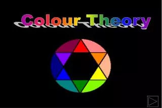
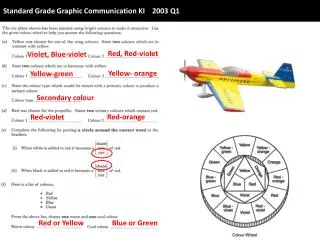
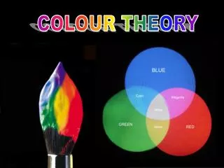
Standard Grade Graphic Communication Colour Theory. The Colour Wheel. All theory at S.G. Graphic Communication is based on the colour wheel. Primary Colours RED YELLOW BLUE All other colours are mixed from these basic three. Secondary Colour - GREEN Mixed from Yellow and Blue.

E N D
Standard Grade Graphic Communication Colour Theory
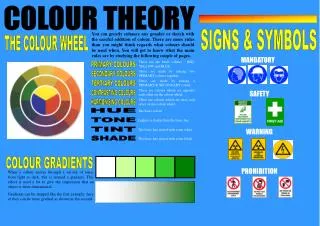
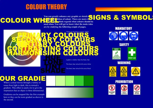
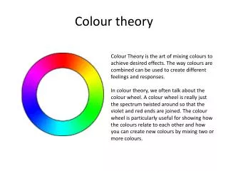
The Colour Wheel All theory at S.G. Graphic Communication is based on the colour wheel
Primary Colours REDYELLOWBLUE All other colours are mixed from these basic three Secondary Colour - GREEN Mixed from Yellow and Blue Secondary Colour - ORANGE Mixed from Yellow and Red Secondary Colour - VIOLET Mixed from Red and Blue
Tertiary Colours Mixed from a PRIMARY colour and a SECONDARY colour Tertiary Colour - Yellow/Orange Tertiary Colour - Red/Orange Tertiary Colour - Red/Violet Tertiary Colour - Blue/Violet Tertiary Colour - Blue/Green Tertiary Colour - Yellow/Green Yellow Green Yellow Orange Blue Green Red Orange Blue Violet Red Violet
Tints and Shades When WHITE is added to a colour it is called a TINT of that colour. When BLACK is added to a colour it is called a SHADE of that colour. SHADE TINT Receding , Advancing, Harmony and Contrasting Colours. Cold colours are said to be RECEDING colours Warm colours are said to be ADVANCING colours Similar colours are in HARMONY Opposite colours are in CONTRAST HARMONY HARMONY CONTRAST RECEDING ADVANCING
Examples of colours that: HARMONISE CONTRAST ADVANCE RECEDE Dark and soft BROWNS Warm Reds/Oranges RED-GREEN BLUE-YELLOW Cold BLUES
SUNMED HOLIDAYS Colour Choices Colour selection for a product is guided by the function of the product, the environment in which the product will be used and the market for which the product is intended. Red:Great power of attraction. Hot, bold, exciting, festive, passionate and positive. Can be associated with rage, aggression, danger, courage and speed. Yellow:Most easily seen, luminous, bright, pleasant, happy, sunny, livelyand cheerful. Blue:Formal, cool, sophisticated, aristocratic, serene, passive, elegant and reliable. Orange: Sunny, cheerful, warm and happy. Green:Restful, fresh, cool, soothing, natural and informal. Purple: Rich, pompous, impressive and regal. Violet:Cool, negative, retiring subdued and solemn. Grey:Neutral, sedate, dignified and inconspicuous. White:Luminous, positive, light delicate and clean. Black:Subdued, solemn and profound, Brown:Safe, reliable and earthy natural.
Display, Flash Bars & Signs Flash Bars Flash bars are used to make the subject of a display more prominent and eye catching i.e. the perfume bottle shown opposite has three different 'flash' bar shapes. The shape of the flash bar is the designers choice. In the cases opposite a blue 'gradient' bar was used because it recedes into the background. Siverstone More examples 14th. July 2004 TRENDS Shoes SIGNS SAFE CONDITION PROHIBITION MANDATORY BRITISH SAFETY KITE MARK WARNING
Justification of Colour Choice As part of the course requirements for Credit level work, whether Manual or Computer generated, reasons are needed for colour choice. Example The blue background is cold and receding creating the feeling of distance so allowing the warm yellow and red text colours to advance to the front giving them the desired importance. The vertical and horizontal flash bars are light blue but gives the illusion of being nearer than the background and at the same time promotes the graphic of the IRON which is the main subject of the display. The ‘shirt’ graphic is also placed over the horizontal flash bar to give it prominence. The various shades of blue give the display an overall formal look to hopefully appeal to the professional person.